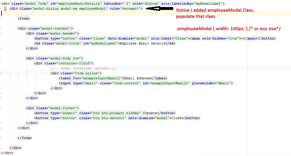
如何更改Twitter Bootstrap模式框的默认宽度?


373

我尝试了以下方法:

   <div class="modal hide fade modal-admin" id="testModal" style="display: none;">
        <div class="modal-header">
          <a data-dismiss="modal" class="close">×</a>
          <h3 id='dialog-heading'></h3>
        </div>
        <div class="modal-body">
            <div id="dialog-data"></div>
        </div>
        <div class="modal-footer">
          <a data-dismiss="modal" class="btn" >Close</a>
          <a class="btn btn-primary" id="btnSaveChanges">Save changes</a>
        </div>
    </div>

而这个JavaScript:

    $('.modal-admin').css('width', '750px');
    $('.modal-admin').css('margin', '100px auto 100px auto');
    $('.modal-admin').modal('show')

结果不是我所期望的。模态左上方位于屏幕中央。

谁能帮我。有没有其他人尝试过。我认为这不是一件不寻常的事情。


Bootstrap插件没有太多选择。尝试在Bootstrap CSS文件中找到该类,并查看是否通过CSS设置了该类,那么您应该可以覆盖它,或者至少可以更好地了解它是哪个元素。
GillesC 2012年

3
查看Nick N的答案,这是一个非常不错的响应式答案!stackoverflow.com/a/16090509/539484
2013年

Answers:


373

更新:

bootstrap 3您需要更改模态对话框。因此,在这种情况下,您可以将类添加到站立modal-admin的位置modal-dialog

原始答案(引导程序<3)

您是否有某种原因试图使用JS / jQuery进行更改?

您只需使用CSS即可轻松完成此操作,这意味着您不必在文档中进行样式设置。在您自己的自定义CSS文件中,添加:

body .modal {
    /* new custom width */
    width: 560px;
    /* must be half of the width, minus scrollbar on the left (30px) */
    margin-left: -280px;
}

在您的情况下:

body .modal-admin {
    /* new custom width */
    width: 750px;
    /* must be half of the width, minus scrollbar on the left (30px) */
    margin-left: -375px;
}

我将主体放在选择器之前的原因是,它比默认选项具有更高的优先级。这样,您可以将其添加到自定义CSS文件中,而无需担心更新Bootstrap。


2
感谢@NickN,滚动到下方以获得更好(响应)的答案!
OnTheFly 2013年

1
@FloatingRock您可以使其具有响应性,请看我的回答
Nick N.

1
@NickN。杀手!谢谢尼克
FloatingRock

47
Bootstrap 3使此操作变得更容易。.modal .modal-dialog { width: 800px; }左侧位置会自动计算。
加文

1
实际上,这对我不起作用。@ZimSystem发表评论的解决方案可以解决问题。
tonjo

270

如果要使其仅使用CSS进行响应,请使用以下命令:

.modal.large {
    width: 80%; /* respsonsive width */
    margin-left:-40%; /* width/2) */ 
}

注意1:我使用了一个.large类,您也可以在正常情况下执行此操作.modal

注意2:在Bootstrap 3中,可能不再需要负向左空白 (未亲自确认)

/*Bootstrap 3*/
.modal.large {
     width: 80%;
}

注3:在Bootstrap 3和Bootstrap 4中,有一个 modal-lg类。因此,这可能就足够了,但是如果要使其响应,则仍然需要我为Bootstrap 3提供的修复程序。

在某些应用程序fixed模态中,在这种情况下,您可以尝试width:80%; left:10%;(公式:left = 100-width / 2)


这似乎导致模态在非常狭窄的屏幕上偏离屏幕一半。
cofiem

5
Cofiem,请使用媒体查询解决此问题
Nick N.

1
@NickN。我的媒体查询没有解决它。你能添加一个例子吗?无视,我明白了。我有最大宽度而不是最小宽度。 @media (min-width: 400px) { body .modal-lrg{ width: 80%; /* respsonsive width */ margin-left:-40%; /* width/2) */ } }
HPWD

我发现仅使用%不能提供足够的控制权,而不能使用已经内置在引导程序中的列。
亚历克斯

@Alex我认为它为您提供了更多控制权,您将如何利用现有的列呢?
尼克·N。

107

如果您使用的是Bootstrap 3,则需要更改modal-dialog div而不是已接受答案中所示的modal div。同样,为了保持Bootstrap 3的响应特性,使用媒体查询编写覆盖CSS非常重要,这样在较小的设备上,模式将为全宽。

请参见此JSFiddle尝试不同的宽度。

的HTML

<div class="modal fade">
    <div class="modal-dialog custom-class">
        <div class="modal-content">
            <div class="modal-header">
                <button type="button" class="close" data-dismiss="modal" aria-hidden="true">&times;</button>
                <h3 class="modal-header-text">Text</h3>
            </div>
            <div class="modal-body">
                This is some text.
            </div>
            <div class="modal-footer">
                This is some text.
            </div>
        </div><!-- /.modal-content -->
    </div><!-- /.modal-dialog -->
</div><!-- /.modal -->

的CSS

@media screen and (min-width: 768px) {
    .custom-class {
        width: 70%; /* either % (e.g. 60%) or px (400px) */
    }
}

3
更正bootstrap3。无需调整边距就可以工作!thx
SQueek

1
我删除了答案中的id属性,因为它不是必需的。
弧度

它可以工作,但不能响应mlunoe或Dave的答案。
ksiomelo 2014年

80

如果您想要不破坏相关设计的东西,请尝试以下操作:

body .modal {
  width: 90%; /* desired relative width */
  left: 5%; /* (100%-width)/2 */
  /* place center */
  margin-left:auto;
  margin-right:auto; 
}

正如@Marco Johannesen所说,选择器之前的“ body”是这样,它的优先级高于默认值。


4
我建议只使用margin-left:auto; margin-right:auto;,而不是auto一路走去
CWD

在某些情况下,可能需要top: 30%根据内部内容的百分比。
bool.dev 2012年

6
当我省略.modal.fade.in规则时,这对我来说效果很好,该规则将模式一直移动到Bootstrap V2.2.2中的底部。
ramiro

1
这与ANGULAR-UI模态示例一起使用...只需将代码放在css文件中并加载到页面中... angular-ui.github.io/bootstrap/#/modal ...在plnkr.co上
Marcello de Sales

1
很棒的解决方案在Internet Explorer 8,9,10中的2.3.2引导程序和MAIN上很好用!!!边距为左的解决方案:-40%在Internet Explorer中不正确!!!
Cioxideru 2014年

41

在Bootstrap 3+中,更改模式对话框大小的最合适方法是使用size属性。下面是一个示例,请注意modal-sm沿modal-dialog类,指示一个小的模式。它可以包含sm小,md中和lg大的值。

<div class="modal fade" id="ww_vergeten" tabindex="-1" role="dialog" aria-labelledby="modal_title" aria-hidden="true">
  <div class="modal-dialog modal-sm"> <!-- property to determine size -->
    <div class="modal-content">
      <div class="modal-header">
        <button type="button" class="close" data-dismiss="modal" aria-hidden="true">&times;</button>
        <h4 class="modal-title" id="modal_title">Some modal</h4>
      </div>
      <div class="modal-body">

        <!-- modal content -->

      </div>
      <div class="modal-footer">
        <button type="button" class="btn btn-primary" id="some_button" data-loading-text="Loading...">Send</button>
      </div>
    </div>
  </div>
</div>

将其添加到我的回答中:)
2014年

3
这不是最好的答案吗?我想最好的答案可以帮助您自定义它,但是大多数用例应该由Bootstrap的内置类满足。
WebSpanner'2

我正在使用Bootstrap 3.x,但我似乎没有modal-md课程。
James Poulose

34

因为Bootstrap 3这里是怎么做的。

modal-wide为您的HTML标记添加样式(根据Bootstrap 3 docs中的示例改编)

<div class="modal fade modal-wide" id="myModal" tabindex="-1" role="dialog" aria-labelledby="myModalLabel" aria-hidden="true">
  <div class="modal-dialog">
    <div class="modal-content">
      <div class="modal-header">
        <button type="button" class="close" data-dismiss="modal" aria-hidden="true">&times;</button>
        <h4 id="myModalLabel" class="modal-title">Modal title</h4>
      </div>
      <div class="modal-body">
        <p>One fine body&hellip;</p>
      </div>
      <div class="modal-footer">
        <button type="button" class="btn btn-default" data-dismiss="modal">Close</button>
        <button type="button" class="btn btn-primary">Save changes</button>
      </div>
    </div><!-- /.modal-content -->
  </div><!-- /.modal-dialog -->
</div><!-- /.modal -->

并添加以下CSS

.modal-wide .modal-dialog {
  width: 80%; /* or whatever you wish */
}

没有必要覆盖margin-leftBootstrap 3得到这个现在被居中。


3
只是为了避免造成混淆,没有技术上的理由来添加modal-wide该类,这意味着它不是Bootstrap的“内部”类。您可以轻松完成#myModal .modal-dialog { width: 80%; }
Gavin

1
是的 但是,将其作为一种样式可以使其更加可重用。
戴夫萨格2013年

2
是的,我明白。引导类和自定义类之间很难有很多区别,所以我想记一下。
加文2013年

20

Bootstrap 3中,您需要的是这个

<style>
    .modal .modal-dialog { width: 80%; }
</style>

以上大多数答案对我没有用!


你知道如何改变模态高度吗?感谢您的回答,它就像一个魅力:)
FrenkyB

17

解决方案来自页面

$('#feedback-modal').modal({
    backdrop: true,
    keyboard: true
}).css({
    width: 'auto',
    'margin-left': function () {
        return -($(this).width() / 2);
    }
});

15

在Bootstrap v3中,有一种简单的方法可以使模式更大。只需在modal-dialog旁边添加modal-lg类即可。

<!-- My Modal Popup -->
<div id="MyWidePopup" class="modal fade" role="dialog">
    <div class="modal-dialog modal-lg"> <---------------------RIGHT HERE!!
        <!-- Modal content-->
        <div class="modal-content">

为什么要投反对票?它绝对干净地给了我一个漂亮的宽对话框!并且仅使用“适当的”引导程序类!
戴夫

尝试跳回一些HTML元素-使用可以测试的最简单结构。
戴夫

13

引导程序3:为了维持小型和超小型设备的响应功能,我执行了以下操作:

@media (min-width: 768px) {
.modal-dialog-wide
{ width: 750px;/* your width */ }
}

这是正确的。这对我有用。不要忘记将响应式布局的width属性更改为XX%。顺便说一句,在我的情况下,该版本是3.0.3
Jerry Chen

7

这就是我所做的,在我的custom.css中,添加了这些行,仅此而已。

.modal-lg {
    width: 600px!important;
    margin: 0 auto;
}

显然,您可以更改宽度的大小。


7

如果Bootstrap> 3,只需在样式中添加样式即可。

<div class="modal-dialog" style="width:80%;">
  <div class="modal-content">
  </div>
</div>

6

我发现此解决方案更适合我。您可以使用此:

$('.modal').css({
  'width': function () { 
    return ($(document).width() * .9) + 'px';  
  },
  'margin-left': function () { 
    return -($(this).width() / 2); 
  }
});

或这取决于您的要求:

$('.modal').css({
  width: 'auto',
  'margin-left': function () {
     return -($(this).width() / 2);
  }
});

看到我发现的帖子:https : //github.com/twitter/bootstrap/issues/675


5

FYI Bootstrap 3自动处理left属性。因此,只需添加此CSS即可更改宽度并将其居中:

.modal .modal-dialog { width: 800px; }

为B3工作!非常感谢!
Bagata

4

保留响应式设计,将宽度设置为所需的宽度。

.modal-content {
  margin-left: auto;
  margin-right: auto;
  max-width: 360px;
}

把事情简单化。


4

改变班级model-dialog可以达到预期的效果。这些小技巧对我有用。希望它能帮助您解决此问题。

.modal-dialog {
    width: 70%;
}

3

对于Bootstrap 3,所需要的只是一个通过CSS给出模态对话框的百分比值

的CSS

#alertModal .modal-dialog{
     width: 20%;
}

1
是的,occam的剃须刀就放在这把。在3.0上进行测试的效果很好
Gui de Guinetik

3

我结合使用了CSS和jQuery以及此页面上的提示,以使用Bootstrap 3创建流畅的宽度和高度。

首先,一些CSS处理内容区域的宽度和可选滚动条

.modal.modal-wide .modal-dialog {
  width: 90%;
}
.modal-wide .modal-body {
  overflow-y: auto;
}

然后一些jQuery可以根据需要调整内容区域的高度

$(".modal-wide").on("show.bs.modal", function() {
  var height = $(window).height() - 200;
  $(this).find(".modal-body").css("max-height", height);
});

有关完整的文章和代码,请 访问http://scottpdawson.com/development/creating-a-variable-width-modal-dialog-using-bootstrap-3/


3

在带有CSS的Bootstrap 3中,您可以简单地使用:

body .modal-dialog {
    /* percentage of page width */
    width: 40%;
}

这样可以确保您不会破坏页面的设计,因为我们正在使用.modal-dialog而不是.modal将其应用于阴影。


2

尝试类似以下的操作(请参见此处的实时jsfiddle示例:http : //jsfiddle.net/periklis/hEThw/1/

<a class="btn" onclick = "$('#myModal').modal('show');$('#myModal').css('width', '100px').css('margin-left','auto').css('margin-right','auto');" ref="#myModal" >Launch Modal</a>
<div class="modal" id="myModal" style = "display:none">
  <div class="modal-header">
    <a class="close" data-dismiss="modal">×</a>
    <h3>Modal header</h3>
  </div>
  <div class="modal-body">
    <p>One fine body…</p>
  </div>
  <div class="modal-footer">
    <a href="#" class="btn">Close</a>
    <a href="#" class="btn btn-primary">Save changes</a>
  </div>
</div>​

2

我发现与其使用百分比来使模式响应成为响应,不如使用已经内置在引导程序中的列和其他响应元素来进行更多控制。


要使模式响应/任意数量的列大小:

1)在模态对话框div周围添加一个额外的div,其类为.container-

<div class="container">
    <div class="modal-dialog">
    </div>
</div>


2)添加一些CSS以使模式全宽-

.modal-dialog {
    width: 100% }


3)如果您有其他模态,也可以添加一个额外的类-

<div class="container">
    <div class="modal-dialog modal-responsive">
    </div>
</div>

.modal-responsive.modal-dialog {
    width: 100% }


4)如果您想要各种尺寸的模态,请添加一行/列-

<div class="container">
  <div class="row">
    <div class="col-md-4">
      <div class="modal-dialog modal-responsive">
       ...
      </div>
    </div>
  </div>
</div>

2

在您的css文件中添加以下内容

.popover{
         width:auto !important; 
         max-width:445px !important; 
         min-width:200px !important;
       }

2

在脚本下方使用:

.modal {
  --widthOfModal: 98%;
  width: var(--widthOfModal) !important;
  margin-left: calc(calc(var(--widthOfModal) / 2) * (-1)) !important;
  height: 92%;

  overflow-y: scroll;
}

演示

演示gif


1

通过使用以下内容达到了预期的结果:

.modal-dialog {
    width: 41% !important;
}

1

Bootstrap 3.xx

   <!-- Modal -->
<div class="modal fade" id="employeeBasicDetails" tabindex="-1" role="dialog" aria-labelledby="myModalLabel">
    <div class="modal-dialog modal-sm employeeModal" role="document">

        <form>

        <div class="modal-content">
            <div class="modal-header">
                <button type="button" class="close" data-dismiss="modal" aria-label="Close"><span aria-hidden="true">&times;</span></button>
                <h4 class="modal-title" id="myModalLabel">Modal Title</h4>
            </div>

            <div class="modal-body row">
                Modal Body...
            </div>

            <div class="modal-footer"> 
                <button type="button" class="btn btn-default" data-dismiss="modal">Close</button>
            </div>
        </div>

        </form>

    </div>
</div>

注意,我在第二个div中添加了.employeeModal类。然后设置该类的样式。

.employeeModal{
        width: 700px;
    }

代码段的屏幕截图


0

我用这种方式,对我来说很完美

$("#my-modal")
.modal("toggle")
.css({'width': '80%', 'margin-left':'auto', 'margin-right':'auto', 'left':'10%'});

0

Bootstrap 2的基于基础的解决方案(无js):

.modal-width(@modalWidth) {
    width: @modalWidth;
    margin-left: -@modalWidth/2;

    @media (max-width: @modalWidth) {
        position: fixed;
        top:   20px;
        left:  20px;
        right: 20px;
        width: auto;
        margin: 0;
        &.fade  { top: -100px; }
        &.fade.in { top: 20px; }
    }
}

然后,在任何您想指定模态宽度的地方:

#myModal {
    .modal-width(700px);
}

0

我使用了SCSS和完全响应模式:

.modal-dialog.large {
    @media (min-width: $screen-sm-min) { width:500px; }
    @media (min-width: $screen-md-min) { width:700px; }
    @media (min-width: $screen-lg-min) { width:850px; }
} 

0
you can use any prefix or postfix name for modal. but you need to make sure that's should use everywhere with same prefix/postfix name.    

body .modal-nk {
        /* new custom width */
        width: 560px;
        /* must be half of the width, minus scrollbar on the left (30px) */
        margin-left: -280px;
    }

要么

body .nk-modal {
            /* new custom width */
            width: 560px;
            /* must be half of the width, minus scrollbar on the left (30px) */
            margin-left: -280px;
        }
By using our site, you acknowledge that you have read and understand our Cookie Policy and Privacy Policy.
Licensed under cc by-sa 3.0 with attribution required.