如何拉伸背景图像以填充div
Answers:
5
IE浏览器不支持此功能。要做什么?
—
KarSho
它不起作用,请参见下面的波纹管以获得更好的答案:background-size:100%100%;
—
chriscatfr 2014年
为什么要倍增而不是拉伸图像以适合容器:jsfiddle.net/qdzaw/424
—
SearchForKnowledge
您需要添加
—
Rorrik
background-repeat: no-repeat;
hendo,您的JSFiddle不再起作用(指向hootsuite的无效链接),您能更新一下吗?
—
TylerH 2015年
您可以使用:
background-size: cover;或仅将大型背景图像用于:
background: url('../images/teaser.jpg') no-repeat center #eee;
盖子不张紧,它可以剪照片
—
drdrej '16
我不知道您要使用背景img做什么,但是
—
Ouadie
background-size: cover; background-position: center会填充的背景而div不会拉伸图像
非常适合拉伸会变形图像的图片!
—
Stijn Van Bael
现代CSS3(建议用于未来,可能是最佳解决方案)
.selector{
   background-size: cover;
   /* stretches background WITHOUT deformation so it would fill the background space,
      it may crop the image if the image's dimensions are in different ratio,
      than the element dimensions. */
}
最高 拉伸而没有修剪或变形(可能无法填充背景): background-size: contain;
强制绝对拉伸(可能导致变形,但没有裁剪): background-size: 100% 100%;
“旧” CSS“始终有效”的方式
绝对定位图像(相对定位)父级的第一个子级,并将其拉伸到父级尺寸。
的HTML
<div class="selector">
   <img src="path.extension" alt="alt text">
   <!-- some other content -->
</div>
相当于CSS3 background-size: cover;:
为了动态地做到这一点,您将不得不使用相反的contains方法(见下文),并且如果您需要将裁剪后的图像居中,则需要使用JavaScript来动态地做到这一点,例如使用jQuery:
$('.selector img').each(function(){
   $(this).css({
      "left": "50%",
      "margin-left": "-"+( $(this).width()/2 )+"px",
      "top": "50%",
      "margin-top": "-"+( $(this).height()/2 )+"px"
   });
});
实际示例:
相当于CSS3 background-size: contain;:
这可能有点棘手-溢出父级的背景尺寸会将CSS设置为100%,另一个自动设置。
实际示例:
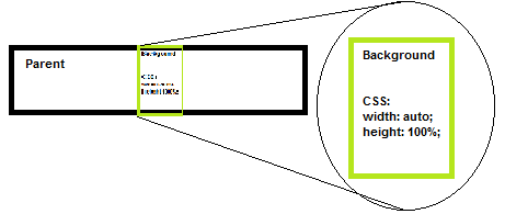
.selector img{
position: absolute; top:0; left: 0;
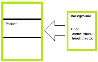
width: 100%;
height: auto;
/* -- OR -- */
/* width: auto;
height: 100%; */
}相当于CSS3 background-size: 100% 100%;:
.selector img{
   position: absolute; top:0; left: 0;
   width: 100%;
   height: 100%;
}
PS:要完全动态地以“旧”方式进行覆盖/容纳物的等效操作(因此您不必担心溢出/比率),则必须使用javascript为您检测比例并按所述设置尺寸。 ..
比其他“封面”答案更完整的答案。不幸的是,它一直陷在底部附近……
—
BillyNair 2015年
为此,您可以使用CSS3 background-size属性。这样写:
#div2{
    background-image:url(http://s7.static.hootsuite.com/3-0-48/images/themes/classic/streams/message-gradient.png);
    -moz-background-size:100% 100%;
    -webkit-background-size:100% 100%;
    background-size:100% 100%;
    height:180px;
    width:200px;
    border: 1px solid red;
}检查此:http : //jsfiddle.net/qdzaw/1/
IE浏览器不支持此功能。要做什么?
—
KarSho
对于IE,请使用IMG标签,以100%的高度和宽度给出绝对位置。
—
sandeep
你可以加:
#div2{
    background-image:url(http://s7.static.hootsuite.com/3-0-48/images/themes/classic/streams/message-gradient.png);
    background-size: 100% 100%;
    height:180px;
    width:200px;
    border: 1px solid red;
}您可以在此处了解更多信息:css3 background-size
考虑到这表明背景大小接受2个宽度和高度值,因此比接受的答案好得多。
—
krb686
background-size是css3,并非所有浏览器都支持
—
Mahdi Jazini
body{
  margin:0;
  background:url('image.png') no-repeat 50% 50% fixed;
  background-size: cover;
}要保持宽高比,请使用 background-size: 100% auto;
div {
    background-image: url('image.jpg');
    background-size: 100% auto;
    width: 150px;
    height: 300px;
}