更改开关的“打开”颜色
Answers:
到目前为止,最好使用AppCompat.v7库中的SwitchCompat。然后,您可以使用简单的样式来更改组件的颜色。
values/themes.xml:

<style name="Theme.MyTheme" parent="Theme.AppCompat.Light">
    <!-- colorPrimary is used for the default action bar background -->
    <item name="colorPrimary">@color/my_awesome_color</item>

    <!-- colorPrimaryDark is used for the status bar -->
    <item name="colorPrimaryDark">@color/my_awesome_darker_color</item>

    <!-- colorAccent is used as the default value for colorControlActivated,
         which is used to tint widgets -->
    <item name="colorAccent">@color/accent</item>

    <!-- You can also set colorControlNormal, colorControlActivated
         colorControlHighlight, and colorSwitchThumbNormal. -->

</style>参考:Android开发者博客
编辑:
正确应用该方法的方式是通过android:theme="@style/Theme.MyTheme"
,也可以将其应用于父样式,例如EditTexts,RadioButtons,Switches,CheckBoxes和ProgressBars:
<style name="My.Widget.ProgressBar" parent="Widget.AppCompat.ProgressBar">

<style name="My.Widget.Checkbox" parent="Widget.AppCompat.CompoundButton.CheckBox">colorAccent,“关”是colorSwitchThumbNormal。如果使用AppCompat主题,则需要使用SwitchCompat而不是Switch。如果使用SDK 23+,则可以将android:thumbTint和android:thumbTintMode与一起使用ColorStateList。
派对晚了,但这就是我的做法
样式
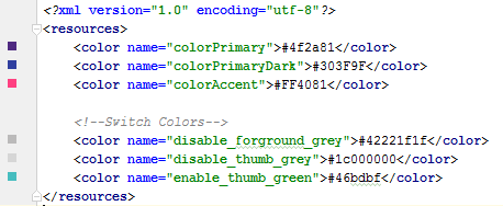
 <style name="SCBSwitch" parent="Theme.AppCompat.Light">
        <!-- active thumb & track color (30% transparency) -->
        <item name="colorControlActivated">#46bdbf</item>

        <!-- inactive thumb color -->
        <item name="colorSwitchThumbNormal">#f1f1f1
        </item>

        <!-- inactive track color (30% transparency) -->
        <item name="android:colorForeground">#42221f1f
        </item>
    </style>
色彩
布局
<android.support.v7.widget.SwitchCompat
    android:layout_width="wrap_content"
    android:layout_height="wrap_content"
    android:layout_alignParentRight="true"
    android:checked="false"
    android:theme="@style/SCBSwitch" />
结果
查看启用和禁用开关的颜色变化
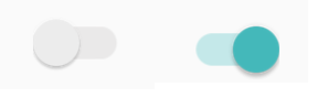
SwitchCompat;)
这对我有用(需要Android 4.1):
Switch switchInput = new Switch(this);
int colorOn = 0xFF323E46;
int colorOff = 0xFF666666;
int colorDisabled = 0xFF333333;
StateListDrawable thumbStates = new StateListDrawable();
thumbStates.addState(new int[]{android.R.attr.state_checked}, new ColorDrawable(colorOn));
thumbStates.addState(new int[]{-android.R.attr.state_enabled}, new ColorDrawable(colorDisabled));
thumbStates.addState(new int[]{}, new ColorDrawable(colorOff)); // this one has to come last
switchInput.setThumbDrawable(thumbStates);
请注意,“默认”状态需要最后添加,如下所示。
我看到的唯一问题是,开关的“拇指”现在看起来大于开关的背景或“轨道”。我认为这是因为我仍在使用默认的轨迹图像,它周围有一些空白空间。但是,当我尝试使用此技术自定义轨道图像时,我的开关似乎具有1像素的高度,只出现了少量开/关文本。一定有解决方案,但是我还没有找到……
Android 5更新
在Android 5中,上面的代码使开关完全消失。我们应该能够使用新的 setButtonTintList方法,但是对于开关来说,这似乎被忽略了。但这有效:
ColorStateList buttonStates = new ColorStateList(
        new int[][]{
                new int[]{-android.R.attr.state_enabled},
                new int[]{android.R.attr.state_checked},
                new int[]{}
        },
        new int[]{
                Color.BLUE,
                Color.RED,
                Color.GREEN
        }
);
switchInput.getThumbDrawable().setTintList(buttonStates);
switchInput.getTrackDrawable().setTintList(buttonStates);
Android 6-7更新
正如Cheruby在评论中指出的那样,我们可以使用新的setThumbTintList和对我有用的产品。我们也可以使用setTrackTintList,但是将颜色混合使用,结果比深色主题中的预期要暗,比浅色主题中的预期要亮,有时甚至不可见。在Android 7中,我可以通过覆盖跟踪色调模式来最小化该更改,但是在Android 6中,我无法获得令人满意的结果。您可能需要定义其他颜色来补偿混合。(您是否曾经有过Google不想让我们自定义应用外观的感觉?)
ColorStateList thumbStates = new ColorStateList(
        new int[][]{
                new int[]{-android.R.attr.state_enabled},
                new int[]{android.R.attr.state_checked},
                new int[]{}
        },
        new int[]{
                Color.BLUE,
                Color.RED,
                Color.GREEN
        }
);
switchInput.setThumbTintList(thumbStates);
if (Build.VERSION.SDK_INT >= 24) {
    ColorStateList trackStates = new ColorStateList(
            new int[][]{
                    new int[]{-android.R.attr.state_enabled},
                    new int[]{}
            },
            new int[]{
                    Color.GRAY,
                    Color.LTGRAY
            }
    );
    switchInput.setTrackTintList(trackStates);
    switchInput.setTrackTintMode(PorterDuff.Mode.OVERLAY);
}switchInput.setThumbTintList(buttonStates); 适用于牛轧糖。API 21-22:按照@Alexey的建议使用DrawableCompat。那个switchInput.setButtonTintList(buttonStates);对我没有用,它没有为我的Switch着色状态。低于21的API: switchInput.getThumbDrawable().setColorFilter(someColor, PorterDuff.Mode.SrcIn); 这些对我有用。我也使用Xamarin,因此,如果您使用Xamarin.Forms,请在Android渲染器中将其转换为C#。
要在不使用style.xml或Java代码的情况下更改Switch样式,可以将switch自定义为布局XML:
<Switch
        android:id="@+id/checkbox"
        android:layout_width="wrap_content"
        android:thumbTint="@color/blue"
        android:trackTint="@color/white"
        android:checked="true"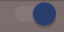
android:layout_height="wrap_content" />它是android:thumbTint和android:trackTint的属性,可让您自定义颜色
这是此XML的视觉结果:
app:thumbTint,而不是android:thumbTint和变化switch与SwitchCompat
创建一个自定义的Switch并覆盖setChecked以更改颜色:
  public class SwitchPlus extends Switch {

    public SwitchPlus(Context context) {
        super(context);
    }

    public SwitchPlus(Context context, AttributeSet attrs) {
        super(context, attrs);
    }

    public SwitchPlus(Context context, AttributeSet attrs, int defStyleAttr) {
        super(context, attrs, defStyleAttr);
    }

    @Override
    public void setChecked(boolean checked) {
        super.setChecked(checked);
        changeColor(checked);
    }

    private void changeColor(boolean isChecked) {
        if (Build.VERSION.SDK_INT >= Build.VERSION_CODES.JELLY_BEAN) {
            int thumbColor;
            int trackColor;

            if(isChecked) {
                thumbColor = Color.argb(255, 253, 153, 0);
                trackColor = thumbColor;
            } else {
                thumbColor = Color.argb(255, 236, 236, 236);
                trackColor = Color.argb(255, 0, 0, 0);
            }

            try {
                getThumbDrawable().setColorFilter(thumbColor, PorterDuff.Mode.MULTIPLY);
                getTrackDrawable().setColorFilter(trackColor, PorterDuff.Mode.MULTIPLY);
            }
            catch (NullPointerException e) {
                e.printStackTrace();
            }
        }
    }
}虽然SubChord的回答是正确的,但并不能真正回答如何设置“ on”颜色而不影响其他小部件的问题。为此,请ThemeOverlay在styles.xml中使用:
<style name="ToggleSwitchTheme" parent="ThemeOverlay.AppCompat.Light">
    <item name="colorAccent">@color/green_bright</item>
</style>
并在您的开关中引用它:
<android.support.v7.widget.SwitchCompat
  android:theme="@style/ToggleSwitchTheme" ... />
这样做只会影响您要应用它的视图的颜色。
<androidx.appcompat.widget.SwitchCompat
                android:layout_width="wrap_content"
                android:layout_height="wrap_content"
                app:thumbTint="@color/white"
                app:trackTint="@drawable/checker_track"/>
在checker_track.xml内部:
<selector xmlns:android="http://schemas.android.com/apk/res/android">
    <item android:color="@color/lightish_blue" android:state_checked="true"/>
    <item android:color="@color/hint" android:state_checked="false"/>
</selector>thumbTint仅适用于Android API 21及更高版本。我要如何在Android 21以下更改颜色?
当开关状态更改时,我通过更新滤色器解决了该问题。
public void bind(DetailItem item) {
    switchColor(item.toggle);
    listSwitch.setOnCheckedChangeListener(new CompoundButton.OnCheckedChangeListener() {
        @Override
        public void onCheckedChanged(CompoundButton compoundButton, boolean b) {
                switchColor(b);
        }
    });
}

private void switchColor(boolean checked) {
    if (Build.VERSION.SDK_INT >= Build.VERSION_CODES.JELLY_BEAN) {
        listSwitch.getThumbDrawable().setColorFilter(checked ? Color.BLACK : Color.WHITE, PorterDuff.Mode.MULTIPLY);
        listSwitch.getTrackDrawable().setColorFilter(!checked ? Color.BLACK : Color.WHITE, PorterDuff.Mode.MULTIPLY);
    }
}使可绘制“ newthumb.xml”
<selector xmlns:android="http://schemas.android.com/apk/res/android">
    <item android:color="@color/Green" android:state_checked="true"/>
    <item android:color="@color/Red" android:state_checked="false"/>
</selector>
并使可绘制的“ newtrack.xml”
<selector xmlns:android="http://schemas.android.com/apk/res/android">
        <item android:color="@color/black" android:state_checked="true"/>
        <item android:color="@color/white" android:state_checked="false"/>
    </selector>
并将其添加到Switch中:
<Switch
        android:trackTint="@drawable/newtrack"
        android:thumbTint="@drawable/newthumb"
/>trackTint或建议@drawable资源thumbTint。一个人需要手动编写它,然后它才能工作。
在Android Lollipop及更高版本中,以您的主题样式定义它:
<style name="BaseAppTheme" parent="Material.Theme">
    ...
    <item name="android:colorControlActivated">@color/color_switch</item>
</style>创建自己的9色块图像并将其设置为切换按钮的背景。
arlomedia建议的解决方案对我有用。关于他的多余空间问题,我解决了删除交换机的所有填充的问题。
编辑
根据要求,这里是我所拥有的。
在布局文件中,我的开关位于线性布局内,并且位于TextView之后。
<LinearLayout
        android:id="@+id/myLinearLayout"
        android:orientation="horizontal"
        android:layout_width="match_parent"
        android:layout_height="50dp"
        android:layout_alignParentTop="true"
        android:layout_centerHorizontal="true"
        android:layout_gravity="center_horizontal|center"
        android:gravity="right"
        android:padding="10dp"
        android:layout_marginTop="0dp"
        android:background="@drawable/bkg_myLinearLayout"
        android:layout_marginBottom="0dp">
        <TextView
            android:id="@+id/myTextForTheSwitch"
            android:layout_height="wrap_content"
            android:text="@string/TextForTheSwitch"
            android:textSize="18sp"
            android:layout_centerHorizontal="true"
            android:layout_gravity="center_horizontal|center"
            android:gravity="right"
            android:layout_width="wrap_content"
            android:paddingRight="20dp"
            android:textColor="@color/text_white" />
        <Switch
            android:id="@+id/mySwitch"
            android:layout_width="wrap_content"
            android:layout_height="wrap_content"
            android:textOn="@string/On"
            android:textOff="@string/Off"
            android:layout_centerHorizontal="true"
            android:layout_gravity="center_horizontal"
            android:layout_toRightOf="@id/myTextForTheSwitch"
            android:layout_alignBaseline="@id/myTextForTheSwitch"
            android:gravity="right" />
    </LinearLayout>
由于我正在使用Xamarin / Monodroid(最低Android 4.1),因此我的代码是:
Android.Graphics.Color colorOn = Android.Graphics.Color.Green;
Android.Graphics.Color colorOff = Android.Graphics.Color.Gray;
Android.Graphics.Color colorDisabled = Android.Graphics.Color.Green;

StateListDrawable drawable = new StateListDrawable();
drawable.AddState(new int[] { Android.Resource.Attribute.StateChecked }, new ColorDrawable(colorOn));
drawable.AddState(new int[] { -Android.Resource.Attribute.StateEnabled }, new ColorDrawable(colorDisabled));
drawable.AddState(new int[] { }, new ColorDrawable(colorOff));

swtch_EnableEdit.ThumbDrawable = drawable;
swtch_EnableEdit以前是这样定义的(Xamarin):
Switch swtch_EnableEdit = view.FindViewById<Switch>(Resource.Id.mySwitch);我没有设置所有填充,也没有调用.setPadding(0,0,0,0)。
您可以为自定义样式的开关小部件创建自定义样式,在为其自定义样式时使用默认颜色
<style name="switchStyle" parent="Theme.AppCompat.Light">
    <item name="colorPrimary">@color/colorPrimary</item>
    <item name="colorPrimaryDark">@color/colorPrimaryDark</item>
    <item name="colorAccent">@color/colorPrimary</item>    <!-- set your color -->
</style> 您可以尝试使用该lib库,轻松更改开关按钮的颜色。
https://github.com/kyleduo/SwitchButton
尝试在此处找出正确的答案:TextView背景色的选择器。用两个词用XML创建带有颜色的Shape,然后在选择器中将其分配为状态“ checked”。
最简单的方法是定义轨道色调,并将色调模式设置为src_over以删除30%的透明度。
android:trackTint="@drawable/toggle_style"
android:trackTintMode="src_over"
toggle_style.xml
<selector xmlns:android="http://schemas.android.com/apk/res/android">
    <item android:color="@color/informationDefault"
        android:state_checked="true"
        />
    <item android:color="@color/textDisabled" android:state_checked="false"/>
</selector>作为现有答案的补充:您可以使用以下选项中的选择器来自定义拇指和轨迹 res/color文件夹中的,例如:
switch_track_selector
<?xml version="1.0" encoding="utf-8"?>
<selector
    xmlns:android="http://schemas.android.com/apk/res/android">
    <item android:color="@color/lightBlue"
        android:state_checked="true" />
    <item android:color="@color/grey"/>
</selector>
switch_thumb_selector
<selector
    xmlns:android="http://schemas.android.com/apk/res/android">
    <item android:color="@color/darkBlue"
        android:state_checked="true" />
    <item android:color="@color/white"/>
</selector>
使用以下选择器来自定义轨迹和拇指色调:
<androidx.appcompat.widget.SwitchCompat
    android:layout_width="wrap_content"
    android:layout_height="wrap_content"
    app:trackTint="@color/switch_track_selector"
    app:thumbTint="@color/switch_thumb_selector"/>
请记住,如果对这些属性使用standart Switch和android名称空间,则它仅适用于API 23及更高版本,因此请SwitchCompat与app名称空间配合使用xmlns:app="http://schemas.android.com/apk/res-auto"作为通用的解决方案。
结果:

在xml中,您可以将颜色更改为:
 <androidx.appcompat.widget.SwitchCompat
    android:id="@+id/notificationSwitch"
    android:layout_width="match_parent"
    android:layout_height="wrap_content"
    android:checked="true"
    app:thumbTint="@color/darkBlue"
    app:trackTint="@color/colorGrey"/>
您可以动态更改为:
Switch.thumbDrawable.setColorFilter(ContextCompat.getColor(requireActivity(), R.color.darkBlue), PorterDuff.Mode.MULTIPLY)
Switch此自定义选择器。