我知道用CSS实际修改图像是不可能的,这就是为什么我将crop用引号引起来。
我想做的是拍摄矩形图像,然后使用CSS使它们显示为正方形,而不会扭曲图像。
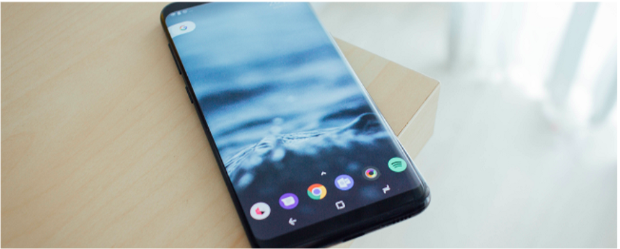
我基本上想转这个:
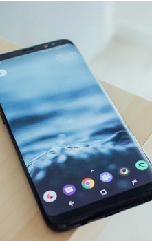
变成这个:
4
这些图像是div的背景图像还是对于它们来说,将它们保留在<img>标签中对SEO很重要?
—
2013年
你有尝试过吗?对于CSS3
—
法布里西奥磨砂
background-position或带有overflow:hidden和且具有相对位置的图像的旧包装div,这相当简单。
它们肯定是背景图片
—
novicePrgrmr
看我的回答,我认为这是您总体上最好的选择。它避免了定位元素。
—
迈克尔