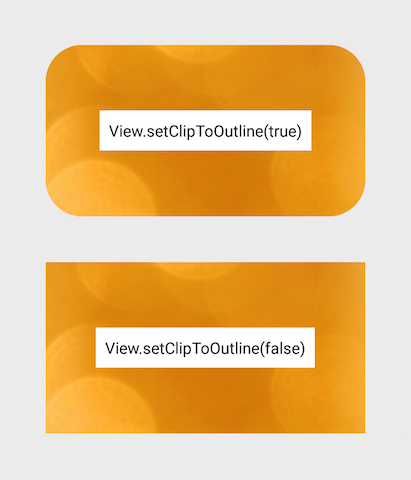
如何使圆角的布局..?


516

如何制作带有圆角的布局?我想对我的圆角应用圆角LinearLayout


创建一个带有角的可绘制形状,然后设置为背景..问题出在哪里?
stinepike

您只需要将舍入的图像设置为布局的背景,否则就可以像第一条评论中所述那样成形
SilentKiller

您只需要在SO上搜索...,您将发现大量的提升器..
Pankaj Kumar

角落对我来说很模糊
filthy_wizard

Answers:


1028

1:在可绘制对象中定义layout_bg.xml

<?xml version="1.0" encoding="UTF-8"?>
<shape xmlns:android="http://schemas.android.com/apk/res/android">
    <solid android:color="#FFFFFF"/>
    <stroke android:width="3dp" android:color="#B1BCBE" />
    <corners android:radius="10dp"/>
    <padding android:left="0dp" android:top="0dp" android:right="0dp" android:bottom="0dp" />
</shape>

2:layout_bg.xml作为背景添加到布局

android:background="@drawable/layout_bg"

194
这行不通。按照您的设置,它是背景,因此内容将覆盖圆角,如果您在圆角上绘制内容,则不会看到圆角。
Android开发人员

22
几乎总是,我的内容永远不会出现。这很完美。
David JY Tang

2
您如何避免该错误Element shape doesn't have the required attribute android:layout_height
洛伦兹

2
Element shape doesn't have the required attribute android:layout_height出现错误的原因是因为layout_bg.xml不在drawable文件夹内。
Atul 2013年

8
@ nhouser9:实际上,它更像是“它可以工作,但是要警告您的前景/内容可能在角落”。因此,根据使用情况,它可能会100%工作。我很高兴答案没有太多的否决票,因为它很有用,我很高兴评论有一百个赞成票,因为很容易发现这种解决方案的局限性。两全其美。
Benoit Duffez '18年

124

对于API 21+,请使用剪辑视图

圆形的轮廓裁剪已添加到ViewAPI 21中的类。有关更多信息,请参阅此培训文档或本参考

这种内置功能使圆角非常容易实现。它适用于任何视图或布局,并支持适当的裁剪。

这是做什么:

  • 创建一个可绘制的圆形并将其设置为视图的背景: android:background="@drawable/round_outline"
  • 根据文档,那么您所要做的就是: android:clipToOutline="true"

不幸的是,似乎存在一个错误,并且当前无法识别此XML属性。幸运的是,我们可以在Java中设置裁剪:

  • 在您的活动或片段中: View.setClipToOutline(true)

看起来像什么:

在此处输入图片说明

关于ImageViews的特别说明

setClipToOutline()仅在将视图的背景设置为可绘制形状时起作用。如果存在此背景形状,则“视图”会将背景的轮廓视为边框,以进行裁剪和阴影处理。

这意味着,如果您想使用来在ImageView上圆角化setClipToOutline(),则您的图像必须来自android:src而不是android:background(因为背景用于圆形)。如果必须使用背景而不是src来设置图像,则可以使用以下嵌套视图解决方法:

  • 创建一个外部布局,其背景设置为可绘制的形状
  • 将该布局环绕在ImageView周围(不填充)
  • 现在,ImageView(包括布局中的任何其他内容)将被裁剪为外部布局的圆形形状。

9
不工作的API小于21等不及,直到我只能支持API 21
startoftext

使用'setClipToOutline'可以工作,但是它也可以删除框架本身(用于背景的可绘制对象)。有什么办法可以避免这种情况?
Android开发人员

您是否阅读了有关使用src=@drawable...代替的注释background=@drawable?您可以执行此操作,也可以将ImageView嵌套在保存形状轮廓的容器视图中。
hungryghost

9
每个人都对该错误进行评论-它已经存在了将近三年,并且没有迹象表明这个十年中的任何时间都将得到修复。让我们施加一些压力。
Josh Hansen

如何解决这个错误不会被未定
P·弗斯特

74

这是XML文件的副本,用于创建带有白色背景,黑色边框和圆角的可绘制对象:

 <?xml version="1.0" encoding="UTF-8"?> 
    <shape xmlns:android="http://schemas.android.com/apk/res/android"> 
        <solid android:color="#ffffffff"/>    

        <stroke android:width="3dp"
                android:color="#ff000000"
                />

        <padding android:left="1dp"
                 android:top="1dp"
                 android:right="1dp"
                 android:bottom="1dp"
                 /> 

        <corners android:bottomRightRadius="7dp" android:bottomLeftRadius="7dp" 
         android:topLeftRadius="7dp" android:topRightRadius="7dp"/> 
    </shape>

将其另存为xml文件到drawable目录中,使用它的方式就像使用其资源名称(R.drawable.your_xml_name)来使用任何可绘制背景(图标或资源文件)一样


5
喜欢圆角的可能性
水星

1
这个答案几乎就是上面的答案。唯一真正的改变是每个角半径的定义,并且给每个角相同的值,我会改为将其写在一行中:<corners android:radius="7dp" />:)
ZooMagic

这对我来说是最好的答案,因为它涵盖了对特定角进行倒圆的操作...好工作,可以100%工作
Mahmoud Ayman

ImageView的角未圆化(修剪),我该如何解决?
普里莫兹Kralj

仍在2019年9月正常工作。
Nikolas Rieble

36

在Android v7支持库中使用CardView。尽管有点沉重,但它可以解决所有问题,而且很容易。与set drawable background方法不同,它可以成功裁剪子视图。

<?xml version="1.0" encoding="utf-8"?>
<android.support.v7.widget.CardView xmlns:android="http://schemas.android.com/apk/res/android"
    xmlns:card_view="http://schemas.android.com/apk/res-auto"
    xmlns:tools="http://schemas.android.com/tools"
    android:layout_width="match_parent"
    android:layout_height="wrap_content"
    card_view:cardBackgroundColor="@android:color/transparent"
    card_view:cardCornerRadius="5dp"
    card_view:cardElevation="0dp"
    card_view:contentPadding="0dp">
    <YOUR_LINEARLAYOUT_HERE>
</android.support.v7.widget.CardView>

2
对于每个能够“负担”得起的人来说,要比其他任何事情都要好得多。令我感到困惑的是,这种基本的东西不是标准Android视图的一部分,而是几乎所有Web浏览器的CSS
Ben Philipp

29

我这样做:

检查截图:

相对布局背景

创建绘制的名为文件custom_rectangle.xml绘制文件夹:

<?xml version="1.0" encoding="utf-8"?>
<shape xmlns:android="http://schemas.android.com/apk/res/android"
    android:shape="rectangle" >

    <solid android:color="@android:color/white" />

    <corners android:radius="10dip" />

    <stroke
        android:width="1dp"
        android:color="@android:color/white" />

</shape>

现在在View上应用Rectangle背景

mView.setBackground(R.drawlable.custom_rectangle);

完成


14
这行不通。按照您的设置,它是背景,因此内容将覆盖圆角,如果您在圆角上绘制内容,则不会看到圆角。
Android开发人员

25

我认为一种更好的方法是合并两件事:

  1. 使布局的位图,如图所示这里

  2. 做一个圆形绘制从位图,如图所示这里

  3. 在imageView上设置可绘制对象。

这将处理其他解决方案无法解决的情况,例如内容带有角点。

我认为它也对GPU更友好,因为它显示的是单层而不是2层。

唯一更好的方法是创建完全自定义的视图,但这需要很多代码,并且可能会花费很多时间。我认为我在这里提出的建议是两全其美的。

这是如何完成的代码片段:

RoundedCornersDrawable.java

/**
 * shows a bitmap as if it had rounded corners. based on :
 * http://rahulswackyworld.blogspot.co.il/2013/04/android-drawables-with-rounded_7.html
 * easy alternative from support library: RoundedBitmapDrawableFactory.create( ...) ; 
 */
public class RoundedCornersDrawable extends BitmapDrawable {

    private final BitmapShader bitmapShader;
    private final Paint p;
    private final RectF rect;
    private final float borderRadius;

    public RoundedCornersDrawable(final Resources resources, final Bitmap bitmap, final float borderRadius) {
        super(resources, bitmap);
        bitmapShader = new BitmapShader(getBitmap(), Shader.TileMode.CLAMP, Shader.TileMode.CLAMP);
        final Bitmap b = getBitmap();
        p = getPaint();
        p.setAntiAlias(true);
        p.setShader(bitmapShader);
        final int w = b.getWidth(), h = b.getHeight();
        rect = new RectF(0, 0, w, h);
        this.borderRadius = borderRadius < 0 ? 0.15f * Math.min(w, h) : borderRadius;
    }

    @Override
    public void draw(final Canvas canvas) {
        canvas.drawRoundRect(rect, borderRadius, borderRadius, p);
    }
}

CustomView.java

public class CustomView extends ImageView {
    private View mMainContainer;
    private boolean mIsDirty=false;

    // TODO for each change of views/content, set mIsDirty to true and call invalidate

    @Override
    protected void onDraw(final Canvas canvas) {
        if (mIsDirty) {
            mIsDirty = false;
            drawContent();
            return;
        }
        super.onDraw(canvas);
    }

    /**
     * draws the view's content to a bitmap. code based on :
     * http://nadavfima.com/android-snippet-inflate-a-layout-draw-to-a-bitmap/
     */
    public static Bitmap drawToBitmap(final View viewToDrawFrom, final int width, final int height) {
        // Create a new bitmap and a new canvas using that bitmap
        final Bitmap bmp = Bitmap.createBitmap(width, height, Bitmap.Config.ARGB_8888);
        final Canvas canvas = new Canvas(bmp);
        viewToDrawFrom.setDrawingCacheEnabled(true);
        // Supply measurements
        viewToDrawFrom.measure(MeasureSpec.makeMeasureSpec(canvas.getWidth(), MeasureSpec.EXACTLY),
                MeasureSpec.makeMeasureSpec(canvas.getHeight(), MeasureSpec.EXACTLY));
        // Apply the measures so the layout would resize before drawing.
        viewToDrawFrom.layout(0, 0, viewToDrawFrom.getMeasuredWidth(), viewToDrawFrom.getMeasuredHeight());
        // and now the bmp object will actually contain the requested layout
        canvas.drawBitmap(viewToDrawFrom.getDrawingCache(), 0, 0, new Paint());
        return bmp;
    }

    private void drawContent() {
        if (getMeasuredWidth() <= 0 || getMeasuredHeight() <= 0)
            return;
        final Bitmap bitmap = drawToBitmap(mMainContainer, getMeasuredWidth(), getMeasuredHeight());
        final RoundedCornersDrawable drawable = new RoundedCornersDrawable(getResources(), bitmap, 15);
        setImageDrawable(drawable);
    }

}

编辑:基于“ RoundKornersLayouts”库找到了一个不错的选择。有一个要用于所有要扩展的布局类的类,将其四舍五入:

//based on https://github.com/JcMinarro/RoundKornerLayouts
class CanvasRounder(cornerRadius: Float, cornerStrokeColor: Int = 0, cornerStrokeWidth: Float = 0F) {
    private val path = android.graphics.Path()
    private lateinit var rectF: RectF
    private var strokePaint: Paint?
    var cornerRadius: Float = cornerRadius
        set(value) {
            field = value
            resetPath()
        }

    init {
        if (cornerStrokeWidth <= 0)
            strokePaint = null
        else {
            strokePaint = Paint()
            strokePaint!!.style = Paint.Style.STROKE
            strokePaint!!.isAntiAlias = true
            strokePaint!!.color = cornerStrokeColor
            strokePaint!!.strokeWidth = cornerStrokeWidth
        }
    }

    fun round(canvas: Canvas, drawFunction: (Canvas) -> Unit) {
        val save = canvas.save()
        canvas.clipPath(path)
        drawFunction(canvas)
        if (strokePaint != null)
            canvas.drawRoundRect(rectF, cornerRadius, cornerRadius, strokePaint)
        canvas.restoreToCount(save)
    }

    fun updateSize(currentWidth: Int, currentHeight: Int) {
        rectF = android.graphics.RectF(0f, 0f, currentWidth.toFloat(), currentHeight.toFloat())
        resetPath()
    }

    private fun resetPath() {
        path.reset()
        path.addRoundRect(rectF, cornerRadius, cornerRadius, Path.Direction.CW)
        path.close()
    }

}

然后,在每个自定义的布局类中,添加与此类似的代码:

class RoundedConstraintLayout : ConstraintLayout {
    private lateinit var canvasRounder: CanvasRounder

    constructor(context: Context) : super(context) {
        init(context, null, 0)
    }

    constructor(context: Context, attrs: AttributeSet) : super(context, attrs) {
        init(context, attrs, 0)
    }

    constructor(context: Context, attrs: AttributeSet, defStyle: Int) : super(context, attrs, defStyle) {
        init(context, attrs, defStyle)
    }

    private fun init(context: Context, attrs: AttributeSet?, defStyle: Int) {
        val array = context.obtainStyledAttributes(attrs, R.styleable.RoundedCornersView, 0, 0)
        val cornerRadius = array.getDimension(R.styleable.RoundedCornersView_corner_radius, 0f)
        val cornerStrokeColor = array.getColor(R.styleable.RoundedCornersView_corner_stroke_color, 0)
        val cornerStrokeWidth = array.getDimension(R.styleable.RoundedCornersView_corner_stroke_width, 0f)
        array.recycle()
        canvasRounder = CanvasRounder(cornerRadius,cornerStrokeColor,cornerStrokeWidth)
        if (Build.VERSION.SDK_INT < Build.VERSION_CODES.JELLY_BEAN_MR2) {
            setLayerType(FrameLayout.LAYER_TYPE_SOFTWARE, null)
        }
    }

    override fun onSizeChanged(currentWidth: Int, currentHeight: Int, oldWidth: Int, oldheight: Int) {
        super.onSizeChanged(currentWidth, currentHeight, oldWidth, oldheight)
        canvasRounder.updateSize(currentWidth, currentHeight)
    }

    override fun draw(canvas: Canvas) = canvasRounder.round(canvas) { super.draw(canvas) }

    override fun dispatchDraw(canvas: Canvas) = canvasRounder.round(canvas) { super.dispatchDraw(canvas) }

}

如果希望支持属性,请按照库中的说明使用:

<resources>
  <declare-styleable name="RoundedCornersView">
      <attr name="corner_radius" format="dimension"/>
      <attr name="corner_stroke_width" format="dimension"/>
      <attr name="corner_stroke_color" format="color"/>
  </declare-styleable>
</resources>

另一种替代方法(对于大多数使用而言可能更简单):使用MaterialCardView。它允许自定义圆角,笔触颜色和宽度以及高程。

例:

<FrameLayout
    xmlns:android="http://schemas.android.com/apk/res/android" xmlns:app="http://schemas.android.com/apk/res-auto"
    xmlns:tools="http://schemas.android.com/tools" android:layout_width="match_parent"
    android:layout_height="match_parent" android:clipChildren="false" android:clipToPadding="false"
    tools:context=".MainActivity">

    <com.google.android.material.card.MaterialCardView
        android:layout_width="100dp" android:layout_height="100dp" android:layout_gravity="center"
        app:cardCornerRadius="8dp" app:cardElevation="8dp" app:strokeColor="#f00" app:strokeWidth="2dp">

        <ImageView
            android:layout_width="match_parent" android:layout_height="match_parent" android:background="#0f0"/>

    </com.google.android.material.card.MaterialCardView>

</FrameLayout>

结果:

在此处输入图片说明

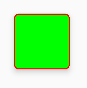
请注意,如果使用笔划,则在笔划的边缘会出现细微的瑕疵(在此处留下内容的一些像素)。如果放大,您会注意到它。我在这里报告了此问题。

编辑:似乎是固定的,但不是在IDE上。在这里报道。


感谢组装这真棒答案,它让我在正确的方向前进,但我可以利用一些帮助一个非常相关的问题在这里stackoverflow.com/questions/25877515/...
威尔汤姆森

这会产生错误,因为ImageView中没有可用的默认构造函数。
2014年

这应该被接受。您没有找到平凡的逻辑,而是找到了一个很棒的解决方案。这也解决了您在其他答案的注释中提到的问题。感谢您的努力,也许您可​​以纠正一个功能齐全的类,并通过github进行共享。我认为这可能会帮助太多人。
2015年

@Senhor你认为我应该吗?我会考虑的。现在,您可以在此处查看我创建的其他存储库:github.com/AndroidDeveloperLB?tab=repositories
android开发人员

作为很大一部分,您可以尝试一下。顺便说一句autofittextview看起来真的很酷。
2015年

10

尝试这个...

1.创建可绘制的xml(custom_layout.xml):

<?xml version="1.0" encoding="utf-8"?>
<shape xmlns:android="http://schemas.android.com/apk/res/android" >

<solid android:color="#FFFFFF" />

<stroke
    android:width="2dp"
    android:color="#FF785C" />

<corners android:radius="10dp" />

</shape>

2.添加您的视图背景

android:background="@drawable/custom_layout"

就像我在上面写过类似的解决方案:这是行不通的。按照您的设置,它是背景,因此内容将覆盖圆角,如果您在圆角上绘制内容,则不会看到圆角。
Android开发人员

9

如果您想使布局四舍五入,则最好使用CardView,它提供了许多功能来使设计美观。

<android.support.v7.widget.CardView
    android:layout_width="match_parent"
    android:layout_height="wrap_content"
    card_view:cardCornerRadius="5dp">
      <LinearLayout
            android:layout_width="match_parent"
            android:layout_height="wrap_content">

            <TextView
                android:layout_width="0dp"
                android:layout_height="wrap_content"
                android:layout_weight=".3"
                android:text="@string/quote_code"
                android:textColor="@color/white"
                android:textSize="@dimen/text_head_size" />
      </LinearLayout>
</android.support.v7.widget.CardView>

使用此card_view:cardCornerRadius =“ 5dp”,您可以更改半径。


5

最好和最简单的方法是在布局中使用可绘制的card_background。这也遵循Google的材料设计指南。只需在您的LinearLayout中添加以下内容即可:

android:background="@drawable/card_background"

将此添加到您的可绘制目录,并将其命名为card_background.xml

<?xml version="1.0" encoding="utf-8"?>
<layer-list xmlns:android="http://schemas.android.com/apk/res/android">

    <item>
        <shape android:shape="rectangle">
            <solid android:color="#BDBDBD"/>
            <corners android:radius="5dp"/>
        </shape>
    </item>

    <item
        android:left="0dp"
        android:right="0dp"
        android:top="0dp"
        android:bottom="2dp">
        <shape android:shape="rectangle">
            <solid android:color="#ffffff"/>
            <corners android:radius="5dp"/>
        </shape>
    </item>
</layer-list>

5

使用CardView可以获取任何布局的圆角边缘。使用card_view:cardCornerRadius =“ 5dp”进行cardview可获得圆形的布局边缘。

<LinearLayout xmlns:android="http://schemas.android.com/apk/res/android"
  xmlns:card_view="http://schemas.android.com/apk/res-auto"
  android:layout_width="match_parent"
  android:layout_height="match_parent"
  android:orientation="vertical">

      <android.support.v7.widget.CardView
        android:layout_width="match_parent"
        android:layout_height="wrap_content"
        card_view:cardCornerRadius="5dp">
          <LinearLayout
                android:layout_width="match_parent"
                android:layout_height="wrap_content"
                android:orientation="horizontal"
                android:padding="15dp"
                android:weightSum="1">

                <TextView
                    android:layout_width="0dp"
                    android:layout_height="wrap_content"
                    android:layout_weight=".3"
                    android:text="@string/quote_code"
                    android:textColor="@color/white"
                    android:textSize="@dimen/text_head_size" />

                <TextView
                    android:layout_width="0dp"
                    android:layout_height="wrap_content"
                    android:layout_weight=".7"
                    android:text="@string/quote_details"
                    android:textColor="@color/white"
                    android:textSize="@dimen/text_head_size" />
            </LinearLayout>
       </android.support.v7.widget.CardView>
   </LinearLayout>

Cardsupport.v7库中的CardView,可以从API7或更高版本使用。
Nikita G.

5

更好的方法是:

background_activity.xml

<?xml version="1.0" encoding="UTF-8"?>
<layer-list xmlns:android="http://schemas.android.com/apk/res/android">
    <item android:gravity="fill">
        <color android:color="@color/black"/>
    </item>
    <item>
        <shape android:gravity="fill">
            <solid android:color="@color/white"/>
            <corners android:radius="10dip"/>
            <padding android:left="0dip" android:top="0dip" android:right="0dip" android:bottom="0dip" />
        </shape>
    </item>
</layer-list>

这也将在API 21下工作,并为您提供以下信息:

结果


如果您愿意付出更多的努力来更好地控制,请使用android.support.v7.widget.CardViewcardCornerRadius属性(并将elevation属性设置为0dp,以使用cardView消除所有伴随的阴影)。此外,这将在API级别低至15时起作用。


如果内容适合背景,它将覆盖它。它并不会真正固定到您设置的形状。
Android开发人员

你是说另一种观点?您能否更新代码以显示您的意思?这个想法是圆角不会放置黑色区域。拐角处应该有透明的颜色。
Android开发人员

哦,我现在收到你的问题。我想为此,您可以在内容上使用少量固定利润
Abdul Wasae

但是,由于固定边距是矩形,而不是根据您选择的形状,因此内容不会被切成您选择的形状。
Android开发人员

5

通过编程设置拐角半径的功能

static void setCornerRadius(GradientDrawable drawable, float topLeft,
        float topRight, float bottomRight, float bottomLeft) {
    drawable.setCornerRadii(new float[] { topLeft, topLeft, topRight, topRight,
            bottomRight, bottomRight, bottomLeft, bottomLeft });
}

static void setCornerRadius(GradientDrawable drawable, float radius) {
    drawable.setCornerRadius(radius);
}

使用

GradientDrawable gradientDrawable = new GradientDrawable();
gradientDrawable.setColor(Color.GREEN);
setCornerRadius(gradientDrawable, 20f);
//or setCornerRadius(gradientDrawable, 20f, 40f, 60f, 80f); 

view.setBackground(gradientDrawable);

4
<?xml version="1.0" encoding="UTF-8"?>
<shape xmlns:android="http://schemas.android.com/apk/res/android">
    <solid android:color="#FFFFFF"/>
    <stroke android:width="3dip" android:color="#B1BCBE" />
    <corners android:radius="10dip"/>
    <padding android:left="3dip" android:top="3dip" android:right="3dip" android:bottom="3dip" />
</shape>

@David,只需将填充值与笔划的值相同,则无论图像大小如何,边框都可见


3

我已经在@gauravsapiens答案中加了我的注释,以使您对参数将产生的影响有一个合理的了解。

<?xml version="1.0" encoding="utf-8"?>
<shape xmlns:android="http://schemas.android.com/apk/res/android">

    <!-- Background color -->
    <solid android:color="@color/white" />

    <!-- Stroke around the background, width and color -->
    <stroke android:width="4dp" android:color="@color/drop_shadow"/>

    <!-- The corners of the shape -->
    <corners android:radius="4dp"/>

    <!-- Padding for the background, e.g the Text inside a TextView will be 
    located differently -->
    <padding android:left="10dp" android:right="10dp" 
             android:bottom="10dp" android:top="10dp" />

</shape>

如果您只是想创建一个圆角形状,则删除填充和笔触即可。如果同时删除了实体,则实际上将在透明背景上创建圆角。

为了变得懒惰,我在下面创建了一个形状,该形状只是带有圆角的纯白色背景-尽情享受吧!:)

<?xml version="1.0" encoding="utf-8"?>
<shape xmlns:android="http://schemas.android.com/apk/res/android">

    <!-- Background color -->
    <solid android:color="@color/white" />

    <!-- The corners of the shape -->
    <corners android:radius="4dp"/>

</shape>

3

在drawable中创建xml, layout_background.xml

 <?xml version="1.0" encoding="utf-8"?>
    <shape xmlns:android="http://schemas.android.com/apk/res/android" >
      <solid android:color="@color/your_colour" />
      <stroke
            android:width="2dp"
            android:color="@color/your_colour" />
      <corners android:radius="10dp" />      
    </shape>
 <--width, color, radius should be as per your requirement-->

然后在您的 layout.xml

 android:background="@drawable/layout_background"

2

随着材料零件库,你可以使用MaterialShapeDrawable绘制自定义形状

只需将LinearLayout放入您的xml布局中即可:

<LinearLayout
    android:id="@+id/linear_rounded"
    android:layout_width="match_parent"
    android:layout_height="wrap_content"
    ..>

    <!-- content ..... -->

</LinearLayout>

然后,您可以在代码中应用ShapeAppearanceModel。就像是:

float radius = getResources().getDimension(R.dimen.default_corner_radius);

LinearLayout linearLayout= findViewById(R.id.linear_rounded);
ShapeAppearanceModel shapeAppearanceModel = new ShapeAppearanceModel()
    .toBuilder()
    .setAllCorners(CornerFamily.ROUNDED,radius)
    .build();

MaterialShapeDrawable shapeDrawable = new MaterialShapeDrawable(shapeAppearanceModel);
//Fill the LinearLayout with your color
shapeDrawable.setFillColor(ContextCompat.getColorStateList(this,R.color.secondaryLightColor));


ViewCompat.setBackground(linearLayout,shapeDrawable);

在此处输入图片说明

注意::它需要材料组件库的版本1.1.0


1
 <shape xmlns:android="http://schemas.android.com/apk/res/android"
android:padding="@dimen/_10sdp"
android:shape="rectangle">

<solid android:color="@color/header" />

<corners
    android:bottomLeftRadius="@dimen/_5sdp"
    android:bottomRightRadius="@dimen/_5sdp"
    android:topLeftRadius="@dimen/_5sdp"
    android:topRightRadius="@dimen/_5sdp" />

By using our site, you acknowledge that you have read and understand our Cookie Policy and Privacy Policy.
Licensed under cc by-sa 3.0 with attribution required.