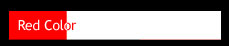
是否有CSS属性可font-color根据background-color以下图片反转相关内容?
Answers:
有一个CSS属性叫做mix-blend-mode,但是IE不支持。我建议使用伪元素。如果您想支持IE6和IE7,则还可以使用两个DIV代替伪元素。
.inverted-bar {
    position: relative;
}

.inverted-bar:before,
.inverted-bar:after {
    padding: 10px 0;
    text-indent: 10px;
    position: absolute;
    white-space: nowrap;
    overflow: hidden;
    content: attr(data-content);
}

.inverted-bar:before {
    background-color: aqua;
    color: red;
    width: 100%;
}

.inverted-bar:after {
    background-color: red;
    color: aqua;
    width: 20%;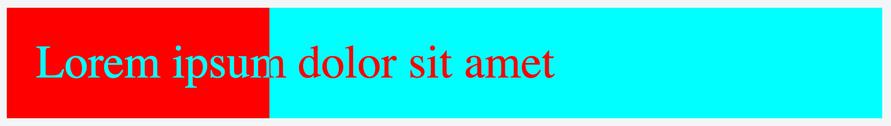
}<div class="inverted-bar" data-content="Lorem ipsum dolor sit amet"></div>使用mix-blend-mode。

div {
    position:absolute;
    height:200px
}

/* A white bottom layer */
#whitebg {
    background: white;
    width:400px;
    z-index:1
}

/* A black layer on top of the white bottom layer */
#blackbg {
    background: black;
    width:100px;
    z-index:2
}

/* Some white text on top with blend-mode set to 'difference' */
span {
    position:absolute;
    font-family: Arial, Helvetica;
    font-size: 100px;
    mix-blend-mode: difference;
    color: white;
    z-index: 3
}

/* A red DIV over the scene with the blend-mode set to 'screen' */
#makered {
    background-color: red;
    mix-blend-mode: screen;
    width:400px;
    z-index:4
}<div id="whitebg"></div>
<div id="blackbg"></div>
<div id="makered"></div>
<span>test</span>我知道这是一个古老的问题,但是我想添加一个我一直在使用的解决方案mix-blend-mode。
想法是使信息分为两层,即背面和正面,其中背面和正面具有不同的背景和文本颜色。这些在尺寸和文字上都是相同的。在这两者之间,我使用裁剪框div至作物前(顶)层至所需的宽度,示出了前部,其中它没有限幅层,和露出了背面修剪窗口的层之外。
这类似于接受的答案中的“ Two div”解决方案,但是使用了额外的裁剪框。此解决方案的优点是,如果需要,可以轻松地使文本居中,并且可以直接简单地选择颜色。
HTML:
<div class='progress' id='back'>
  <span></span>
  <div class='progress' id='boundbox'>
    <div class='progress' id='front'>
    </div>
  </div>
</div>
CSS:
.progress {
  display: block;
  margin: 0;

  /* Choose desired padding/height in coordination with font size */
  padding: 10px;
  height: 28px;
}

#back {
  position: relative;

  /* Choose a border to your liking, or none */
  border: 1px solid lightgray;

  /* Choose your desired text attributes */
  text-align: center;
  font-family: Calibri, "Sans Serif";
  font-size: 16pt;

  /* Set the desired width of the whole progress bar */
  width: 75%;

  /* Choose the desired background and text color */
  background-color: white;
  color: black;
}

#front {
  position: absolute;
  left: 0;
  top: 0;

  /* Choose the desired background and text colors */
  background-color: navy;
  color: white;
}

#boundbox {
  position: absolute;
  left: 0;
  top: 0;
  overflow: hidden;
}
我使用jQuery编程设置的百分比进度,并确保在宽度前面比赛的的背面,和他们有相同的文字。使用纯Javascript也可以轻松完成此操作。
// Set *front* width to *back* width
// Do this after DOM is ready
$('#front').width($('#back').width())

// Based upon an event that determines a content change
// you can set the text as in the below example
percent_complete = 45  // obtain this value from somewhere; 45 is just a test

$('#front').text(percent_complete.toString() + '% complete')
$('#back span').text($('#front').text())
bb_width = (percent_complete * $('#back').width())/100
$('#boundbox').css('width', bb_width.toString())
这是一个小提琴:进度栏。

我在Chrome,Firefox,Microsoft Edge和IE版本11中对此进行了测试。
我认为这更容易理解。
*{
    margin: 0;
    padding: 0;
    box-sizing: border-box;
    font-family: sans-serif;
}
.titulo{
    text-align: center;
    margin: 2em;
}
.padre{
    margin: 0 auto;
    display: flex;
    justify-content: center;
    align-items: center;
    margin-top: 10em;
    position: relative;
    width: 1000px;
    height: 500px;
}
.caja-1{
    background-color: black;
    width: 500px;
    height: 500px;
    left: 0;
    mix-blend-mode: screen;
    position:absolute;
}
.caja-3{
    width: 500px;
    height: 500px;
    display: flex;
    background-color: white;
    position: absolute;
    right: 0;
}
.texto{
    font-size: 5em;
    color: white;
    mix-blend-mode: difference;
    position:absolute;
}
<!DOCTYPE html>
<html lang="es">
<head>
<meta charset="UTF-8">
<meta name="viewport" content="width=device-width, initial-scale=1.0">
<meta http-equiv="X-UA-Compatible" content="ie=edge">
<title>ESTILOS CONTRASTADOS CSS3</title>
</head>
<body>
<h1 class="titulo">MIX-BLEND-MODE CSS EFFECT</h1>
<div class="padre">
<div class="caja-1"></div>
<div class="caja-3"></div>
<h1 class="texto">CODE STOCK CENTER</h1>
</div>
</body>
</html>