android中textview的圆角


171

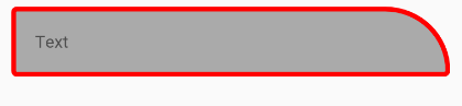
我有一个textview,希望它的角是圆形的。我已经知道可以使用android:background="@drawable/somefile"。就我而言,此标记已包含在内,因此无法再次使用。例如android:background="@drawable/mydialogbox"已经在后台创建图像

<RelativeLayout xmlns:android="http://schemas.android.com/apk/res/android"
    android:layout_width="wrap_content"
    android:layout_height="fill_parent"
    android:layout_gravity="top"
    android:background="@drawable/mydialogbox"
    android:orientation="horizontal" >

    <TextView
        android:id="@+id/textview_name"
        android:layout_alignParentTop="true"
        android:layout_centerHorizontal="true" />

    </LinearLayout>

</RelativeLayout>

因此,当我textview(textview_name)也想使用圆角时,该如何实现。


4
如果您得到的答案多于接受答案,那么其他人也可以从您的贡献中获得帮助
MilapTank 2014年

Answers:


438

1)rounded_corner.xmldrawable文件夹中创建并添加以下内容,

<?xml version="1.0" encoding="utf-8"?>
<shape xmlns:android="http://schemas.android.com/apk/res/android" >         
   <stroke
          android:width="1dp"
          android:color="@color/common_border_color" />

   <solid android:color="#ffffff" />

   <padding
           android:left="1dp"
           android:right="1dp"
           android:bottom="1dp"
           android:top="1dp" />

   <corners android:radius="5dp" />
</shape>

2)在TextViewbackground属性中设置此可绘制对象,例如:

android:background="@drawable/rounded_corner"

我希望这对您有用。


16
答案是正确的,只是发布者没有详细解释。您需要创建一个xml [例如 带有上述代码的可绘制文件夹中的[rounded_view.xml]。并在围绕textview的布局中将其作为参数android:background =“ @ drawable / rounded_view”
Sharjeel Ahmed

4
android:background =“ @ drawable / rounded_corner”不要在此处使用扩展名!
鲍里斯·加富罗夫

4
android:shape="rectangle"如果它对您不起作用,请添加
kristyna '16

如果无法自动运行
重新构建

18

除此之外radius,还有一些属性圆角状topRightRadiustopLeftRadiusbottomRightRadiusbottomLeftRadius

TextViewred边界with corner and灰色`背景的例子

bg_rounded.xml

<shape xmlns:android="http://schemas.android.com/apk/res/android">
    <stroke
        android:width="10dp"
        android:color="#f00" />

    <solid android:color="#aaa" />

    <corners
        android:radius="5dp"
        android:topRightRadius="100dp" />
</shape>

文字检视

<TextView
    android:layout_width="match_parent"
    android:layout_height="wrap_content"
    android:background="@drawable/bg_rounded"
    android:text="Text"
    android:padding="20dp"
    android:layout_margin="10dp"
    />

结果

在此处输入图片说明


16

由于您的顶层视图已经设置了android:background属性,因此您可以使用<layer-list>链接)创建一个新的XML drawable,将您的旧背景和新的圆角背景结合在一起。

<item>列表中的每个元素都是在下一个元素上绘制的,因此列表中的最后一项是最后一个元素。

<?xml version="1.0" encoding="utf-8"?>
<layer-list
    xmlns:android="http://schemas.android.com/apk/res/android" >
    <item>
        <bitmap android:src="@drawable/mydialogbox" />
    </item>
    <item>
        <shape>
            <stroke
                android:width="1dp"
                android:color="@color/common_border_color" />

            <solid android:color="#ffffff" />

            <padding
                    android:left="1dp"
                    android:right="1dp"
                    android:top="1dp" />

            <corners android:radius="5dp" />
        </shape>
    </item>
</layer-list>

6

在drawable文件夹下创建一个xml gradient.xml文件

<?xml version="1.0" encoding="utf-8"?>
<selector xmlns:android="http://schemas.android.com/apk/res/android">
    <item>
        <shape android:shape="rectangle"  >
            <corners android:radius="50dip" />
            <stroke android:width="1dip" android:color="#667162" />
            <gradient android:angle="-90" android:startColor="#ffffff" android:endColor="#ffffff" />
        </shape>
    </item>
</selector>

然后将此添加到您的TextView

android:background="@drawable/gradient"

6
  1. 右键单击可绘制文件夹并创建新文件
  2. 根据您的名字命名文件,并将扩展名添加为.xml
  3. 在文件中添加以下代码
  <?xml version="1.0" encoding="utf-8"?>
  <shape xmlns:android="http://schemas.android.com/apk/res/android"
      android:shape="rectangle">
      <corners android:radius="5dp" />
      <stroke android:width="1dp"  />
      <solid android:color="#1e90ff" />
  </shape>
  1. 将线条添加到需要倒圆角的位置 android:background="@drawable/corner"

4

您可以按以下方式使用提供的矩形形状(除非需要,否则不带渐变):

drawable/rounded_rectangle.xml

<?xml version="1.0" encoding="utf-8"?>
<shape xmlns:android="http://schemas.android.com/apk/res/android"
    android:shape="rectangle">
    <corners android:radius="5dp" />
    <stroke android:width="1dp" android:color="#ff0000" />
    <solid android:color="#00ff00" />
</shape>

然后在您的文本视图中:

android:background="@drawable/rounded_rectangle"

当然,您将需要自定义尺寸和颜色。


4

有两个步骤

1)在您的可绘制文件夹中创建此文件: rounded_corner.xml

<?xml version="1.0" encoding="utf-8"?>
<shape xmlns:android="http://schemas.android.com/apk/res/android"
    android:shape="rectangle">
         <corners android:radius="10dp" />  // set radius of corner
         <stroke android:width="2dp" android:color="#ff3478" /> // set color and width of border
         <solid android:color="#FFFFFF" /> // inner bgcolor
</shape>

2)将此文件设置为您的TextView背景属性。

android:background="@drawable/rounded_corner"

您也可以在Button或Edittext中使用此drawable


3
<?xml version="1.0" encoding="utf-8"?>
<layer-list xmlns:android="http://schemas.android.com/apk/res/android">

    <item android:id="@android:id/background">
        <shape>
            <corners android:radius="5dp" />
            <solid android:color="#ffffff"/>

        </shape>
    </item>
</layer-list>

2

借助Material Components Library,您可以使用MaterialShapeDrawable

带有TextView

    <TextView
        android:id="@+id/textview"
        ../>

您可以通过编程方式应用MaterialShapeDrawable

float radius = getResources().getDimension(R.dimen.corner_radius);

TextView textView = findViewById(R.id.textview);
ShapeAppearanceModel shapeAppearanceModel = new ShapeAppearanceModel()
        .toBuilder()
        .setAllCorners(CornerFamily.ROUNDED,radius)
        .build();

MaterialShapeDrawable shapeDrawable = new MaterialShapeDrawable(shapeAppearanceModel);
ViewCompat.setBackground(textView,shapeDrawable);

在此处输入图片说明

如果要更改背景颜色和边框,请应用:

shapeDrawable.setFillColor(ContextCompat.getColorStateList(this,R.color.....));
shapeDrawable.setStroke(2.0f, ContextCompat.getColor(this,R.color....));


0

只需使用圆角图像作为该视图的背景即可。

android:background="@drawable/my_custom_image"
By using our site, you acknowledge that you have read and understand our Cookie Policy and Privacy Policy.
Licensed under cc by-sa 3.0 with attribution required.