Flexbox:水平和垂直居中


670

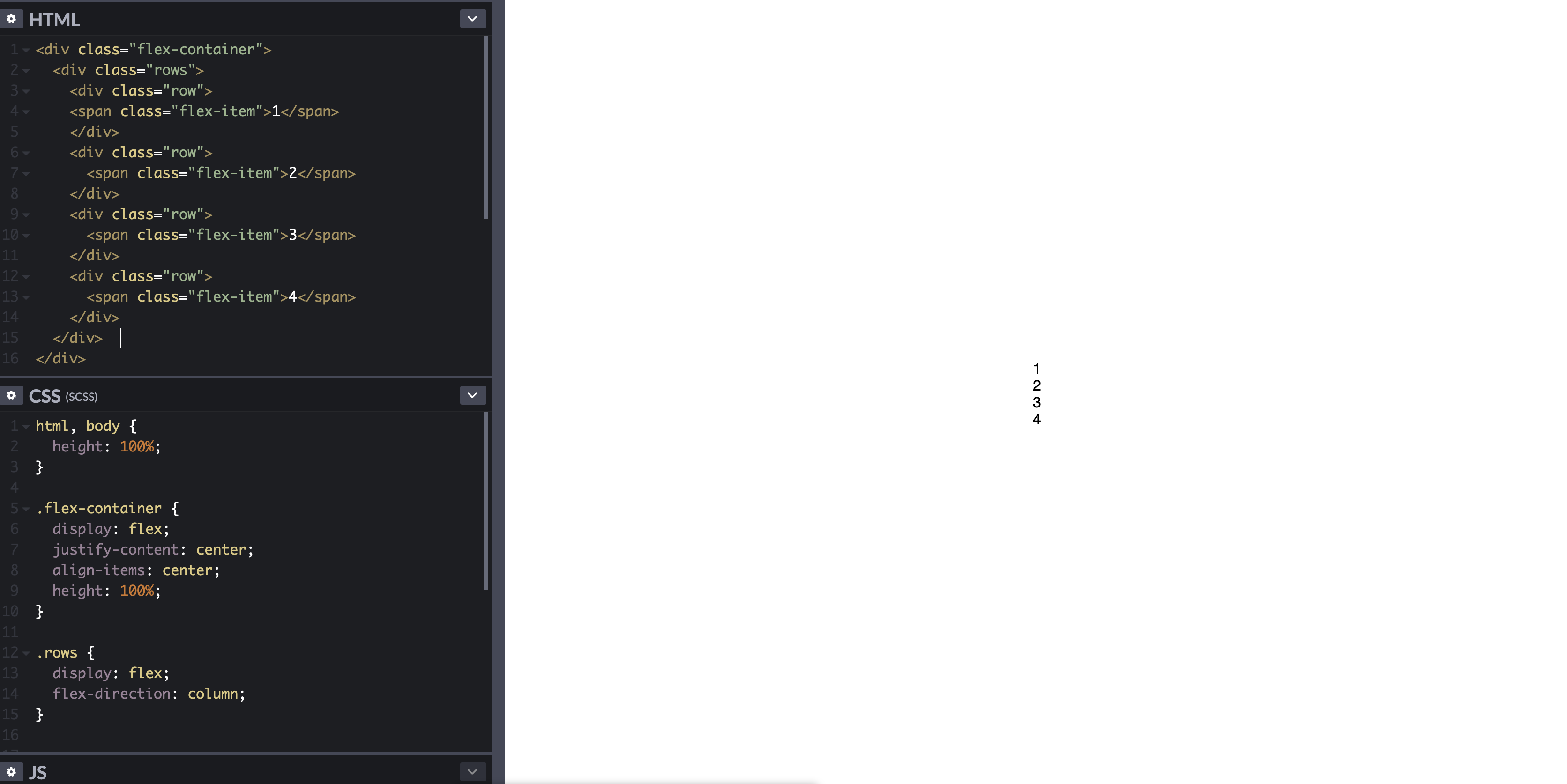
如何使用flexbox在容器内水平和垂直居中div。在下面的示例中,我希望每个数字彼此相邻(按行),它们水平居中。

.flex-container {
  padding: 0;
  margin: 0;
  list-style: none;
  display: flex;
  align-items: center;
  justify-content: center;
}
row {
  width: 100%;
}
.flex-item {
  background: tomato;
  padding: 5px;
  width: 200px;
  height: 150px;
  margin: 10px;
  line-height: 150px;
  color: white;
  font-weight: bold;
  font-size: 3em;
  text-align: center;
}
<div class="flex-container">
  <div class="row">
    <span class="flex-item">1</span>
  </div>
  <div class="row">
    <span class="flex-item">2</span>
  </div>
  <div class="row">
    <span class="flex-item">3</span>
  </div>
  <div class="row">
    <span class="flex-item">4</span>
  </div>
</div>

http://codepen.io/anon/pen/zLxBo


在您的CSS中
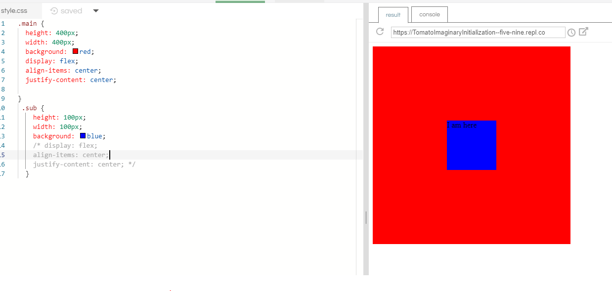
row{,它对行没有影响。如果将其更改为.row{结果将完全不同。
Hamid Mayeli

Answers:


751

我认为您想要以下内容。

html, body {
    height: 100%;
}
body {
    margin: 0;
}
.flex-container {
    height: 100%;
    padding: 0;
    margin: 0;
    display: -webkit-box;
    display: -moz-box;
    display: -ms-flexbox;
    display: -webkit-flex;
    display: flex;
    align-items: center;
    justify-content: center;
}
.row {
    width: auto;
    border: 1px solid blue;
}
.flex-item {
    background-color: tomato;
    padding: 5px;
    width: 20px;
    height: 20px;
    margin: 10px;
    line-height: 20px;
    color: white;
    font-weight: bold;
    font-size: 2em;
    text-align: center;
}
<div class="flex-container">
    <div class="row"> 
        <div class="flex-item">1</div>
        <div class="flex-item">2</div>
        <div class="flex-item">3</div>
        <div class="flex-item">4</div>
    </div>
</div>

参见演示:http : //jsfiddle.net/audetwebdesign/tFscL/

你的.flex-item元素应该是块级(div而非span)如果你想要的高度和顶部/底部填充,以正常工作。

另外,在上.row,将宽度设置为auto而不是100%

您的.flex-container属性很好。

如果您希望.row垂直居中于视口中,请为html和分配100%的高度body,然后将页body边距清零。

请注意,.flex-container需要一个高度才能看到垂直对齐效果,否则,容器将计算出包围内容所需的最小高度,该最小高度小于此示例中的视口高度。

附注:
flex-flowflex-directionflex-wrap性能会犯这样的设计更容易实现。我认为.row不需要容器,除非您要在元素周围添加一些样式(背景图像,边框等)。

有用的资源是:http : //demo.agektmr.com/flexbox/


5
弹性项目不需要是块级的,除非它们包含的内容需要它。另外,您已为所有显示属性添加了前缀,但未为其他Flexbox属性添加前缀(在其他草稿中具有不同的名称)。
cimmanon

1
@cimmanon我同意您关于区块级别的意见,并据此编辑了我的帖子。对齐不需要块级,但如果用户要指定高度等,则可能需要块级。我对浏览器前缀不屑一顾,为了实现一个有效的演示,我只是假设一个完美的浏览器。再次感谢您的评论,感谢您的反馈。
Marc Audet 2013年

1
如果溢出,则会裁剪顶部。 i.imgur.com/3dgFfQK.png有什么办法可以避免这种情况?
Brian Gates 2014年

1
@BrianGates如果窗口的高度太短,如何显示4个元素2x2、1x4?
Marc Audet 2014年


252

如何在Flexbox中垂直和水平居中放置元素

以下是两个常规的居中解决方案。

一个用于垂直对齐的弹性项目(flex-direction: column),另一个用于水平对齐的弹性项目(flex-direction: row)。

在这两种情况下,居中div的高度可以是可变的,不确定的,未知的等。居中的div的高度无关紧要。

这是两者的HTML:

<div id="container"><!-- flex container -->

    <div class="box" id="bluebox"><!-- flex item -->
        <p>DIV #1</p>
    </div>

    <div class="box" id="redbox"><!-- flex item -->
        <p>DIV #2</p>
    </div>

</div>

CSS(装饰风格除外)

弹性物品垂直堆叠时:

#container {
    display: flex;           /* establish flex container */
    flex-direction: column;  /* make main axis vertical */
    justify-content: center; /* center items vertically, in this case */
    align-items: center;     /* center items horizontally, in this case */
    height: 300px;
}

.box {
    width: 300px;
    margin: 5px;
    text-align: center;     /* will center text in <p>, which is not a flex item */
}

在此处输入图片说明

演示


当伸缩项目水平堆叠时:

flex-direction从上面的代码中调整规则。

#container {
    display: flex;
    flex-direction: row;     /* make main axis horizontal (default setting) */
    justify-content: center; /* center items horizontally, in this case */
    align-items: center;     /* center items vertically, in this case */
    height: 300px;
}

在此处输入图片说明

演示


集中弹性项目的内容

一个范围柔性格式化的内容被限制为父子关系。子代之外的flex容器的后代不参与flex布局,并且将忽略flex属性。本质上,flex属性不能在子级之外继承。

因此,您始终需要将display: flexdisplay: inline-flex应用于父元素,以便将flex属性应用于子级。

为了使flex项目中包含的文本或其他内容垂直和/或水平居中,请将项目设为(嵌套的)flex容器,然后重复居中规则。

.box {
    display: flex;
    justify-content: center;
    align-items: center;        /* for single line flex container */
    align-content: center;      /* for multi-line flex container */
}

此处有更多详细信息:如何在Flexbox中垂直对齐文本?

或者,您可以将其应用于margin: auto弹性项目的content元素。

p { margin: auto; }

auto在此处了解有关弹性边距的信息:对齐弹性项目的方法(请参见框#56)。


将多行弹性项目居中

当flex容器具有多行(由于包装)时,该align-content属性对于跨轴对齐将是必需的。

从规格:

8.4。包装伸缩线:align-content 属性

align-content当横轴上有多余的空间时,此属性会在Flex容器内将Flex容器的线justify-content对齐,类似于在主轴内对齐单个项目的方式。 注意,此属性对单行flex容器无效。

此处有更多详细信息:flex-wrap如何与align-self,align-items和align-content一起使用?


浏览器支持

除了IE <10以外,所有主流浏览器都支持Flexbox 。某些最新的浏览器版本(例如Safari 8和IE10)需要供应商前缀。要快速添加前缀,请使用Autoprefixer此答案中有更多详细信息。


旧版浏览器的居中解决方案

有关使用CSS表和定位属性的替代居中解决方案,请参见以下答案:https : //stackoverflow.com/a/31977476/3597276


我们可以水平左右,垂直居中吗?
kapil

2
@kapil,将justify-content属性调整介于之间围绕空间 ... jsfiddle.net/8o29y7pd/105
Michael Benjamin

3
这个答案应该放在首位。使用Flex应该是首选的方法,因为它可以在设备和屏幕之间很好地扩展。它比使用浮点数和管理多个div要容易得多。
SeaWarrior404

即11不能正常工作水平和垂直中心
giveJob

1
完美的答案,可能是Google上最好的答案!
JAN

43

.container {
    display: flex;
    justify-content: center;
    align-items: center;
}

到您想居中放置的容器元素。文档: 证明内容对齐项目


3
感谢您的简洁答复。尽管上面的所有杂语都很好,但这三行代码正是我到达这里寻找的内容(display: inline-flex对我而言,但这很容易编辑。)
杰夫·沃德

27

不要忘记使用重要的浏览器特定属性:

align-items:居中; ->

-webkit-box-align: center;
-moz-box-align: center;
-ms-flex-align: center;
-webkit-align-items: center;
align-items: center;

证明内容:中心;->

-webkit-box-pack: center;
-moz-box-pack: center;
-ms-flex-pack: center;
-webkit-justify-content: center;
justify-content: center;

您可以阅读以下两个链接以更好地了解flex:http : //css-tricks.com/almanac/properties/j/justify-content/http://ptb2.me/flexbox/

祝好运。


1
这是一个好点,对于今天(仅支持最新的浏览器),您只需要最后两行-webkit ..用于野生动物园,而最后一行则用于其他所有
Pete Kozak 2014年

1
+1是因为旧的2009年和2012年3月的工作草案仍具有很大的用户份额(根据caniuse.com约占8%)。
奔奔

Flext在Safari中不起作用,您如何解决该问题?
user3378649

多天前,我在Windows上检查了Safari浏览器的最新版本,但我记不太清了,但是我会检查一下并说出来。请告诉我您指的是什么版本的safari?在哪个操作系统上?
QMaster

@ user3378649最新的野生动物园版本可以支持Flex-box,请参见以下链接:caniuse.com/#search=flexbox
QMaster

15

1-将父div上的CSS设置为 display: flex;

2-将父div上的CSS设置为flex-direction: column;
注意,这将使该div中的所有内容自上而下排列。如果父div仅包含子对象而不包含其他子元素,则此方法效果最佳。

3-将父div上的CSS设置为 justify-content: center;

这是CSS外观的示例:

.parentDivClass {
  display: flex;
  flex-direction: column;
  justify-content: center;
}


8

diplay: flex;因为它是容器,并且margin:auto;它的项目完美。

注意:您必须设置widthheight才能看到效果。

#container{
  width: 100%; /*width needs to be setup*/
  height: 150px; /*height needs to be setup*/
  display: flex;
}

.item{
  margin: auto; /*These will make the item in center*/
  background-color: #CCC;
}
<div id="container">
   <div class="item">CENTER</div>
</div>


3

如果您需要在链接中居中放置文本,则可以做到这一点:

div {
  display: flex;

  width: 200px;
  height: 80px;
  background-color: yellow;
}

a {
  display: flex;
  align-items: center;
  justify-content: center;
  text-align: center; /* only important for multiple lines */

  padding: 0 20px;
  background-color: silver;
  border: 2px solid blue;
}
<div>
  <a href="#">text</a>
  <a href="#">text with two lines</a>
</div>


1
甜!有时候,我觉得我对Flexbox太过分了。)假设我需要更多练习,它的某些逻辑仍然不清楚。谢谢,狮子座!
佐尔坦

3

margin: auto与flexbox完美搭配。它垂直和水平居中。

html, body {
  height: 100%;
  max-height: 100%;
}

.flex-container {
  display: flex;
    
  height: 100%;
  background-color: green;
}

.container {
  display: flex;
  margin: auto;
}
<!DOCTYPE html>
<html>
<head>
  <meta charset="utf-8">
  <meta name="viewport" content="width=device-width">
  <title>JS</title>
</head>
<body>
  <div class="flex-container">
    <div class="container">
      <div class="row">
        <span class="flex-item">1</span>
      </div>
      <div class="row">
        <span class="flex-item">2</span>
      </div>
      <div class="row">
        <span class="flex-item">3</span>
      </div>
     <div class="row">
        <span class="flex-item">4</span>
    </div>
  </div>  
</div>
</body>
</html>


1

结果: 码

HTML:

<div class="flex-container">
  <div class="rows">

    <div class="row">
      <span class="flex-item">1</span>
    </div>
    <div class="row">
      <span class="flex-item">2</span>
    </div>
    <div class="row">
      <span class="flex-item">3</span>
    </div>
    <div class="row">
      <span class="flex-item">4</span>
    </div>

  </div>  
</div>

CSS:

html, body {
  height: 100%;  
}

.flex-container {
  display: flex;
  justify-content: center;
  align-items: center;
  height: 100%;
}

.rows {
  display: flex;
  flex-direction: column;
}

其中flex-containerdiv用于将div垂直和水平居中rows,而rowsdiv用于将“项目”分组并在基于列的列中对其进行排序。


0
    .flex-container {
  padding: 0;
  margin: 0;
  list-style: none;
  display: flex;
  align-items: center;
  justify-content: center;
}
row {
  width: 100%;
}
.flex-item {
  background: tomato;
  padding: 5px;
  width: 200px;
  height: 150px;
  margin: 10px;
  line-height: 150px;
  color: white;
  font-weight: bold;
  font-size: 3em;
  text-align: center;
}

尽管此代码可以回答问题,但提供有关如何和/或为什么解决问题的其他上下文将提高​​答案的长期价值。
Piotr Labunski

-7

使用CSS +

<div class="EXTENDER">
  <div class="PADDER-CENTER">
    <div contentEditable="true">Edit this text...</div>
  </div>
</div>

这里看看


1
由于现代浏览器使用纯flexbox可以轻松且广泛地支持此功能,因此您肯定不需要库解决方案。特别是因为他问如何使用Flex Box而不是CSS库来做到这一点。
bungleofsketches 2015年
By using our site, you acknowledge that you have read and understand our Cookie Policy and Privacy Policy.
Licensed under cc by-sa 3.0 with attribution required.