如何创建可与Bootstrap 3完美搭配的粘性页脚


76

无论是否具有顶级导航,站点的页脚都会很粘。Bootstrap具有可轻松创建固定页脚的功能,但没有用于创建粘性页脚的功能-两者之间存在很大差异。

对这个问题进行谷歌搜索将发现,即使不是成千上万的开发人员也有相同的问题,但是没有好的答案。

具有讽刺意味的是,Bootstrap文档页面本身在引导样式和固定的顶部导航栏旁边都有一个粘性页脚。这都是自定义CSS,而不是框架的一部分。因此,显而易见的方法是采用和重构其自定义样式,因为它显然在Bootstrap框架中发挥良好的作用,但这似乎比原本要痛苦的多。

请参阅此插件,以获取带有Bootstrap顶部导航栏和不良的,不粘脚的页脚的示例页面。

问题:

(感谢Softlayer-用于图形

不粘页脚的外观非常难看

所需解决方案:

页脚总是在底部

当然,页脚也应该具有响应性,并且跨浏览器友好。


2
您是否实际尝试过使用文档或example \ template?如果是这样,请发布您的代码...
Schmalzy

@Schmalzy-谢谢,这有所帮助。我从上面链接的示例创建了plnkr。 plnkr.co/edit/4OH2ZL?p=preview
Robert Christian

Answers:


77

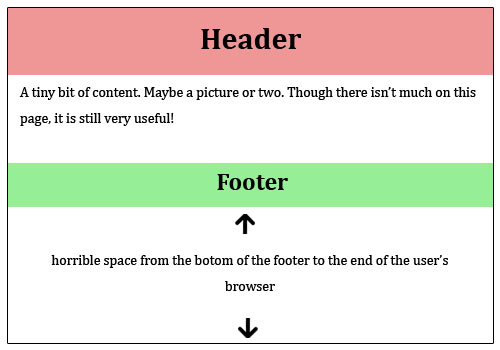
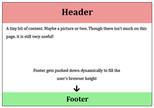
答案,因为Schmalzy指出,可以发现这里在getbootstrap网站的示例部分。

但是该示例不包括顶级导航。有关固定页脚的固定顶部导航,请参阅plnkr或下面的代码。

样式CSS:

/* Styles go here */

/* Sticky footer styles
-------------------------------------------------- */

html,
body {
  height: 100%;
  /* The html and body elements cannot have any padding or margin. */
}

/* Wrapper for page content to push down footer */
#wrap {
  min-height: 100%;
  height: auto;
  /* Negative indent footer by its height */
  margin: 0 auto -60px;
  /* Pad bottom by footer height */
  padding: 0 0 60px;
}

/* Set the fixed height of the footer here */
#footer {
  height: 60px;
  background-color: #f5f5f5;
}


/* Custom page CSS
-------------------------------------------------- */
/* Not required for template or sticky footer method. */

.container {
  width: auto;
  max-width: 680px;
  padding: 0 15px;
}
.container .credit {
  margin: 20px 0;
}

Index.html:

<!DOCTYPE html>
<html lang="en">
  <head>
    <meta charset="utf-8">
    <meta http-equiv="X-UA-Compatible" content="IE=edge">
    <meta name="viewport" content="width=device-width, initial-scale=1.0">
    <meta name="description" content="">
    <meta name="author" content="">
    <link rel="shortcut icon" href="../../docs-assets/ico/favicon.png">

    <title>Sticky Footer Template for Bootstrap</title>

    <!-- Bootstrap core CSS -->
    <link href="//netdna.bootstrapcdn.com/bootstrap/3.0.1/css/bootstrap.min.css" rel="stylesheet">

    <!-- Custom styles for this template -->
    <link href="style.css" rel="stylesheet">

    <!-- Just for debugging purposes. Don't actually copy this line! -->
    <!--[if lt IE 9]><script src="../../docs-assets/js/ie8-responsive-file-warning.js"></script><![endif]-->

    <!-- HTML5 shim and Respond.js IE8 support of HTML5 elements and media queries -->
    <!--[if lt IE 9]>
      <script src="https://oss.maxcdn.com/libs/html5shiv/3.7.0/html5shiv.js"></script>
      <script src="https://oss.maxcdn.com/libs/respond.js/1.3.0/respond.min.js"></script>
    <![endif]-->
  </head>

  <body>

    <!-- Wrap all page content here -->
    <div id="wrap">

<nav class="navbar navbar-default" role="navigation">
  <!-- Brand and toggle get grouped for better mobile display -->
  <div class="navbar-header">
    <button type="button" class="navbar-toggle" data-toggle="collapse" data-target="#bs-example-navbar-collapse-1">
      <span class="sr-only">Toggle navigation</span>
      <span class="icon-bar"></span>
      <span class="icon-bar"></span>
      <span class="icon-bar"></span>
    </button>
    <a class="navbar-brand" href="#">Brand</a>
  </div>

  <!-- Collect the nav links, forms, and other content for toggling -->
  <div class="collapse navbar-collapse" id="bs-example-navbar-collapse-1">
    <ul class="nav navbar-nav">
      <li class="active"><a href="#">Link</a></li>
      <li><a href="#">Link</a></li>
      <li class="dropdown">
        <a href="#" class="dropdown-toggle" data-toggle="dropdown">Dropdown <b class="caret"></b></a>
        <ul class="dropdown-menu">
          <li><a href="#">Action</a></li>
          <li><a href="#">Another action</a></li>
          <li><a href="#">Something else here</a></li>
          <li class="divider"></li>
          <li><a href="#">Separated link</a></li>
          <li class="divider"></li>
          <li><a href="#">One more separated link</a></li>
        </ul>
      </li>
    </ul>
    <form class="navbar-form navbar-left" role="search">
      <div class="form-group">
        <input type="text" class="form-control" placeholder="Search">
      </div>
      <button type="submit" class="btn btn-default">Submit</button>
    </form>
    <ul class="nav navbar-nav navbar-right">
      <li><a href="#">Link</a></li>
      <li class="dropdown">
        <a href="#" class="dropdown-toggle" data-toggle="dropdown">Dropdown <b class="caret"></b></a>
        <ul class="dropdown-menu">
          <li><a href="#">Action</a></li>
          <li><a href="#">Another action</a></li>
          <li><a href="#">Something else here</a></li>
          <li class="divider"></li>
          <li><a href="#">Separated link</a></li>
        </ul>
      </li>
    </ul>
  </div><!-- /.navbar-collapse -->
</nav>

      <!-- Begin page content -->
      <div class="container">

        <div class="page-header">
          <h1>Sticky footer</h1>
        </div>
        <p class="lead">Pin a fixed-height footer to the bottom of the viewport in desktop browsers with this custom HTML and CSS.</p>
        <p>Use <a href="../sticky-footer-navbar">the sticky footer with a fixed navbar</a> if need be, too.</p>
      </div>
    </div><!-- Wrap Div end -->

    <div id="footer">
      <div class="container">
        <p class="text-muted credit">Example courtesy <a href="http://martinbean.co.uk">Martin Bean</a> and <a href="http://ryanfait.com/sticky-footer/">Ryan Fait</a>.</p>
      </div>
    </div>


    <!-- Bootstrap core JavaScript
    ================================================== -->
    <!-- Placed at the end of the document so the pages load faster -->
  </body>
</html>

任何人都有这个问题的解决方法,但是只有当您向下滚动页面时才可以?很奇怪。
布拉德

1
此页脚没有响应!有关完全响应的解决方案,请参见答案stackoverflow.com/a/23833625/1647737
le_m 2015年

1
如果可以使用flexbox,建议您尝试以下链接:philipwalton.github.io/solved-by-flexbox/demos/sticky-footer
robodo

24

依靠固定高度页脚的粘性页脚解决方案在响应式方法中不受欢迎(其中页脚的高度通常在不同的断点处变化)。我见过的最简单的响应式粘性页脚解决方案涉及display: table在顶级容器上使用,例如:

http://galengidman.com/2014/03/25/response-flexible-height-sticky-footers-in-css/

http://timothy-long.com/sensitive-sticky-footer/

http://www.visualdecree.co.uk/posts/2013/12/17/sensitive-sticky-footers/


显示:要走的路是餐桌
路德(Luther)

19

最好的方法是执行以下操作:
HTML:Sticky Footer
CSS:Sticky Footer
HTML代码示例的CSS

<div class="container">
  <div class="page-header">
    <h1>Sticky footer</h1>
  </div>
  <p class="lead">Pin a fixed-height footer to the bottom of the viewport in desktop browsers with this custom HTML and CSS.</p>
  <p>Use <a href="../sticky-footer-navbar">the sticky footer with a fixed navbar</a> if need be, too.</p>
</div>

<footer class="footer">
  <div class="container">
    <p class="text-muted">Place sticky footer content here.</p>
  </div>
</footer>

CSS代码示例:

    html {
  position: relative;
  min-height: 100%;
}
body {
  /* Margin bottom by footer height */
  margin-bottom: 60px;
}
.footer {
  position: absolute;
  bottom: 0;
  width: 100%;
  /* Set the fixed height of the footer here */
  height: 60px;
  background-color: #f5f5f5;
}

再次进行一些细微调整可能会使它更完美(取决于您的项目),因此不会影响移动视图的页脚。

@media (max-width:768px){ .footer{position:absolute;width:100%;} }
@media (min-width:768px){ .footer{position:absolute;bottom:0;height:60px;width:100%;}}

4
更换position: relativeposition: fixed向下滚动时保持在底部
最多

14

我一直在寻找一种使粘页脚起作用的简单方法。我刚刚应用了class="navbar-fixed-bottom“”,它立即生效,唯一要记住的是调整移动设备的页脚设置。干杯!


6

对于那些正在寻找简单答案的人,您可以从这里获得一个简单的工作示例:

html {
    position: relative;
    min-height: 100%;
}
body {
    margin-bottom: 60px /* Height of the footer */
}
footer {
    position: absolute;
    bottom: 0;
    width: 100%;
    height: 60px /* Example value */
}

刚与打bodymargin-bottom的内容和页脚之间增加空间。


2

我将详细说明robodo在上面的评论之一中所说的,一种非常快速且美观的方法,更重要的是,不涉及任何技巧的响应式(非固定高度)方法是使用flexbox。如果您不受浏览器支持的限制,那么这是一个很好的解决方案。

的HTML

<body>
  <div class="site-content">
    Site content
  </div>
  <footer class="footer">
    Footer content
  </footer>
</body>

的CSS

html {
  height: 100%;
}
body {
  min-height: 100%;
  display: flex;
  flex-direction: column;
}
.site-content {
  flex: 1;
}

可以在此处查看浏览器支持:http : //caniuse.com/#feat=flexbox

使用flexbox的更常见的问题解决方案:https : //github.com/philipwalton/solved-by-flexbox


1

不确定您到目前为止是否尝试过,但是非常简单。只需执行以下操作:http : //plnkr.co/edit/kmEWh7?p=preview

html, body {
  height: 100%;
}

footer {
  position: absolute;
  bottom: 0;
}

谢谢,这可行,但不能涵盖所有情况。例如,垂直缩小视口,然后看到页脚在段落文本之间移动。
罗伯特·克里斯蒂安

当然可以!您需要一个粘性页脚,因此它会在底部粘贴,并且如果您缩小视口,它将覆盖文本。这就是为什么必须将包含内容的div设置为溢出的原因:auto; 并为其底部填充至少等于页脚的高度。
查尔斯·英格尔斯

@CharlesIngalls这样的错误答案。问题是关于页脚的粘滞,这个答案没有任何意义。
WeAreRight

1

由于它位于引导程序3中,因此该网站将使用jQuery。因此,解决方案也可以是以下方法,而不是尝试使用复杂的CSS:

<!DOCTYPE html>
<html xmlns="http://www.w3.org/1999/xhtml">
<head>
    <title></title>
    <link href="css/bootstrap.min.css" rel="stylesheet" />
    <style>
        .my-footer {
            border-radius : 0px;
            margin : 0px; /* pesky margin below .navbar */
            position : absolute;
            width : 100%;
        }
    </style>
</head>
<body>
    <div class="container-fluid">
        <div class="row">
            <!-- Content of any length -->
            asdfasdfasdfasdfs <br />
            asdfasdfasdfasdfs <br />
            asdfasdfasdfasdfs <br />
        </div>
    </div>

    <div class="navbar navbar-inverse my-footer">
        <div class="container-fluid">
            <div class="row">
                <p class="navbar-text">My footer content goes here...</p>
            </div>
        </div>
    </div>

    <script src="js/jquery-1.11.0.min.js"></script>
    <script src="js/bootstrap.min.js"></script>

    <script type="text/javascript">
        $(document).ready(function () {
            var $docH = $(document).height();
            // The document height will grow as the content on the page grows.
            $('.my-footer').css({
                /*
                The default height of .navbar is 50px with a 1px border,
                change this 52 if you change the height of your footer.
                */
                top: ($docH - 52) + 'px'
            });
        });
    </script>
</body>
</html>

对此有不同的看法,希望对您有所帮助。

亲切的问候。


1

如果您的html具有(粗糙)结构:

<div class="wrapper">
   <div>....</div>
   ...
   <div>....</div>
</div>
<div class="footer">
   ...
</div>

那么将页脚固定到屏幕底部的最简单的CSS是

html, body {
    height: 100%;
}
.wrapper {
  min-height: calc(100vh - 80px);
}
.footer {
   height: 80px;
}

...页脚的高度为80px。calc计算包装器的高度等于窗口的高度减去页脚的高度(80px),该页脚超出.wrapper


-1
   <style type="text/css">

     /* Sticky footer styles
     -------------------------------------------------- */

     html,
     body {
       height: 100%;
       /* The html and body elements cannot have any padding or margin. */
     }

     /* Wrapper for page content to push down footer */
     #wrap {
       min-height: 100%;
       height: auto !important;
       height: 100%;
       /* Negative indent footer by it's height */
       margin: 0 auto -60px;
     }

     /* Set the fixed height of the footer here */
     #push,
     #footer {
       height: 60px;
     }
     #footer {
       background-color: #f5f5f5;
     }

     /* Lastly, apply responsive CSS fixes as necessary */
     @media (max-width: 767px) {
       #footer {
         margin-left: -20px;
         margin-right: -20px;
         padding-left: 20px;
         padding-right: 20px;
       }
     }


     /* Custom page CSS
     -------------------------------------------------- */
     /* Not required for template or sticky footer method. */

     .container {
       width: auto;
       max-width: 680px;
     }
     .container .credit {
       margin: 20px 0;
     }

   </style>


<div id="wrap">

  <!-- Begin page content -->
  <div class="container">
    <div class="page-header">
      <h1>Sticky footer</h1>
    </div>
    <p class="lead">Pin a fixed-height footer to the bottom of the viewport in desktop browsers with this custom HTML and CSS.</p>
    <p>Use <a href="./sticky-footer-navbar.html">the sticky footer</a> with a fixed navbar if need be, too.</p>
  </div>

  <div id="push"></div>
</div>

<div id="footer">
  <div class="container">
    <p class="muted credit">Example courtesy <a href="http://martinbean.co.uk">Martin Bean</a> and <a href="http://ryanfait.com/sticky-footer/">Ryan Fait</a>.</p>
  </div>
</div>
By using our site, you acknowledge that you have read and understand our Cookie Policy and Privacy Policy.
Licensed under cc by-sa 3.0 with attribution required.