实际上,您可以通过支持库RoundedBitmapDrawableFactory类(此处和此处)使用Google提供的内容)提供的内容,而不是使用第三方库:
摇篮:
implementation 'androidx.appcompat:appcompat:1.0.0-beta01'
MainActivity.kt
class MainActivity : AppCompatActivity() {

    override fun onCreate(savedInstanceState: Bundle?) {
        super.onCreate(savedInstanceState)
        setContentView(R.layout.activity_main)
        val originalDrawable = ContextCompat.getDrawable(this, R.drawable.avatar_1)!!
        val bitmap = convertDrawableToBitmap(originalDrawable)
        val drawable = RoundedBitmapDrawableFactory.create(resources, bitmap)
        drawable.setAntiAlias(true)
        drawable.cornerRadius = Math.max(bitmap.width, bitmap.height) / 2.0f
        avatarImageView.setImageDrawable(drawable)
    }

    companion object {
        @JvmStatic
        fun convertDrawableToBitmap(drawable: Drawable): Bitmap {
            if (drawable is BitmapDrawable)
                return drawable.bitmap
            // We ask for the bounds if they have been set as they would be most
            // correct, then we check we are  > 0
            val bounds = drawable.bounds
            val width = if (!bounds.isEmpty) bounds.width() else drawable.intrinsicWidth
            val height = if (!bounds.isEmpty) bounds.height() else drawable.intrinsicHeight
            // Now we check we are > 0
            val bitmap = Bitmap.createBitmap(if (width <= 0) 1 else width, if (height <= 0) 1 else height,
                    Bitmap.Config.ARGB_8888)
            val canvas = Canvas(bitmap)
            drawable.setBounds(0, 0, canvas.width, canvas.height)
            drawable.draw(canvas)
            return bitmap
        }
    }
}
RES /布局/activity_main.xml
<FrameLayout
    xmlns:android="http://schemas.android.com/apk/res/android" xmlns:app="http://schemas.android.com/apk/res-auto"
    xmlns:tools="http://schemas.android.com/tools" android:layout_width="match_parent"
    android:layout_height="match_parent" tools:context=".MainActivity">

    <androidx.appcompat.widget.AppCompatImageView
        android:id="@+id/avatarImageView" android:layout_width="100dp" android:layout_height="100dp"
        android:layout_gravity="center"/>

</FrameLayout>
res / drawable / avatar_1.xml
<vector xmlns:android="http://schemas.android.com/apk/res/android" android:width="128dp" android:height="128dp"
        android:viewportHeight="128.0" android:viewportWidth="128.0">
    <path
        android:fillColor="#FF8A80" android:pathData="M0 0h128v128h-128z"/>
    <path
        android:fillColor="#FFE0B2"
        android:pathData="M36.3 94.8c6.4 7.3 16.2 12.1 27.3 12.4 10.7,-.3 20.3,-4.7 26.7,-11.6l.2.1c-17,-13.3,-12.9,-23.4,-8.5,-28.6 1.3,-1.2 2.8,-2.5 4.4,-3.9l13.1,-11c1.5,-1.2 2.6,-3 2.9,-5.1.6,-4.4,-2.5,-8.4,-6.9,-9.1,-1.5,-.2,-3 0,-4.3.6,-.3,-1.3,-.4,-2.7,-1.6,-3.5,-1.4,-.9,-2.8,-1.7,-4.2,-2.5,-7.1,-3.9,-14.9,-6.6,-23,-7.9,-5.4,-.9,-11,-1.2,-16.1.7,-3.3 1.2,-6.1 3.2,-8.7 5.6,-1.3 1.2,-2.5 2.4,-3.7 3.7l-1.8 1.9c-.3.3,-.5.6,-.8.8,-.1.1,-.2 0,-.4.2.1.2.1.5.1.6,-1,-.3,-2.1,-.4,-3.2,-.2,-4.4.6,-7.5 4.7,-6.9 9.1.3 2.1 1.3 3.8 2.8 5.1l11 9.3c1.8 1.5 3.3 3.8 4.6 5.7 1.5 2.3 2.8 4.9 3.5 7.6 1.7 6.8,-.8 13.4,-5.4 18.4,-.5.6,-1.1 1,-1.4 1.7,-.2.6,-.4 1.3,-.6 2,-.4 1.5,-.5 3.1,-.3 4.6.4 3.1 1.8 6.1 4.1 8.2 3.3 3 8 4 12.4 4.5 5.2.6 10.5.7 15.7.2 4.5,-.4 9.1,-1.2 13,-3.4 5.6,-3.1 9.6,-8.9 10.5,-15.2m-14.4,-49.8c.9 0 1.6.7 1.6 1.6 0 .9,-.7 1.6,-1.6 1.6,-.9 0,-1.6,-.7,-1.6,-1.6,-.1,-.9.7,-1.6 1.6,-1.6zm-25.7 0c.9 0 1.6.7 1.6 1.6 0 .9,-.7 1.6,-1.6 1.6,-.9 0,-1.6,-.7,-1.6,-1.6,-.1,-.9.7,-1.6 1.6,-1.6z"/>
    <path
        android:fillColor="#E0F7FA"
        android:pathData="M105.3 106.1c-.9,-1.3,-1.3,-1.9,-1.3,-1.9l-.2,-.3c-.6,-.9,-1.2,-1.7,-1.9,-2.4,-3.2,-3.5,-7.3,-5.4,-11.4,-5.7 0 0 .1 0 .1.1l-.2,-.1c-6.4 6.9,-16 11.3,-26.7 11.6,-11.2,-.3,-21.1,-5.1,-27.5,-12.6,-.1.2,-.2.4,-.2.5,-3.1.9,-6 2.7,-8.4 5.4l-.2.2s-.5.6,-1.5 1.7c-.9 1.1,-2.2 2.6,-3.7 4.5,-3.1 3.9,-7.2 9.5,-11.7 16.6,-.9 1.4,-1.7 2.8,-2.6 4.3h109.6c-3.4,-7.1,-6.5,-12.8,-8.9,-16.9,-1.5,-2.2,-2.6,-3.8,-3.3,-5z"/>
    <path
        android:fillColor="#444" android:pathData="M76.3,47.5 m-2.0, 0 a 2.0,2.0 0 1,1 4.0,0 a2.0,2.0 0 1,1 -4.0,0"/>
    <path
        android:fillColor="#444" android:pathData="M50.7,47.6 m-2.0, 0 a 2.0,2.0 0 1,1 4.0,0 a2.0,2.0 0 1,1 -4.0,0"/>
    <path
        android:fillColor="#444"
        android:pathData="M48.1 27.4c4.5 5.9 15.5 12.1 42.4 8.4,-2.2,-6.9,-6.8,-12.6,-12.6,-16.4 17.2 1.5 14.1,-9.4 14.1,-9.4,-1.4 5.5,-11.1 4.4,-11.1 4.4h-18.8c-1.7,-.1,-3.4 0,-5.2.3,-12.8 1.8,-22.6 11.1,-25.7 22.9 10.6,-1.9 15.3,-7.6 16.9,-10.2z"/>
</vector>
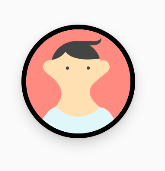
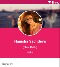
结果:

并且,假设您想在其顶部添加边框,可以使用以下示例:
stroke_drawable.xml
<shape xmlns:android="http://schemas.android.com/apk/res/android" android:shape="oval">
    <stroke
        android:width="4dp" android:color="@android:color/black"/>
</shape>
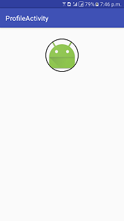
并将其添加android:foreground="@drawable/stroke_drawable"到布局XML文件的ImageView中,您将获得以下信息:

不过,我不确定如何添加阴影(在较旧的Android版本上可以使用)。使用FloatingActionButton(来自“ com.google.android.material:material”依赖项),我无法使位图填充FAB本身。如果可行的话,使用它可能会更好。
编辑:如果您想添加高程阴影(可从API 21获得),则可以更改我写的内容:
在布局XML文件中:
<androidx.appcompat.widget.AppCompatImageView android:padding="4dp"
    android:id="@+id/avatarImageView" android:layout_width="100dp" android:layout_height="100dp" android:elevation="8dp"
    android:layout_gravity="center" android:background="@drawable/stroke_drawable" tools:srcCompat="@drawable/avatar_1"/>
CircularShadowViewOutlineProvider.kt
@TargetApi(Build.VERSION_CODES.LOLLIPOP)
class CircularShadowViewOutlineProvider : ViewOutlineProvider() {
    override fun getOutline(view: View, outline: Outline) {
        val size = Math.max(view.width, view.height)
        outline.setRoundRect(0, 0, size, size, size / 2f)
    }
}
在代码中:
    if (Build.VERSION.SDK_INT >= Build.VERSION_CODES.LOLLIPOP)
        avatarImageView.outlineProvider = CircularShadowViewOutlineProvider()
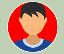
结果: