带有Material Design和AppCompat的Android中的着色按钮


256

AppCompat今天更新发布之前,我可以更改Android L中按钮的颜色,但不能更改旧版本上的按钮的颜色。包括新的AppCompat更新后,我无法更改任何一个版本的颜色,但是当我尝试尝试该按钮时,该按钮便消失了。有人知道如何更改按钮的颜色吗?
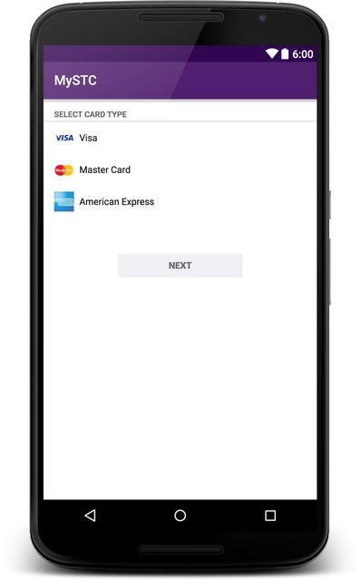
下图显示了我想要实现的目标:

图片显示理想结果

白色按钮是默认按钮,红色按钮是我想要的按钮。

这是我之前所做的更改styles.xml:中按钮颜色的操作

<item name="android:colorButtonNormal">insert color here</item>

并动态地执行此操作:

button.getBackground().setColorFilter(getResources().getColor(insert color here), PorterDuff.Mode.MULTIPLY);

我也确实将主题父级从更改@android:style/Theme.Material.Light.DarkActionBarTheme.AppCompat.Light.DarkActionBar


我尝试了相同的方法,但没有改变按钮的颜色。我还从属性中删除了android:因为它来自支持库,而不是android名称空间的一部分
Informatic0re

如果您使用的Android版本:colorButtonNormal与Android 5.0它的作品-但它似乎不是向后兼容
Informatic0re

是的,这正是我正在经历
mail929

我还发现,配音色不会更改CheckBox的颜色,但在较旧的版本中会更改
Informatic0re

加上一种动态方法。:)
theapache64 '16

Answers:


222

正式在支持库第22版(2015年3月13日,星期五)中修复。查看相关的Google代码问题:

https://issuetracker.google.com/issues/37008632

使用范例

theme.xml:

<item name="colorButtonNormal">@color/button_color</item>

v21 / theme.xml

<item name="android:colorButtonNormal">@color/button_color</item>

17
有没有示例如何使用它?如何仅在一个按钮上设置颜色?
复杂情况2015年

3
@WindRider但是我有一个问题,我想用它来创建具有不同颜色的按钮。我创建样式Button.Red,Button.Green,所有父样式都等于Button基本样式。我将项目colorButtonNormal设置为请求的颜色,将此设置为按钮主题。不幸的是,它仅为21的按钮着色。在其下方,它不会覆盖主题中定义的colorButtonNormal。
dominik4142

71
使用AppCompat 22.1.1,它也适用于我在2.3.7、4.4.4和5.1上也仅适用于一个按钮:设置按钮的 android:theme="@style/ColoredButton",以及在styles.xml中 <style name="ColoredButton" parent="Widget.AppCompat.Button"> <item name="colorButtonNormal">@color/button_yellow</item> </style>
hunyadym 2015年

2
@hunyadym,向按钮添加主题会由于某些原因中断onClick。在设计库提供更好的方法之前,我将其归类为解决方法。
2015年

3
@gladed:您的情况似乎是这个错误:code.google.com/p/android/issues/detail?
id=62795#c1

148

编辑(22.06.2016):

我发布原始回复后,Appcompat库开始支持材质按钮。在本文中,您可以看到凸起和扁平按钮的最简单实现。

原始答案:

由于该AppCompat不支持该按钮,因此您可以使用xml作为背景。为此,我查看了Android的源代码,并找到了用于样式化素材按钮的相关文件。

1-从源代码看材质按钮的原始实现。

看看android源代码上的btn_default_material.xml

您可以将文件复制到项目的drawable-v21文件夹中。但是请不要在这里触摸颜色属性。您需要更改的文件是第二个文件。

drawable-v21 / custom_btn.xml

<ripple xmlns:android="http://schemas.android.com/apk/res/android"
    android:color="?attr/colorControlHighlight">
    <item android:drawable="@drawable/btn_default_mtrl_shape" />
</ripple>

2-获取原始材质按钮的形状

当您意识到在此drawable中使用的形状可以在源代码的此文件中找到。

<inset xmlns:android="http://schemas.android.com/apk/res/android"
   android:insetLeft="@dimen/button_inset_horizontal_material"
   android:insetTop="@dimen/button_inset_vertical_material"
   android:insetRight="@dimen/button_inset_horizontal_material"
   android:insetBottom="@dimen/button_inset_vertical_material">
<shape android:shape="rectangle">
    <corners android:radius="@dimen/control_corner_material" />
    <solid android:color="?attr/colorButtonNormal" />
    <padding android:left="@dimen/button_padding_horizontal_material"
             android:top="@dimen/button_padding_vertical_material"
             android:right="@dimen/button_padding_horizontal_material"
             android:bottom="@dimen/button_padding_vertical_material" />
</shape>

3-获取材质按钮的尺寸

在此文件中,您可以在此处找到该文件使用的某些尺寸。您可以复制整个文件并将其放入values文件夹。这对于将相同大小(用于材料按钮中的按钮)应用于所有按钮很重要

4-为旧版本创建另一个可绘制文件

对于较旧的版本,您应该有另一个具有相同名称的drawable。我直接将项目放在行内而不是引用。您可能要引用它们。但同样,最重要的是材质按钮的原始尺寸。

drawable / custom_btn.xml

    <?xml version="1.0" encoding="utf-8"?>
    <selector xmlns:android="http://schemas.android.com/apk/res/android">
    
    <!-- pressed state -->
    <item android:state_pressed="true">
        <inset xmlns:android="http://schemas.android.com/apk/res/android"
            android:insetLeft="@dimen/button_inset_horizontal_material"
            android:insetTop="@dimen/button_inset_vertical_material"
            android:insetRight="@dimen/button_inset_horizontal_material"
            android:insetBottom="@dimen/button_inset_vertical_material">
            <shape android:shape="rectangle">
                <corners android:radius="@dimen/control_corner_material" />
                <solid android:color="@color/PRESSED_STATE_COLOR" />
                <padding android:left="@dimen/button_padding_horizontal_material"
                    android:top="@dimen/button_padding_vertical_material"
                    android:right="@dimen/button_padding_horizontal_material"
                    android:bottom="@dimen/button_padding_vertical_material" />
            </shape>
        </inset>
    </item>
    
    <!-- focused state -->
    <item android:state_focused="true">
        <inset xmlns:android="http://schemas.android.com/apk/res/android"
            android:insetLeft="@dimen/button_inset_horizontal_material"
            android:insetTop="@dimen/button_inset_vertical_material"
            android:insetRight="@dimen/button_inset_horizontal_material"
            android:insetBottom="@dimen/button_inset_vertical_material">
            <shape android:shape="rectangle">
                <corners android:radius="@dimen/control_corner_material" />
                <solid android:color="@color/FOCUSED_STATE_COLOR" />
                <padding android:left="@dimen/button_padding_horizontal_material"
                    android:top="@dimen/button_padding_vertical_material"
                    android:right="@dimen/button_padding_horizontal_material"
                    android:bottom="@dimen/button_padding_vertical_material" />
            </shape>
        </inset>
    </item>
    
    <!-- normal state -->
    <item>
        <inset xmlns:android="http://schemas.android.com/apk/res/android"
            android:insetLeft="@dimen/button_inset_horizontal_material"
            android:insetTop="@dimen/button_inset_vertical_material"
            android:insetRight="@dimen/button_inset_horizontal_material"
            android:insetBottom="@dimen/button_inset_vertical_material">
            <shape android:shape="rectangle">
                <corners android:radius="@dimen/control_corner_material" />
                <solid android:color="@color/NORMAL_STATE_COLOR" />
                <padding android:left="@dimen/button_padding_horizontal_material"
                    android:top="@dimen/button_padding_vertical_material"
                    android:right="@dimen/button_padding_horizontal_material"
                    android:bottom="@dimen/button_padding_vertical_material" />
            </shape>
        </inset>
    </item>
</selector>

结果

您的按钮将对Lollipop设备产生连锁反应。除波纹效果外,旧版本将具有完全相同的按钮。但是,既然您为不同的状态提供了可绘制对象,它们也会响应触摸事件(就像以前一样)。


4
对,就是这样。如果所有按钮都使用相同的背景,并且不想一次又一次添加,请在styles.xml中定义按钮样式。 <style name =“ ButtonStyle” parent =“ android:Widget.Button”> < item name =“ android:background”> @ drawable / custom_btn </ item> </ style> 并在主题中添加按钮样式 <item name =“ android:buttonStyle”> @ style / ButtonStyle </ item>
eluleci

1
如何在21之前的版本中向此按钮添加高度?据我了解,我应该在按钮下方添加带有阴影的新形状,但是我应该放在哪里呢?
xakz

7
非常令人烦恼的是,开箱即用不支持此功能
2015年

39
我完全同意你的看法。按钮是最常用的窗口小部件,但不包含在材料支持库中。我想知道他们在想什么。
eluleci 2015年

1
另外,按照您的指南,似乎根本没有显示背景……
JMRboosties 2015年

111

AppCompat库的v23.0.0版对此进行了增强,增加了更多主题,包括

Widget.AppCompat.Button.Colored

首先包括appCompat依赖项(如果还没有的话)

compile('com.android.support:appcompat-v7:23.0.0') {
    exclude group: 'com.google.android', module: 'support-v4'
}

现在,由于您需要使用应用程序兼容性的v23版本,因此您还需要定位SDK-v23版本!

    compileSdkVersion = 23
    targetSdkVersion = 23

在你的 values/theme

<item name="android:buttonStyle">@style/BrandButtonStyle</item>

在你的 values/style

<style name="BrandButtonStyle" parent="Widget.AppCompat.Button.Colored">
    <item name="colorButtonNormal">@color/yourButtonColor</item>
    <item name="android:textColor">@color/White</item>
</style>

在你的 values-v21/style

<style name="BrandButtonStyle" parent="Widget.AppCompat.Button.Colored">
    <item name="android:colorButtonNormal">@color/yourButtonColor</item>
    <item name="android:textColor">@color/White</item>
</style>

由于按钮主题基于,Widget.AppCompat.Button.Colored因此按钮上的文本颜色默认为白色!

但是当您禁用该按钮时似乎存在问题,该按钮会将其颜色更改为浅灰色,但文本颜色将保持白色!

一种解决方法是将按钮上的文本颜色专门设置为白色!就像我上面显示的样式一样。

现在您只需定义您的按钮,然后让AppCompat完成其余的操作即可:)

<Button
        android:layout_width="200dp"
        android:layout_height="48dp" />

残疾状态 禁用状态

启用状态 启用状态

编辑:

添加 <Button android:theme="@style/BrandButtonStyle"/>


19
现在,这是最好的方法!您还可以通过使用单个按钮上的样式<Button android:theme="@style/BrandButtonStyle"/>。它是theme属性,没有style属性。
mohlendo

7
@Muhammad Alfaifi您是否有样本项目或要旨?我创建了一个干净的项目,但是它不起作用:github.com/Bresiu/ThemeTest。在带有
音色的

4
这仅在指定属性android:theme时对我有效。我无法使用button标记使属性样式适合我。
雷·亨特

8
使用v23.1 lib时,此操作无法正常工作,当尝试将其设置为整个主题时,它始终将强调色显示为bg,而不是所定义的颜色
Patrick Favre

3
在v23.1上,此处存在相同的问题,禁用按钮与启用按钮的颜色相同。非常沮丧 有人知道吗?
AhmedW

63

在Android支持库22.1.0中,Google Button注意到了这种色调。因此,自定义按钮背景颜色的另一种方法是使用backgroundTint属性。

例如,

<Button
       android:id="@+id/add_remove_button"
       android:layout_width="wrap_content"
       android:layout_height="wrap_content"
       android:backgroundTint="@color/bg_remove_btn_default"
       android:textColor="@android:color/white"
       tools:text="Remove" />

1
最后!博客文章的发布22.1:android-developers.blogspot.no/2015/04/...
GuillermoMP

5
文档说:“当您在布局中使用Button时,将自动使用它。只需要在编写自定义视图时手动使用此类即可。” developer.android.com/reference/android/support/v7/widget/…这是否意味着我们不必手动更改所有布局和Java代码?
Stephane 2015年


真棒!现在,是否有一个AppCompatToggleButton可以让您更改ToggleButtons的背景?也许我可以窃代码...
swooby 2015年

19
不幸的是,这仅适用于API 21+。即使使用AppCompat库,android:backgroundTint属性也无法在棒棒糖之前使用。仅主题中的colorButtonNormal可在棒棒糖之前使用。
Timur_C

42

要支持彩色按钮,请使用具有以下功能的最新AppCompat库(> 23.2.1):

膨胀-XML

AppCompat小部件:

android.support.v7.widget.AppCompatButton

AppCompat样式:

style="@style/Widget.AppCompat.Button.Colored"

注意!要在xml中设置自定义颜色:请使用attr:app而不是android

(使用alt+enter或声明xmlns:app="http://schemas.android.com/apk/res-auto"使用app

应用程序:backgroundTint =“ @ color / your_custom_color”

例:

<android.support.v7.widget.AppCompatButton
     style="@style/Widget.AppCompat.Button.Colored"
     app:backgroundTint="@color/your_custom_color"
     android:layout_width="wrap_content"
     android:layout_height="wrap_content"     
     android:text="Colored Button"/>

或以编程方式设置-JAVA

 ViewCompat.setBackgroundTintList(your_colored_button,
 ContextCompat.getColorStateList(getContext(),R.color.your_custom_color));

您的Java代码为我工作。Muhammad Alfaifi的答案帮助设置了按钮的文本颜色。
2016年

有没有一种简单的方法可以以编程方式设置色调(不是背景)?
金库

精彩!同样适用于4.4.4!而且选择器的状态也保持得很好!
sud007 '16

根据文档:在布局中设置按钮时会自动使用。创建自定义视图时,只需指定AppCompatButton。
gMale

有趣的是,XML更改可以完美地在片段中工作,但不能在活动布局中工作。“活动”按钮仅使用colorAccent。程序化版本虽然有效。
里昂,

25

使用最新的支持库,您可以从继承您的活动AppCompatActivity,因此它将使Buttonas 膨胀,AppCompatButton并有机会使用android:theme="@style/SomeButtonStyle",在布局上为每个按钮的颜色设置样式,其中SomeButtonStyle为:

<style name="SomeButtonStyle" parent="@android:style/Widget.Button">
    <item name="colorButtonNormal">@color/example_color</item>
</style>

在2.3.7、4.4.1、5.0.2中为我工作


谢谢!!!我刚刚更改了“ Widget.AppCompat.EditText”的父值,因为我需要更新EditText样式。
胡安·萨拉维亚

3
谢谢,也为我工作。确保使用android:theme而不是style。您还可以添加colorControlHighlightcolorControlActivated
Rachel

不起作用,API 22,AppCompatActivity,主题Material.Light
Andrey Uglev 2015年

1
尝试使用@AndreyUglev Theme.AppCompat.Light代替。
Artem 2015年

嗨,它会更改所需的颜色,但会消除阴影。
Amio.io

16

如果你想低于风格

在此处输入图片说明

添加此样式您的按钮

style="@style/Widget.AppCompat.Button.Borderless.Colored"

如果你想要这种风格

在此处输入图片说明

添加以下代码

style="@style/Widget.AppCompat.Button.Colored"

1
compile 'com.android.support:appcompat-v7:23.1.0'您必须添加。
Pratik Butani 2015年

1
但是问题是如何使材质的按钮具有不同的颜色,以使并非所有按钮都具有主题的原色。
Apostrofix

15

答案是主题而不是风格

问题在于Button的颜色坚持主题的colorButtonNormal。我尝试过用多种不同的方式来更改样式,但是没有运气。所以我改变了按钮的主题

使用colorButtonNormal和colorPrimary创建主题:

<style name="ThemeAwesomeButtonColor" parent="AppTheme">
    <item name="colorPrimary">@color/awesomePrimaryColor</item>
    <item name="colorButtonNormal">@color/awesomeButtonColor</item>
</style>

在按钮中使用此主题

<Button
        android:id="@+id/btn_awesome"
        style="@style/AppTheme.Button"
        android:theme="@style/ThemeAwesomeButtonColor"
        android:layout_width="match_parent"
        android:layout_height="wrap_content"
        android:text="@string/btn_awesome"/>

“ AppTheme.Button”可以是扩展Button样式的任何东西,例如此处我使用原色作为文本颜色:

<style name="AppTheme.Button" parent="Base.Widget.AppCompat.Button">
    ...
    <item name="android:textColor">?attr/colorPrimary</item>
    ...
</style>

然后,您会获得想要与材质设计兼容的任何颜色的按钮。


我可以在样式中添加哪些其他属性?
Sagar Nayak

4

我刚刚创建了一个android库,可让您轻松修改按钮颜色和波纹颜色

https://github.com/xgc1986/RippleButton

<com.xgc1986.ripplebutton.widget.RippleButton
    android:layout_width="wrap_content"
    android:layout_height="wrap_content"
    android:id="@+id/btn"
    android:text="Android button modified in layout"
    android:textColor="@android:color/white"
    app:buttonColor="@android:color/black"
    app:rippleColor="@android:color/white"/>

您无需为要使用不同颜色的每个按钮创建样式,即可随意自定义颜色


4

这项工作对我来说与Android + 4.0中的appcompat-v7:22.2.0

在你的styles.xml中

<style name="Button.Tinted" parent="Widget.AppCompat.Button">
    <item name="colorButtonNormal">YOUR_TINT_COLOR</item>
    <item name="colorControlHighlight">@color/colorAccent</item>
    <item name="android:textColor">@android:color/white</item>
</style>

在您的布局文件中

<Button
    android:id="@+id/but_next"
    android:layout_width="match_parent"
    android:layout_height="wrap_content"
    android:text="@string/but_continue"
    android:theme="@style/Button.Tinted" />

嗨,它会更改所需的颜色,但会消除阴影。
Amio.io

嗨,我可以看到。现在是正确的行为。
Amio.io 2015年

您如何用Java做到这一点?

@MicroR检查上面的答案。
ingyesid

4

布局:

<android.support.v7.widget.AppCompatButton
  style="@style/MyButton"
  ...
  />

styles.xml:

<style name="MyButton" parent="Widget.AppCompat.Button.Colored">
  <item name="backgroundTint">@color/button_background_selector</item>
  <item name="android:textColor">@color/button_text_selector</item>
</style>

颜色/button_background_selector.xml:

<?xml version="1.0" encoding="utf-8"?>
<selector xmlns:android="http://schemas.android.com/apk/res/android">
    <item android:state_enabled="false" android:color="#555555"/>
    <item android:color="#00ff00"/>
</selector>

color / button_text_selector.xml:

<?xml version="1.0" encoding="utf-8"?>
<selector xmlns:android="http://schemas.android.com/apk/res/android">
    <item android:state_enabled="false" android:color="#888888"/>
    <item android:color="#ffffff"/>
</selector>

3

对于使用ImageButton此处的人,您将如何操作:

在style.xml中:

<style name="BlueImageButton" parent="Base.Widget.AppCompat.ImageButton">
    <item name="colorButtonNormal">@color/primary</item>
    <item name="android:tint">@color/white</item>
</style>

在v21 / style.xml中:

<style name="BlueImageButton" parent="Widget.AppCompat.ImageButton">
    <item name="android:colorButtonNormal">@color/primary</item>
    <item name="android:tint">@color/white</item>
</style>

然后在您的布局文件中:

<android.support.v7.widget.AppCompatImageButton
    android:id="@+id/my_button"
    android:theme="@style/BlueImageButton"
    android:layout_width="42dp"
    android:layout_height="42dp"
    android:layout_gravity="center_vertical"
    android:src="@drawable/ic_check_black_24dp"
    />

这很有帮助。...我想注意将按钮样式用作主题而不是按钮小部件中的样式非常重要。我在style =“ @ style / BlueImageButton”下应用了它,但是没有用
velval

3

如果您将样式解决方案与colorButtonNormal一起使用,请不要忘记从Widget.AppCompat.Button.Colored继承,以便波纹效果有效;)

喜欢

<style name="CustomButtonStyle" parent="Widget.AppCompat.Button.Colored">
      <item name="colorButtonNormal">@android:color/white</item>
</style>

2

使用AppCompatButton的另一个简单解决方案

<android.support.v7.widget.AppCompatButton
     android:layout_width="wrap_content"
     android:layout_height="wrap_content"
     style="@style/Widget.AppCompat.Button.Colored"
     app:backgroundTint="@color/red"
     android:text="UNINSTALL" />

2

用:

android:backgroundTint="@color/customColor"

甚至 :

android:background="@color/customColor"

这将为按钮提供自定义颜色。


1

如果你只是想“蜗居”材料按钮,就可以使用自定义他们的背景selectableItemBackground属性作为解释在这里


如果您不想更改任何“淡色”颜色或选定的颜色,那么这绝对是一种获得彩色按钮反馈的简单解决方案。谢谢!
theblang


1

对我来说,问题在于,在Android 5.0中,该功能android:colorButtonNormal无效,实际上,该主题中的任何项(如android:colorAccent)都没有,但是在Android 4.4.3中却没有。该项目的配置为,compileSdkVersion并设置targetSdkVersion为22,因此我在@Muhammad Alfaifi进行了所有更改后进行了更改,但最后,我注意到问题是buildToolsVersion,但尚未更新。一旦我更改为23.0.1,所有内容几乎就可以正常工作了。现在,android:colorButtonNormal仍然没有效果,但是至少按钮对做出了反应android:colorAccent,对我来说这是可以接受的。

我希望这个提示可以对某人有所帮助。注意:我已经将样式直接应用于按钮,因为按钮android:theme=[...]也没有效果。


您几乎找到了100%正确的方式来使用新的@ style / Widget.AppCompat.Button.Colored;)-参见此答案stackoverflow.com/a/35811157/19733911
现场

1

一种实现方法是,您仅可以指向一种样式,而不是将应用程序中的所有按钮都主题化。
在themes.xml中添加一个主题

    <style name="Theme.MyApp.Button.Primary.Blue" parent="Widget.AppCompat.Button">
        <item name="colorButtonNormal">@color/someColor</item>
        <item name="android:textColorPrimary">@android:color/white</item>
    </style>

现在在styles.xml中添加

    <style name="MyApp.Button.Primary.Blue" parent="">
        <item name="android:theme">@style/Theme.MyApp.Button.Primary.Blue</item>
    </style>

现在,在布局中,只需指向Button中的STYLE

    <Button
        ...
        style="@style/MyApp.Button.Primary.Blue"
        ...  />

1

更新

使用 如下所示的设计支持库(23.2.0)appcompatwidgets

在Android支持库22.1中

扩大布局时,此操作会自动完成-用AppCompatButton替换Button,用AppCompatTextView替换TextView,以确保每个都可以支持着色。在此版本中,那些支持色调的窗口小部件现已公开提供,即使您需要子类化一种受支持的窗口小部件,也可以使您保持色调支持。

支持色调的小部件的完整列表:

AppCompatAutoCompleteTextView
AppCompatButton
AppCompatCheckBox
AppCompatCheckedTextView
AppCompatEditText
AppCompatMultiAutoCompleteTextView
AppCompatRadioButton
AppCompatRatingBar
AppCompatSpinner
AppCompatTextView

棒棒糖前置设备的材料设计

AppCompat(又名ActionBarCompat)最初是针对运行在Gingerbread上的设备的Android 4.0 ActionBar API的反向移植,它在反向移植的实现和框架实现之上提供了一个通用的API层。AppCompat v21提供了最新的API和功能集,适用于Android 5.0


1

如果要使用Widget.AppCompat.ButtonBase.Widget.AppCompat.Button.Colored等的AppCompat样式,需要将这些样式与支持库中的兼容视图一起使用。

以下代码不适用于lolipop之前的设备:

<Button
   android:layout_width="wrap_content"
   android:layout_height="wrap_content"
   android:theme="@style/Widget.AppCompat.Button" />

您需要使用AppCompatButton来启用AppCompat样式:

<android.support.v7.widget.AppCompatButton
   android:layout_width="wrap_content"
   android:layout_height="wrap_content"
   android:theme="@style/Widget.AppCompat.Button" />

2
扩展XML布局时,不是自动使用应用程序兼容窗口小部件吗?我相信ImageView将被替换,AppCompatImageView并且所有具有相应AppCompat版本的小部件都应相同。
d.aemon

不,如果您不定位上一个目标版本,则需要android.support.v7.widget.AppCompatImageView明确定义。
farukcankaya17年

last target version@power 是什么意思?
d.aemon

1

我用这个 波纹效果和按钮单击阴影效果。

style.xml

<style name="Button.Red" parent="Widget.AppCompat.Button.Colored">
    <item name="android:textColor">@color/material_white</item>
    <item name="android:backgroundTint">@color/red</item>
</style>

布局按钮:

<Button
        style="@style/Button.Red"
        android:layout_width="match_parent"
        android:layout_height="wrap_content"
        android:text="@string/close"/>

0

我实际上不希望更改自定义按钮样式,但不幸的是,它们不再起作用了。

我的应用程序的minSdkVersion为9,以前所有工作正常。

我不知道为什么,但是因为我删除了android:在buttonStyle之前,它似乎又可以工作了

现在=工作:

<item name="buttonStyle">@style/ButtonmyTime</item>

之前=只是灰色的材质按钮:

<item name="android:buttonStyle">@style/ButtonmyTime</item>

我没有适用于newver android版本的spezial文件夹,因为我的按钮相当扁平,并且在所有android版本中它们看起来都一样。

也许有人可以告诉我为什么我必须删除“ android:”。ImageButton仍可以与“ android:”一起使用

<item name="android:imageButtonStyle">@style/ImageButtonmyTimeGreen</item>

0

寻找答案两天后,API <21中的主题按钮对我不起作用。

我唯一的解决方案是不仅使用基本应用程序主题“ colorButtonNormal”覆盖AppCompatButton着色,而且还使用如下视图backgroundTint进行覆盖:

public class AppCompatColorButton extends AppCompatButton {

    public AppCompatColorButton(Context context) {
        this(context, null);
    }

    public AppCompatColorButton(Context context, AttributeSet attrs) {
        this(context, attrs, android.support.v7.appcompat.R.attr.buttonStyle);
    }

    public AppCompatColorButton(Context context, AttributeSet attrs, int defStyleAttr) {
        super(context, attrs, defStyleAttr);

        if (TintManager.SHOULD_BE_USED) {
            setSupportBackgroundTintList(createButtonColorStateList(getContext(), attrs, defStyleAttr));
        }
    }

    static final int[] DISABLED_STATE_SET = new int[]{-android.R.attr.state_enabled};
    static final int[] FOCUSED_STATE_SET = new int[]{android.R.attr.state_focused};
    static final int[] PRESSED_STATE_SET = new int[]{android.R.attr.state_pressed};
    static final int[] EMPTY_STATE_SET = new int[0];

    private ColorStateList createButtonColorStateList(Context context, AttributeSet attrs, int defStyleAttr) {
        final int[][] states = new int[4][];
        final int[] colors = new int[4];
        int i = 0;

        final int themeColorButtonNormal = ThemeUtils.getThemeAttrColor(context, android.support.v7.appcompat.R.attr.colorButtonNormal);
        /*TypedArray a = context.obtainStyledAttributes(attrs, new int[] { android.R.attr.backgroundTint }, defStyleAttr, 0);
        final int colorButtonNormal = a.getColor(0, themeColorButtonNormal);*/
        TypedArray a = context.obtainStyledAttributes(attrs, android.support.v7.appcompat.R.styleable.View, defStyleAttr, 0);
        final int colorButtonNormal = a.getColor(android.support.v7.appcompat.R.styleable.View_backgroundTint, themeColorButtonNormal);
        a.recycle();
        final int colorControlHighlight = ThemeUtils.getThemeAttrColor(context, android.support.v7.appcompat.R.attr.colorControlHighlight);

        // Disabled state
        states[i] = DISABLED_STATE_SET;
        colors[i] = ThemeUtils.getDisabledThemeAttrColor(context, android.support.v7.appcompat.R.attr.colorButtonNormal);
        i++;

        states[i] = PRESSED_STATE_SET;
        colors[i] = ColorUtils.compositeColors(colorControlHighlight, colorButtonNormal);
        i++;

        states[i] = FOCUSED_STATE_SET;
        colors[i] = ColorUtils.compositeColors(colorControlHighlight, colorButtonNormal);
        i++;

        // Default enabled state
        states[i] = EMPTY_STATE_SET;
        colors[i] = colorButtonNormal;
        i++;

        return new ColorStateList(states, colors);
    }
}

然后,您可以像这样定义Button的颜色:

<com.example.views.AppCompatColorButton
            android:layout_width="match_parent"
            android:layout_height="wrap_content"
            android:backgroundTint="#ffff0000"
            app:backgroundTint="#ffff0000"
            android:text="Button"
            android:textColor="@android:color/white" />

0

这样的答案帮助我得出了答案https://stackoverflow.com/a/30277424/3075340

我使用此实用程序方法来设置按钮的背景色。它可以与棒棒糖之前的设备配合使用:

// Set button background tint programmatically so it is compatible with pre-lollipop devices.
public static void setButtonBackgroundTintAppCompat(Button button, ColorStateList colorStateList){
    Drawable d = button.getBackground();
    if (button instanceof AppCompatButton) {
        // appcompat button replaces tint of its drawable background
        ((AppCompatButton)button).setSupportBackgroundTintList(colorStateList);
    } else if (Build.VERSION.SDK_INT >= Build.VERSION_CODES.LOLLIPOP) {
        // Lollipop button replaces tint of its drawable background
        // however it is not equal to d.setTintList(c)
        button.setBackgroundTintList(colorStateList);
    } else {
        // this should only happen if
        // * manually creating a Button instead of AppCompatButton
        // * LayoutInflater did not translate a Button to AppCompatButton
        d = DrawableCompat.wrap(d);
        DrawableCompat.setTintList(d, colorStateList);
        button.setBackgroundDrawable(d);
    }

}

如何在代码中使用:

Utility.setButtonBackgroundTintAppCompat(myButton,
ContextCompat.getColorStateList(mContext, R.color.your_custom_color));

这样,如果您只想更改背景色,则无需指定ColorStateList,仅保留漂亮的按钮效果即可。


0

我将按钮主题设为,它会android:textColor有所@null帮助。

styles.xml

<style name="Button.Base.Borderless" parent="Widget.AppCompat.Button.Borderless.Colored">
    <item name="android:textColor">@null</item>
</style>

some_layout.xml

<Button
    style="@style/Button.Base.Borderless"
    android:layout_width="wrap_content"
    android:layout_height="wrap_content"
    android:text="@string/hint" />

现在,按钮文本颜色colorAccentAppTheme

<style name="AppTheme" parent="@style/Theme.AppCompat.Light.NoActionBar">
    <item name="colorAccent">@color/colorAccent</item>
    <item name="borderlessButtonStyle">@style/Button.Base.Borderless</item>
    <item name="alertDialogTheme">@style/AlertDialog</item>
</style>

0

如果使用kotlin,是否可以看到支持MaterialButton的所有属性。不要使用android:background属性。MaterialButton管理其自己的背景可绘制对象,并且设置新的背景意味着禁用Material按钮的颜色不再能够保证其引入的新属性将正常运行。如果更改了默认背景,则“材质按钮”不能保证定义良好的行为。 在MainActivity.kt

class MainActivity : AppCompatActivity() {
    override fun onCreate(savedInstanceState: Bundle?) {
        super.onCreate(savedInstanceState)
        setContentView(R.layout.activity_main)
        buttonClick.setOnClickListener {
            (it as MaterialButton).apply {
                backgroundTintList = ColorStateList.valueOf(Color.YELLOW)
                backgroundTintMode = PorterDuff.Mode.SRC_ATOP
            }
        }
    }
}

在activity_main.xml中

<?xml version="1.0" encoding="utf-8"?>
<androidx.constraintlayout.widget.ConstraintLayout
    xmlns:android="http://schemas.android.com/apk/res/android"
    xmlns:app="http://schemas.android.com/apk/res-auto"
    xmlns:tools="http://schemas.android.com/tools"
    android:layout_width="match_parent"
    android:layout_height="match_parent"
    android:id="@+id/constraintLayout"
    tools:context=".MainActivity">
    <com.google.android.material.button.MaterialButton
        android:id="@+id/buttonNormal"
        android:layout_width="wrap_content"
        android:layout_height="wrap_content"
        android:layout_marginTop="24dp"
        android:text="Material Button Normal"
        app:layout_constraintEnd_toEndOf="parent"
        app:layout_constraintStart_toStartOf="parent"
        app:layout_constraintTop_toTopOf="parent" />
    <com.google.android.material.button.MaterialButton
        android:id="@+id/buttonTint"
        android:layout_width="wrap_content"
        android:layout_height="wrap_content"
        android:layout_marginTop="16dp"
        android:backgroundTint="#D3212D"
        android:text="Material Button Background Red"
        app:layout_constraintEnd_toEndOf="parent"
        app:layout_constraintStart_toStartOf="parent"
        app:layout_constraintTop_toBottomOf="@+id/buttonNormal" />
    <com.google.android.material.button.MaterialButton
        android:id="@+id/buttonTintMode"
        android:layout_width="wrap_content"
        android:layout_height="wrap_content"
        android:layout_marginTop="16dp"
        android:backgroundTint="#D3212D"
        android:backgroundTintMode="multiply"
        android:text="Tint Red + Mode Multiply"
        app:layout_constraintEnd_toEndOf="parent"
        app:layout_constraintStart_toStartOf="parent"
        app:layout_constraintTop_toBottomOf="@+id/buttonTint" />
    <com.google.android.material.button.MaterialButton
        android:id="@+id/buttonClick"
        android:layout_width="wrap_content"
        android:layout_height="wrap_content"
        android:layout_marginTop="32dp"
        android:text="Click To Change Background"
        app:layout_constraintEnd_toEndOf="parent"
        app:layout_constraintHorizontal_bias="0.498"
        app:layout_constraintStart_toStartOf="parent"
        app:layout_constraintTop_toBottomOf="@+id/buttonTintMode" />
</androidx.constraintlayout.widget.ConstraintLayout>

资源:材质按钮更改颜色示例


0

如果要通过任何颜色的代码执行此操作,请使用以下代码:

DrawableCompat.setTintList(button.getBackground(), ColorStateList.valueOf(yourColor));
By using our site, you acknowledge that you have read and understand our Cookie Policy and Privacy Policy.
Licensed under cc by-sa 3.0 with attribution required.