对按钮具有背景颜色的实质影响


245

我正在使用Android v21支持库。

我创建了具有自定义背景色的按钮。当我使用背景色时,诸如波纹,显露之类的Material设计效果消失了(单击时的高程除外)。
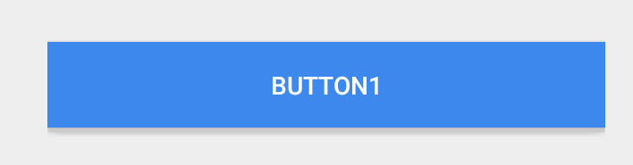
 <Button
 style="?android:attr/buttonStyleSmall"
 android:background="?attr/colorPrimary"
 android:textColor="@color/white"
 android:textAllCaps="true"
 android:layout_width="fill_parent"
 android:layout_height="wrap_content"
 android:text="Button1"
 />

背景 以下是一个普通按钮,效果正常。

<Button
 style="?android:attr/buttonStyleSmall"
 android:layout_width="fill_parent"
 android:layout_height="wrap_content"
 android:textAllCaps="true"
 android:text="Button1"
/>

默认按钮


9
发生这种情况是因为您用所有具有纯色的漂亮“材质”效果替换了背景。至于在保持“材质”效果的同时如何为按钮正确着色,SO上尚无人能够弄清楚。
内森·沃尔特斯

2
@SweetWisher更改背景颜色时,按钮中未应用波纹和其他效果。
萨特什

1
@NathanWalters但是默认的灰色是丑陋的。:-(
萨西什

6
相信我,我知道...无论谁想出正确的方法,我们都会背负沉重的债务。
内森·沃尔特斯

Answers:


431

使用时android:background,您将用空白替换按钮的大部分样式和外观。

更新:AppCompat的23.0.0版本开始,有一种新样式,该样式将主题的颜色用于禁用的颜色和启用的颜色。Widget.AppCompat.Button.ColoredcolorButtonNormalcolorAccent

这使您可以通过以下方式将其直接应用于按钮

<Button
  ...
  style="@style/Widget.AppCompat.Button.Colored" />

如果您需要自定义colorButtonNormalcolorAccent,则可以ThemeOverlay按照本提示android:theme按钮上的说明使用。

上一个答案

您可以在v21目录中使用可绘制背景作为背景,例如:

<?xml version="1.0" encoding="utf-8"?>
<ripple xmlns:android="http://schemas.android.com/apk/res/android"
        android:color="?attr/colorControlHighlight">
    <item android:drawable="?attr/colorPrimary"/>
</ripple>

这样可以确保您的背景色是?attr/colorPrimary默认的波纹动画,并具有默认的波纹动画?attr/colorControlHighlight(您也可以根据需要在主题中进行设置)。

注意:您必须为v21以下版本创建自定义选择器:

<?xml version="1.0" encoding="utf-8"?>
<selector xmlns:android="http://schemas.android.com/apk/res/android">
    <item android:drawable="@color/primaryPressed" android:state_pressed="true"/>
    <item android:drawable="@color/primaryFocused" android:state_focused="true"/>
    <item android:drawable="@color/primary"/>
</selector>

假设您想要默认,按下和聚焦状态的颜色。就我个人而言,我在选择过程中拍了一张涟漪的屏幕截图,并从中拉出了主要/聚焦状态。


13
好答案!正是我在寻找的东西,但是在项目决定在drawable-v21中确定可绘制对象之前,需要进行清理和重建。
user1354603 2014年


4
@ianhanniballake我想知道如何在不丢失圆角自定义功能的情况下结合这种工作技术
Joaquin Iurchuk

3
@ianhanniballake只是一个注释,在<item android:drawable ... />下的涟漪状可绘制对象不能为透明颜色。在这种情况下,不会显示涟漪。我花了一段时间才意识到这一点。
伊万·库什特(IvanKušt)2015年

2
使用appcompat 23.1.1和API 22,禁用和启用状态都采用主题的colorButtonNormal颜色。
雷米·戴维(

93

还有另一种简单的解决方案,可以为“平面”按钮提供自定义背景,同时保持其“材质”效果。

  1. 将您的按钮放在ViewGroup中,并在其中设置所需的背景
  2. 将当前主题中的selectableItemBackground设置为按钮的背景(API> = 11)

即:

<FrameLayout
    android:layout_width="wrap_content"
    android:layout_height="wrap_content"
    android:background="@color/blue">
    <Button
        style="?android:attr/buttonStyleSmall"
        android:background="?android:attr/selectableItemBackground"
        android:textColor="@android:color/white"
        android:textAllCaps="true"
        android:layout_width="fill_parent"
        android:layout_height="wrap_content"
        android:text="Button1"
        />
</FrameLayout>

可以用于平面按钮,它可以在API> = 11上工作,并且在> = 21设备上会产生波纹效果,在21之前的版本中保持常规按钮,直到AppCompat也被更新以支持波纹为止。

您还可以仅对> = 21个按钮使用selectableItemBackgroundBorderless


您从字面上看是开箱即用的:-)尽管这是一种实现方法,但它可能会增加代码耦合,并且推荐使用样式。
萨特什

3
这将创建一个带有彩色背景的扁平按钮。但是创建的按钮看起来像一个正方形,没有圆角和阴影效果。
Sanket Berde 2015年

7
确实是@SanketBerde。因为这就是“扁平”按钮。
kiruwka 2015年

2
最初的问题没有提到单位。顺便说一句,如果您的解决方案中有一个<CardView>父级而不是<FrameLayout>,则结果按钮将被升高并带有阴影。这甚至适用于棒棒糖之前的版本。
Sanket Berde 2015年

1
@SanketBerde非常了解CardView方法,感谢您的分享!
kiruwka 2015年

88

这是一种向后兼容的简单方法,可将波纹效果传递给具有自定义背景的凸起按钮。

您的布局应如下所示

<Button
    android:layout_width="wrap_content"
    android:layout_height="wrap_content"
    android:background="@drawable/my_custom_background"
    android:foreground="?android:attr/selectableItemBackground"/>

9
这是完成此操作的最简便的方法。好答案。
泰勒·帕夫

1
api 21+,但不起作用。应用于具有clickable-true,背景(不同颜色,前景指定)的线性布局。
亚历克斯(Alex)

3
由于Button是TextView而不是FrameLayout,foreground因此在23
androidguy,2016年

2
不错!我什至不知道“前景”是一回事!
埃里克·施伦茨

2
奇迹般有效..!
坎南

25

我今天实际上在使用v22库时遇到了这个问题。

假设您使用的是样式,则可以设置colorButtonNormal属性,默认情况下按钮将使用该颜色。

<style name="AppTheme" parent="BaseTheme">
    <!-- Customize your theme here. -->
    <item name="colorPrimary">@color/primaryColor</item>
    <item name="colorPrimaryDark">@color/primaryColorDark</item>
    <item name="colorAccent">@color/accentColor</item>
    <item name="colorButtonNormal">@color/primaryColor</item>
</style>

除此之外,您仍然可以为按钮创建样式,然后在需要各种颜色的情况下对每个按钮使用该样式(未经测试,只是进行推测)。

切记以v21样式android:在项目名称之前添加。


有关各种彩色按钮,请参见其他Robert的答案:stackoverflow.com/a/31825439/1617737
ban-geoengineering

现在设置了背景色,是否可以在上面的代码块中使用常规属性来指定按钮文本的颜色?
ban-geoengineering

24

使用AppCompat(22.1.1+),您可以添加如下样式:

<style name="MyGreenButton">
    <item name="colorButtonNormal">#009900</item>
</style>

只需应用样式即可使用它:

<android.support.v7.widget.AppCompatButton
    style="@style/MyGreenButton"
    android:layout_width="match_width"
    android:layout_height="wrap_content"
    android:text="A Green Button"
    />

通过编程更改颜色,我发现(在API 15或16上)更新颜色的唯一方法是改为使用“背景色列表”。而且它不会删除API 21设备上的漂亮径向动画:

ColorStateList colorStateList = new ColorStateList(new int[][] {{0}}, new int[] {0xFF009900}); // 0xAARRGGBB
button.setSupportBackgroundTintList(colorStateList);

因为button.setBackground(...)button.getBackground().mutate().setColorFilter(...)不会像在API 21上一样更改API 15和16上的按钮颜色。


1
非常感谢您,它对我来说非常有效(即使在XML布局中使用Button作为AppCompat充气器将其替换为AppCompatButton)
Louis CAD

1
使用ColorStateList.valueOf( ... )来构建一个简单的ColorStateList只有一种颜色。
泰格

colorAccent和rippleColor不要在工作作风
亚尔

感谢您对这篇文章。对我ViewCompat.setBackgroundTintList(myButton, ColorStateList.valueOf(myColor); 有用的东西:Javadoc for setSupportBackgroundTintList表示应以这种方式调用。
JerabekJakub

22

@ianhanniballake的答案是绝对正确和简单的。但是花了我几天的时间才明白。对于不了解他的答案的人,这里有更详细的实现

<Button
        android:id="@+id/btn"
        style="@style/MaterialButton"
        ... />


<style name="MaterialButton" parent="Widget.AppCompat.Button.Colored">
    <item name="android:theme">@style/Theme.MaterialButton</item>
   ...
</style>


<style name="Theme.MaterialButton" parent="YourTheme">
    <item name="colorAccent">@color/yourAccentColor</item>
    <item name="colorButtonNormal">@color/yourButtonNormalColor</item>
</style>

===或===

<Button
        android:id="@+id/btn"
        style="@style/Widget.AppCompat.Button.Colored"
        android:theme="@style/Theme.MaterialButton" />

<style name="Theme.MaterialButton" parent="YourTheme">
    <item name="colorAccent">@color/yourAccentColor</item>
    <item name="colorButtonNormal">@color/yourButtonNormalColor</item>
</style>

5
您的答案对我来说是最后一个难题。也可以写colorButtonNormal基本主题@style/AppTheme。这为AppCompat提供了默认颜色,以对按钮进行相应的着色。然后可以使用您的答案为视图单独设置主题。
Siddharth Pant

1
android:theme="Theme.MaterialButton"还是android:theme="@style/Theme.MaterialButton"
osrl

1
@osrl是android:theme="@style/Theme.MaterialButton"。谢谢您的正确性。
Frank Nguyen

12

我使用了backgroundTint和前景:

<Button
    android:layout_width="match_parent"
    android:layout_height="40dp"
    android:backgroundTint="@color/colorAccent"
    android:foreground="?android:attr/selectableItemBackground"
    android:textColor="@android:color/white"
    android:textSize="10sp"/>

afaik的前景色属性没有必要,因为backgroundTint不会覆盖标准波动
朱利安·奥斯

7

我来到这篇文章,是在寻找一种可以使我的ListView商品的背景颜色保持波纹的方法。

我只是将我的颜色添加为背景,并将selectableItemBackground添加为前景:

<style name="my_list_item">
    <item name="android:background">@color/white</item>
    <item name="android:foreground">?attr/selectableItemBackground</item>
    <item name="android:layout_height">@dimen/my_list_item_height</item>
</style>

它就像一个魅力。我猜同样的技术也可以用于按钮。祝好运 :)


6

如果您对ImageButton感兴趣,可以尝试以下简单的操作:

<ImageButton
    android:layout_width="wrap_content"
    android:layout_height="wrap_content"
    android:src="@android:drawable/ic_button"
    android:background="?attr/selectableItemBackgroundBorderless"
/>

5

v22.1appcompat-v7引入了一些新的可能性。现在可以仅将一个特定主题分配给一个视图。

不推荐使用app:theme来设置工具栏样式。现在,您可以在所有API级别7和更高版本的设备上使用android:theme工具栏,并在API级别11和更高级别的设备上使用android:theme支持所有小部件。

因此,我们无需在全局主题中设置所需的颜色,而是创建一种新的颜色并将其仅分配给 Button

例:

<style name="MyColorButton" parent="Theme.AppCompat.Light.DarkActionBar">
        <item name="colorButtonNormal">@color/myColor</item>
</style>

并使用此样式作为您的主题 Button

<Button
 style="?android:attr/buttonStyleSmall"
 android:layout_width="fill_parent"
 android:layout_height="wrap_content"
 android:text="Button1"
 android:theme="@style/MyColorButton"/>

4

如果您可以使用第三方库,请查看traex / RippleEffect。它使您仅需几行代码即可向任何视图添加波纹效果。您只需要在xml布局文件中包装要与com.andexert.library.RippleView容器产生波纹效果的元素即可。

另外,它还要求Min SDK 9,这样您才能在各个OS版本之间实现设计一致性。

这是从图书馆的GitHub回购中获取的示例:

<com.andexert.library.RippleView
    android:layout_width="wrap_content"
    android:layout_height="wrap_content"
    app:rv_centered="true">

    <ImageView
        android:layout_width="100dp"
        android:layout_height="100dp"
        android:src="@android:drawable/ic_menu_edit"
        android:background="@android:color/holo_blue_dark"/> 

</com.andexert.library.RippleView>

您可以通过将此属性添加到R​​ippleView元素来更改波纹颜色: app:rv_color="@color/my_fancy_ripple_color


3
<android.support.v7.widget.AppCompatButton
    android:layout_width="wrap_content"
    android:layout_height="wrap_content"
    app:backgroundTint="#fff"
    android:textColor="#000"
    android:text="test"/>

xmlns:app="http://schemas.android.com/apk/res-auto"

并且颜色会在脂前脂肪上接受


2

很棒的教程Alex Lockwood中介绍了两种方法:http : //www.androiddesignpatterns.com/2016/08/coloring-buttons-with-themeoverlays-background-tints.html :

方法1:使用ThemeOverlay修改按钮的背景色

<!-- res/values/themes.xml -->
<style name="RedButtonLightTheme" parent="ThemeOverlay.AppCompat.Light">
    <item name="colorAccent">@color/googred500</item>
</style>

<Button
    style="@style/Widget.AppCompat.Button.Colored"
    android:layout_width="wrap_content"
    android:layout_height="wrap_content"
    android:theme="@style/RedButtonLightTheme"/>

方法2:设置AppCompatButton的背景色

<!-- res/color/btn_colored_background_tint.xml -->
<selector xmlns:android="http://schemas.android.com/apk/res/android">

    <!-- Disabled state. -->
    <item android:state_enabled="false"
          android:color="?attr/colorButtonNormal"
          android:alpha="?android:attr/disabledAlpha"/>

    <!-- Enabled state. -->
    <item android:color="?attr/colorAccent"/>

</selector>

<android.support.v7.widget.AppCompatButton
    android:layout_width="wrap_content"
    android:layout_height="wrap_content"
    app:backgroundTint="@color/btn_colored_background_tint"/>

2

以编程方式应用颜色:

if (android.os.Build.VERSION.SDK_INT >= android.os.Build.VERSION_CODES.LOLLIPOP) {

    ColorStateList colorStateListRipple = new ColorStateList(
            new int[][] {{0}},
            new int[] {Color.WHITE} // ripple color
            );

    RippleDrawable rippleDrawable = (RippleDrawable) myButton.getBackground();
    rippleDrawable.setColor(colorStateListRipple);
    myButton.setBackground(rippleDrawable); // applying the ripple color
}

ColorStateList colorStateList = new ColorStateList(
        new int[][]{
                new int[]{android.R.attr.state_pressed}, // when pressed
                new int[]{android.R.attr.state_enabled}, // normal state color
                new int[]{} // normal state color
        },
        new int[]{
                Color.CYAN, // when pressed
                Color.RED, // normal state color
                Color.RED // normal state color
        }
);

ViewCompat.setBackgroundTintList(myButton, colorStateList); // applying the state colors

-1

我尝试了这个:

android:backgroundTint:"@color/mycolor"

而不是更改背景属性。这不会消除实质影响。


这不适用于棒棒糖之前的设备(70%的市场份额)。实际上,它已经被向后移植,但是截至目前,Android Studio在不使用android前缀的情况下仍显示错误。
Siddharth Pant
By using our site, you acknowledge that you have read and understand our Cookie Policy and Privacy Policy.
Licensed under cc by-sa 3.0 with attribution required.