如何使用CSS制作花式箭头?


102

好的,所以每个人都知道您可以使用此三角形:

#triangle {
    width: 0;
    height: 0;
    border-left: 50px solid transparent;
    border-right: 50px solid transparent;
    border-bottom: 100px solid red;
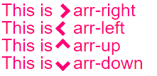
}

然后产生一个实心的三角形。但是,您将如何像这样制作一个空心箭头状的三角形?

在该点只有两条线相交的箭头。 就像大于号:>


3
两个旋转的矩形。
SLaks 2014年


5
使用很大的字体?
GolezTrol 2014年

2
AAAAAHHHH。j08691知道了。谢谢!
Tommay 2014年

4
检查@ j08691弄清钱的正确性。实现此目的的另一种方法是使用字体包,例如Awesome Fonts fortawesome.github.io/Font-Awesome/icon/chevron-right
crazymatt 2014年

Answers:


93

您可以使用beforeafter伪元素,然后对其应用一些CSS。有多种方法。您可以同时添加beforeafter,并旋转和定位它们以形成其中一个条形图。一个更简单的解决方案是在before元素上添加两个边框,然后使用旋转它transform: rotate

向下滚动以获取使用实际元素而不是pseuso元素的其他解决方案

在这种情况下,我将箭头作为项目符号添加到列表中,并使用em大小使其与列表字体大小正确匹配。

ul {
    list-style: none;
}

ul.big {
    list-style: none;
    font-size: 300%
}

li::before {
    position: relative;
    /* top: 3pt; Uncomment this to lower the icons as requested in comments*/
    content: "";
    display: inline-block;
    /* By using an em scale, the arrows will size with the font */
    width: 0.4em;
    height: 0.4em;
    border-right: 0.2em solid black;
    border-top: 0.2em solid black;
    transform: rotate(45deg);
    margin-right: 0.5em;
}

/* Change color */
li:hover {
  color: red; /* For the text */
}
li:hover::before {
  border-color: red; /* For the arrow (which is a border) */
}
<ul>
    <li>Item1</li>
    <li>Item2</li>
    <li>Item3</li>
    <li>Item4</li>
</ul>

<ul class="big">
    <li>Item1</li>
    <li>Item2</li>
    <li>Item3</li>
    <li>Item4</li>
</ul>

当然,您不需要使用beforeafter,也可以将相同的技巧应用于普通元素。对于上面的列表,它很方便,因为您不需要其他标记。但是有时候您可能还是想要(或需要)标记。您可以使用divspan,我什至看到人们甚至i为“图标” 回收了元素。因此该标记可能如下所示。是否<i>正确使用该方法尚有待商,,但为了安全起见,您也可以使用跨度。

/* Default icon formatting */
i {
  display: inline-block;
  font-style: normal;
  position: relative;
}

/* Additional formatting for arrow icon */
i.arrow {
    /* top: 2pt; Uncomment this to lower the icons as requested in comments*/
    width: 0.4em;
    height: 0.4em;
    border-right: 0.2em solid black;
    border-top: 0.2em solid black;
    transform: rotate(45deg);
}
And so you can have an <i class="arrow" title="arrow icon"></i> in your text.
This arrow is <i class="arrow" title="arrow icon"></i> used to be deliberately lowered slightly on request.
I removed that for the general public <i class="arrow" title="arrow icon"></i> but you can uncomment the line with 'top' <i class="arrow" title="arrow icon"></i> to restore that effect.

如果您希望获得更多灵感,请务必查看Nicolas Gallagher撰写的这个纯CSS图标的超赞库。:)


这工作得很好,但是有几件事需要修改。1.如何在不向下移动其余文本的情况下稍微向下移动箭头?我尝试了#arrow :: after,然后设置了页边距上限,但这使所有内容(包括文本)向下移动。2.我需要它来改变鼠标悬停时的颜色。现在,只有文本会更改颜色。我如何才能同时更改文本和箭头?
Tommay 2014年

要更改箭头的颜色,您将需要更改border-color,因为箭头实际上不是字符而是边框。对于定位,您可以添加position: relative到箭头,然后使用top和进行移动left。我已经在修改后的第一个代码段和第二个代码段中展示了定位。注意不错的组合li:hover::before,它指before的是悬停列表项的伪元素。
GolezTrol 2014年

实际上,还有一件事:因此,我现在尝试将此文本居中(使用after元素)。问题在于,此after元素显然占据了很多不可见的空间,结果文本显得非常偏离中心。如何将不可见空间设置为0?我尝试左:0和右:0,以及margin-left:0和margin-right:0,都不起作用。
Tommay 2014年

我不确定您的意思,但是伪元素0本身已经有一个空白,因此您需要一个负空白才能消除任何空白。例如在第二个片段中,您可以添加margin-left: -0.4em;箭头,将箭头放在前一个单词的旁边,没有任何空格。
GolezTrol 2014年


71

这比其他建议要容易得多。

只需画一个正方形并应用 border属性应用于仅两个连接侧即可。

然后根据您希望箭头指向的方向旋转正方形,例如: transform: rotate(<your degree here>)

.triangle {
    border-right: 10px solid; 
    border-bottom: 10px solid;
    height: 30px;
    width: 30px;
    transform: rotate(-45deg);
}
<div class="triangle"></div>


1
这是一个完美的答案,确实需要被接受。很简单,一点点效果。
安德鲁·福克纳

@AndrewFaulkner很高兴它有所帮助。
艾伦·邓宁

38

响应式人字形/箭头

他们调整你的自动文本,并彩色相同的颜色。即插即用:)
jsBin演示游乐场

在此处输入图片说明

body{
  font-size: 25px; /* Change font and  see the magic! */
  color: #f07;     /* Change color and see the magic! */
} 

/* RESPONSIVE ARROWS */
[class^=arr-]{
  border:       solid currentColor;
  border-width: 0 .2em .2em 0;
  display:      inline-block;
  padding:      .20em;
}
.arr-right {transform:rotate(-45deg);  -webkit-transform:rotate(-45deg);}
.arr-left  {transform:rotate(135deg);  -webkit-transform:rotate(135deg);}
.arr-up    {transform:rotate(-135deg); -webkit-transform:rotate(-135deg);}
.arr-down  {transform:rotate(45deg);   -webkit-transform:rotate(45deg);}
This is <i class="arr-right"></i> .arr-right<br>
This is <i class="arr-left"></i> .arr-left<br>
This is <i class="arr-up"></i> .arr-up<br>
This is <i class="arr-down"></i> .arr-down


1
哇,这个符号实际上叫做“右上角”!真好 :)与边框相比,对宽度的控制较少,但仍然显示字体的可能性为+1。对于其他符号,这可能比CSS形状技巧更好。
GolezTrol 2014年

请注意,如果用户没有字体图标,字体图标将无法正常工作,因此您必须确保对大多数系统可用的字体有适当的备用。您也可以选择通过CSS下载字体,但是为几个图标这样做会浪费带宽。但是,如果您有很多图标,或者想要以自己的样式设置它们,则可以选择将所有图标添加到自己的图标字体中,然后通过CSS加载。这样,您(几乎)可以确定拥有正确的字体,而不必下载少数几个符号的大字体。
GolezTrol 2014年

在HTML 4.0中,采用了总共38887个字符的集合。由于v. 6.2.0 September 2012 1Unicode UTF-8字符集上升到110182,并且现在有了HTML5和默认的UTF-8,并且看起来我们的字符看起来很好:unicode.org/Public/UNIDATA/UnicodeData.txt
Roko C. Buljan 2014年

角色存在的事实并不意味着可以显示它。您需要适当的字体来显示它。这就是答案第一版中的字符失败的原因:因为我的浏览器的默认字体不包含这些字符。因此,要使用这样的字符,您将需要指定要使用的字体,并且如果并非所有平台都提供其他字体,则必须提供适当的备用字体。例如,该\231d字符可能在此处可用,但在Mac或Android设备上不可用。HTML版本和响应编码与之无关。
GolezTrol 2014年

你能做得更薄吗?而不是那么胖?更改字体粗细不会执行任何操作。
James111 '16

14

这是另一种方法:

1)使用乘法字符: &times; ×

2)用 overflow:hidden

3)然后添加一个三角形作为尖端的伪元素。

这样做的好处是不需要转换。(它将在IE8 +中运行)

小提琴

.arrow {
  position: relative;
}
.arrow:before {
  content: '×';
  display: inline-block;
  position: absolute;
  font-size: 240px;
  font-weight: bold;
  font-family: verdana;
  width: 103px;
  height: 151px;
  overflow: hidden;
  line-height: 117px;
}
.arrow:after {
  content: '';
  display: inline-block;
  position: absolute;
  left: 101px;
  top: 51px;
  width: 0;
  height: 0;
  border-style: solid;
  border-width: 25px 0 25px 24px;
  border-color: transparent transparent transparent black;
}
<div class="arrow"></div>


2
适用于Internet Explorer,Chrome和Firefox。
托马斯

11

只需伪元素之前之后 使用-CSS

*{box-sizing: border-box; padding: 0; margin: 0}
:root{background: white; transition: background .3s ease-in-out}
:root:hover{background: red }
div{
  margin: 20px auto;
  width: 150px;
  height: 150px;
  position:relative
}

div:before, div:after{
  content: '';
  position: absolute;
  width: 75px;
  height: 20px;
  background: black;
  left: 40px
}

div:before{
  top: 45px;
  transform: rotateZ(45deg)
}

div:after{
  bottom: 45px;
  transform: rotateZ(-45deg)
}
<div/>


8

另一种使用边框且没有CSS3属性的方法:

div, div:after{
    border-width: 80px 0 80px 80px;
    border-color: transparent transparent transparent #000;
    border-style:solid;
    position:relative;
}
div:after{
    content:'';
    position:absolute;
    left:-115px; top:-80px;
    border-left-color:#fff;
}
<div></div>


4

>本身就是非常美妙的箭!只需在其前面添加一个div并为其设置样式即可。

div{
  font-size:50px;
}
div::before{
  content:">";
  font: 50px 'Consolas';
  font-weight:900;
}
<div class="arrowed">Hatz!</div>


2
多数民众赞成在一个“大于”符号,而不是箭头。
Mark Knol 2015年

@MarkKnol这与其他所有人的箭头的外观有何不同?对我来说,这似乎是最好的解决方案。
达林

2

使用Roko C.Buljan方块阴影技巧,具有悬停效果的向左箭头

.arr {
  display: inline-block;
  padding: 1.2em;
  box-shadow: 8px 8px 0 2px #777 inset;
}
.arr.left {
  transform: rotate(-45deg);
}
.arr.right {
  transform: rotate(135deg);
}
.arr:hover {
  box-shadow: 8px 8px 0 2px #000 inset
}
<div class="arr left"></div>
<div class="arr right"></div>


1

我需要input在项目中将更改为箭头。以下是最后的工作。

#in_submit {
  background-color: white;
  border-left: #B4C8E9;
  border-top: #B4C8E9;
  border-right: 3px solid black;
  border-bottom: 3px solid black;
  width: 15px;
  height: 15px;
  transform: rotate(-45deg);
  margin-top: 4px;
  margin-left: 4px;
  position: absolute;
  cursor: pointer;
}
<input id="in_submit" type="button" class="convert_btn">

在这里提琴


很棒的代码!它只使用一个很难做到的元素:)
www139 2015年

0

.arrow {
  display : inline-block;
  font-size: 10px; /* adjust size */
  line-height: 1em; /* adjust vertical positioning */
  border: 3px solid #000000;
  border-left: transparent;
  border-bottom: transparent;
  width: 1em; /* use font-size to change overall size */
  height: 1em; /* use font-size to change overall size */
}

.arrow:before {
  content: "\00a0"; /* needed to hook line-height to "something" */
}

.arrow.left {
  margin-left: 0.5em;
  -webkit-transform: rotate(225deg);
  -moz-transform: rotate(225deg);
  -o-transform: rotate(225deg);
  -ms-transform: rotate(225deg);
  transform: rotate(225deg);
}

.arrow.right {
  margin-right: 0.5em;
  -webkit-transform: rotate(45deg);
  -moz-transform: rotate(45deg);
  -o-transform: rotate(45deg);
  -ms-transform: rotate(45deg);
  transform: rotate(45deg);
}

.arrow.top {
  line-height: 0.5em; /* use this to adjust vertical positioning */
  margin-left: 0.5em;
  margin-right: 0.5em;
  -webkit-transform: rotate(-45deg);
  -moz-transform: rotate(-45deg);
  -o-transform: rotate(-45deg);
  -ms-transform: rotate(-45deg);
  transform: rotate(-45deg);
}

.arrow.bottom {
  line-height: 2em;
  /* use this to adjust vertical positioning */
  margin-left: 0.5em;
  margin-right: 0.5em;
  -webkit-transform: rotate(135deg);
  -moz-transform: rotate(135deg);
  -o-transform: rotate(135deg);
  -ms-transform: rotate(135deg);
  transform: rotate(135deg);
}
<div>
  here are some arrows
  <div class='arrow left'></div> space
  <div class='arrow right'></div> space
  <div class='arrow top'></div> space
  <div class='arrow bottom'></div> space with proper spacing?
</div>

与Roko C类似,但对大小和位置的控制更多。

By using our site, you acknowledge that you have read and understand our Cookie Policy and Privacy Policy.
Licensed under cc by-sa 3.0 with attribution required.