如何使两个并排的div保持相同的高度?


440

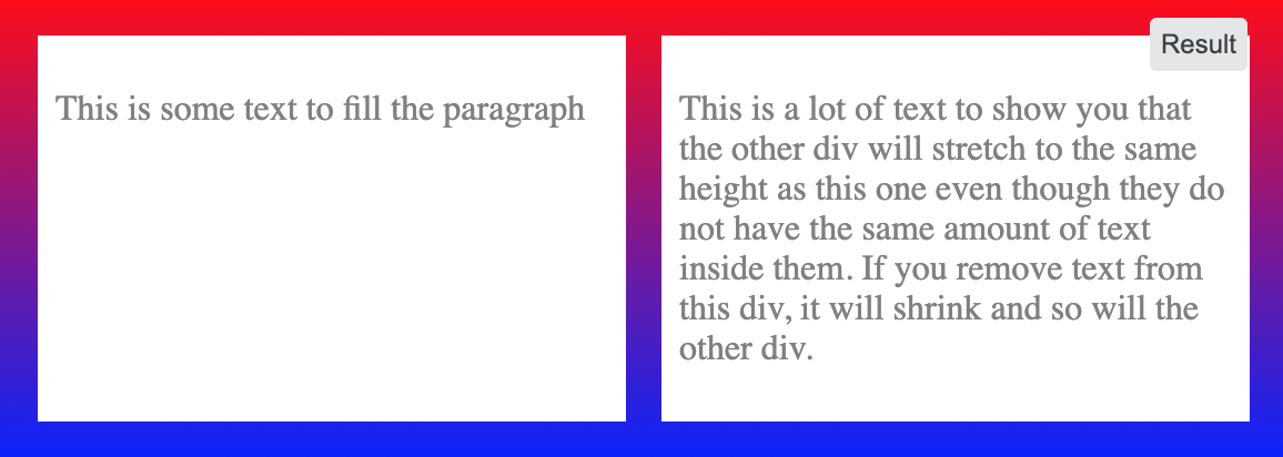
我有两个div并排。我希望它们的高度相同,如果其中之一调整大小,则保持不变。我无法弄清楚这一点。有想法吗?

为了澄清我一个令人困惑的问题,我希望两个框的尺寸始终相同,因此如果一个框由于文本放置而增大,则另一个框应与高度匹配。

<div style="overflow: hidden">
    <div style="border:1px solid #cccccc; float:left; padding-bottom:1000px; margin-bottom:-1000px">
        Some content!<br/>
        Some content!<br/>
        Some content!<br/>
        Some content!<br/>
        Some content!<br/>
    </div>
    <div style="border:1px solid #cccccc; float:left; padding-bottom:1000px; margin-bottom:-1000px">
        Some content!
    </div>
</div>


您是否想要其中一个变得更大,而不是另一个保持相同的身高大小?
Wai Wong 2010年

可以在这里找到一个不是解决方案但处于可编辑环境中的示例:jsfiddle.net/PCJUQ
MvanGeest 2010年

Answers:


591

弹性盒

使用flexbox时,它是一个声明:

.row {
  display: flex; /* equal height of the children */
}

.col {
  flex: 1; /* additionally, equal width */
  
  padding: 1em;
  border: solid;
}
<div class="row">
  <div class="col">Lorem ipsum dolor sit amet, consectetur adipisicing elit.</div>
  <div class="col">Lorem ipsum dolor sit amet, consectetur adipisicing elit. Ad omnis quae expedita ipsum nobis praesentium velit animi minus amet perspiciatis laboriosam similique debitis iste ratione nemo ea at corporis aliquam.</div>
</div>

较旧的浏览器可能需要前缀,请参阅浏览器支持


17
flexbox就像一个魅力。如果您正在开发响应式设计,并且希望第二个div在较小的屏幕中显示,则需要将.row设置为display:block; 在您的媒体查询中。
尼克·祖鲁

7
@NickZulu我相信在这种情况下,您应该设置flex-direction: columnjsfiddle.net/sdsgW/1
Pavlo

1
@Eckstein两种解决方案都不需要。参见演示。
2014年

3
直到我增加了height:100%,这对我才起作用;到儿童专栏
Jacob Raccuia

1
是否可以让一个特定的子div确定另一个的高度?因此,如果其他子div的内容正在更改,则无法更改该特定div的高度
Narek Malkhasyan

149

这是很多人遇到的常见问题,但幸运的是,像Ed Eliot的博客这样的聪明人已经在网上发布了他们的解决方案。

你基本上什么是使双方的div /列非常高的通过添加padding-bottom: 100%,然后“诱骗浏览器”,以为他们没有那么高的使用margin-bottom: -100%。Ed Eliot在他的博客中对此进行了更好的解释,其中还包括许多示例。

.container {
    overflow: hidden;
}
.column {
    float: left;
    margin: 20px;
    background-color: grey;
    padding-bottom: 100%;
    margin-bottom: -100%;
}
<div class="container">

    <div class="column">
        Some content!<br>
        Some content!<br>
        Some content!<br>
        Some content!<br>
        Some content!<br>
    </div>

    <div class="column">
        Something
    </div>

</div>


1
关于“一个真实布局”的解释有点差,但是在检查了第一个链接后,我从他使用的一个示例中很好地实现了它。但是,这确实很糟糕,因为您必须使用图像来表示列的底部边框,并且它对于跨浏览器的支持是可疑的。但是,它确实有效,并且不依赖javascript,因此我将其标记为正确。谢谢!
NibblyPig 2010年

这似乎在旧的IE浏览器中不起作用(是的,很遗憾,我仍然必须支持IE6)。有什么办法使它兼容吗?
Strongriley 2012年

1
@strongriley Checkout Ed Eliot的博客:ejeliot.com/blog/61应该可以在IE6中使用。也许是其他地方引起的问题?
mqchen 2012年

1
如果窗口太窄并且div相互放置,则会中断此操作。
WhyNotHugo 2013年

1
您如何定义表格单元格中实际要出现的单元格填充,例如padding: 7px 10px,如果该padding-bottom属性设置为100%?(overflow:hidden我也需要PS row
user1063287 '18

55

这是CSS从未真正解决过的地方-您只能使用<table>标签(或使用CSS display:table*值伪造标签),因为这是唯一实现“保持一堆相同高度的元素”的地方。

<div style="display: table-row;">

    <div style="border:1px solid #cccccc; display: table-cell;">
        Some content!<br/>
        Some content!<br/>
        Some content!<br/>
        Some content!<br/>
        Some content!<br/>
    </div>

    <div style="border:1px solid #cccccc;  display: table-cell;">
        Some content!
    </div>

</div>

此功能适用于所有版本的Firefox,Chrome和Safari,Opera(至少8版)以及IE(8版)。


5
需要支持IE6 / IE7的用户无法使用此解决方案,但我认为它是最干净的。
twsaef 2012年

2
这个答案是完美的!提醒一下:某些客户可能需要“表格”而不是“表格行”
tiborka 2013年

@ user2025810:噢,谢谢。你知道哪些客户端需要table的不是table-row
Paul D. Waite

@ user2025810:呀,不能说我曾经在那做过测试:)不过,很高兴知道,欢呼。(鉴于其PDF焦点,我敢打赌它支持CSS 2.1的某些与打印相关的功能,这些功能在浏览器中无法很好地实现。)
Paul D. Waite

7
使用此解决方案- width除非您display: table在父元素上添加,否则不要为您的div 使用百分比,这会使事情变得混乱。
Alex G

42

使用jQuery

使用jQuery,您可以使用超简单的单行脚本来实现。

// HTML
<div id="columnOne">
</div>

<div id="columnTwo">
</div>

// Javascript
$("#columnTwo").height($("#columnOne").height());

使用CSS

这有点有趣。该技术称为仿柱。或多或少,您实际上并没有将实际高度设置为相同,但是您装配了一些图形元素,使它们看起来相同的高度。


我认为使用JavaScript是一种非常好的方法。问题是-如果禁用,它会崩溃。我想无论如何我都会用到它,并尽我所能建立最好的应急方案;-)谢谢!
nicorellius

13
这意味着columnOne的高度始终大于columnTwo。
塞巴斯蒂安更丰富的

1
在应用列的高度之前,应先比较它们的高度。我认为js是解决此问题的最佳方法,几乎​​所有浏览器都启用了js,如果没有启用,它们应该退出您的网站和许多其他网站。
SalmanShariati 2014年

6
这也仅在首次加载页面时起作用。如果随后调整窗口大小,导致div调整大小,则它们将不会保持同步
ikariw 2015年

16

我很惊讶没有人提到(非常古老但可靠的)绝对列技术:http : //24ways.org/2008/absolute-columns/

在我看来,它远胜于人造柱和One True Layout的技术。

一般的想法是,with的元素position: absolute;将相对于has的最近的父元素position: relative;。然后,您可以通过分配top: 0px;和来拉伸列以填充100%的高度bottom: 0px;(或您实际需要的任何像素/百分比)。这是一个示例:

<!DOCTYPE html>
<html>
  <head>
    <style>
      #container
      {
        position: relative;
      }

      #left-column
      {
        width: 50%;
        background-color: pink;
      }

      #right-column
      {
        position: absolute;
        top: 0px;
        right: 0px;
        bottom: 0px;
        width: 50%;
        background-color: teal;
      }
    </style>
  </head>
  <body>
    <div id="container">
      <div id="left-column">
        <ul>
          <li>Foo</li>
          <li>Bar</li>
          <li>Baz</li>
        </ul>
      </div>
      <div id="right-column">
        Lorem ipsum
      </div>
    </div>
  </body>
</html>

1
如果右列比左列多,则内容溢出。
大卫

11

您可以使用Jquery的Equal Heights插件来完成此插件,使所有div的高度与其他div完全相同。如果其中一个增长,另一个也会增长。

这里是实施示例

Usage: $(object).equalHeights([minHeight], [maxHeight]);

Example 1: $(".cols").equalHeights(); 
           Sets all columns to the same height.

Example 2: $(".cols").equalHeights(400); 
           Sets all cols to at least 400px tall.

Example 3: $(".cols").equalHeights(100,300); 
           Cols are at least 100 but no more than 300 pixels tall. Elements with too much content will gain a scrollbar.

链接在这里

http://www.cssnewbie.com/equalheights-jquery-plugin/


8

您可以使用Faux Columns

基本上,它使用包含DIV的背景图像来模拟两个等高DIV。使用此技术还可以将阴影,圆角,自定义边框或其他时髦的图案添加到容器中。

不过,仅适用于定宽框。

经过良好测试,可以在每种浏览器中正常工作。


7

在搜索此答案时刚发现此线程。我刚刚做了一个小的jQuery函数,希望对您有所帮助,就像一个魅力:

JAVASCRIPT

var maxHeight = 0;
$('.inner').each(function() {
    maxHeight = Math.max(maxHeight, $(this).height());
});
$('.lhs_content .inner, .rhs_content .inner').css({height:maxHeight + 'px'});

的HTML

<div class="lhs_content">
    <div class="inner">
        Content in here
    </div>
</div>
<div class="rhs_content">
    <div class="inner">
        More content in here
    </div>
</div>

1
我使用outerHeight包括填充和边框。我认为这是最干净的解决方案。
塞巴斯蒂安更丰富的

我一直在寻找的完美解决方案。其他解决方案适用于行有几列的情况,但是这种方法更适合复杂的html内容。少量添加:在响应页面中调整文档大小时,内容高度不会因为固定而改变。因此,我添加了$('。inner')。css({height:“ initial”}); 在“每个功能”之前将高度设置为默认值。
bafsar

5

CSS网格方式

实现此目的的现代方法(这还避免了<div class="row"></div>每两个项目都必须声明一个-wrapper)将利用CSS网格。这也使您可以轻松控制项目行/列之间的间隙。

.grid-container {
  display: grid;
  grid-template-columns: repeat(2, 1fr); /* or simply "1fr 1fr;" */
  grid-row-gap: 10px; 
  grid-column-gap: 10px;
}

.grid-item {
  background-color: #f8f8f8;
  box-shadow: 0 0 3px #666;
  text-align: center;
}

.grid-item img {
  max-width: 100%;
}
<div class="grid-container">
  <div class="grid-item">1 <br />1.1<br />1.1.1</div>
  <div class="grid-item">2</div>
  <div class="grid-item">3
    <img src="https://lorempixel.com/420/320/abstract/1/Sample" alt="" />
    3.1
  </div>
  <div class="grid-item">4</div>
  <div class="grid-item">5 <br />1.1<br />1.1.1</div>
  <div class="grid-item">6<img src="https://lorempixel.com/400/300/abstract/" alt="" />
    6.1</div>
  <div class="grid-item">7</div>
  <div class="grid-item">8</div>
  <div class="grid-item">9 <br />1.1<br />1.1.1</div>
  <div class="grid-item">10</div>
  <div class="grid-item">11
    <img src="https://lorempixel.com/420/320/abstract/1/Sample" alt="" />
    11.1
  </div>
  <div class="grid-item">12</div>
</div>


4

这个问题是在6年前提出的,但如今使用Flexbox布局仍然值得给出一个简单的答案。

只需将以下CSS添加到父亲<div>,它将起作用。

display: -webkit-flex;
display: flex;
flex-direction: row;
align-items: stretch;

前两行声明它将显示为flexbox。并flex-direction: row告诉浏览器其子级将显示在列中。并且align-items: stretch将满足所有子元素将拉伸到相同高度的要求,其中之一会变得更高。


1
@TylerH但是,被询问者已经编辑了他的问题,并添加了I'd like both boxes to always be the same size, so if one grows because text is placed into it, the other one should grow to match the height.未被接受的答案中未提及的问题……我只是在这里完成了。也许我应该对接受的答案发表评论?
Hegwin '16

1
它没有被明确提及,因为它已经被简单的CSS声明所覆盖。全屏打开答案的摘录,并调整浏览器窗口的大小以查看;他们保持彼此相同的大小。
TylerH '16

1
即使接受的答案使用flexbox,此方法也有不同的方法。align-items:拉伸是使我在非常特殊的情况下解决问题的道路。
BenoitLussier

align-items: stretch;flex 不是默认值吗?
madav

3

使用CSS Flexbox和min-height对我有用

在此处输入图片说明

假设您有一个内部有两个div的容器,并且希望这两个div具有相同的高度。

您将在容器上设置' display:flex '以及' align-items:Stretch '

然后给孩子div一个最小高度 ”为100%

见下面的代码

.container {
  width: 100%;
  background: linear-gradient(red,blue);
  padding: 1em;
  /* important */
  display: flex;
  /* important */
  align-items: stretch;
  justify-content: space-around;
}

.child {
  width: 100%;
  background: white;
  color: grey;
  margin: 0 .5em;
  padding: .5em;
  /* important */
  min-height: 100%;
}
<div class="container">
  
  <div class="child"><p>This is some text to fill the paragraph</p></div>
  <div class="child"><p>This is a lot of text to show you that the other div will stretch to the same height as this one even though they do not have the same amount of text inside them. If you remove text from this div, it will shrink and so will the other div.</p></div>
  
</div>


2

如果您不介意divs中的一个是母带并决定两个divs 的高度,则可以这样做:

小提琴

无论如何,div右侧的都会扩大或挤压并溢出以匹配高度。div左侧。

div必须是容器的直接子代,并且必须在容器内指定其宽度。

相关CSS:

.container {
    background-color: gray;
    display: table;
    width: 70%;
    position:relative;
}

.container .left{
    background-color: tomato;
    width: 35%;
}

.container .right{
    position:absolute;
    top:0px;
    left:35%;
    background-color: orange;
    width: 65%;
    height:100%;
    overflow-y: auto;
}

2

我喜欢使用伪元素来实现这一目标。您可以将其用作内容的背景,并让它们填充空间。

使用这些方法,您可以在列,边框等之间设置边距。

.wrapper{
  position: relative;
  width: 200px;
}
.wrapper:before,
.wrapper:after{
  content: "";
  display: block;
  height: 100%;
  width: 40%;
  border: 2px solid blue;
  position: absolute;
  top: 0;
}
.wrapper:before{
  left: 0;
  background-color: red;
}
.wrapper:after{
  right: 0;
  background-color: green;
}

.div1, .div2{
  width: 40%;
  display: inline-block;
  position: relative;
  z-index: 1;
}
.div1{
  margin-right: 20%;
}
<div class="wrapper">
  <div class="div1">Content Content Content Content Content Content Content Content Content
  </div><div class="div2">Other</div>
</div>


1

小提琴

的HTML

<div class="container">

    <div class="left-column">

    </div>

    <div class="right-column">
        <h1>Hello Kitty!</h1>
        <p>Lorem ipsum dolor sit amet, consectetur adipisicing elit. Laudantium cum accusamus ab nostrum sit laborum eligendi, totam nam aperiam harum officia commodi tempora dolorum. Incidunt earum explicabo deleniti architecto illo!</p>
        <p>Lorem ipsum dolor sit amet, consectetur adipisicing elit. Laudantium cum accusamus ab nostrum sit laborum eligendi, totam nam aperiam harum officia commodi tempora dolorum. Incidunt earum explicabo deleniti architecto illo!</p>
    </div>

</div>

的CSS

.container {
    float: left;
    width: 100%;
    background-color: black;
    position: relative;
    left: 0;
}

.container:before,
.container:after {
    content: " ";
    display: table;
}

.container:after {
    clear: both;
}

.left-column {
    float: left;
    width: 30%;
    height: 100%;
    position: absolute;
    background: wheat;
}

.right-column {
    float: right;
    width: 70%;
    position: relative;
    padding: 0;
    margin: 0;
    background: rebeccapurple;            
}

1

我已经尝试了上面提到的几乎所有方法,但是flexbox解决方案无法在Safari上正常工作,而网格布局方法也无法在IE的较早版本上正常工作。

该解决方案适用于所有屏幕,并且与跨浏览器兼容:

.container {margin:15px auto;}
.container ul {margin:0 10px;}
.container li {width:30%; display: table-cell; background-color:#f6f7f7;box-shadow: 0 2px 5px 0 rgba(0, 0, 0, 0.25);}

@media (max-width: 767px){
    .container li { display: inline-block; width:100%; min-height:auto!important;}
}

上面的方法将等于单元格的高度,对于较小的屏幕(如手机或平板电脑),我们可以使用@media上面提到的方法。


0

您可以使用jQuery轻松实现这一目标。

的CSS

.left, .right {border:1px solid #cccccc;}

jQuery的

$(document).ready(function() {
    var leftHeight = $('.left').height();
    $('.right').css({'height':leftHeight});
});

的HTML

   <div class="left">
    <p>Lorem ipsum dolor sit amet, consectetur adipiscing elit. Morbi malesuada, lacus eu dapibus tempus, ante odio aliquet risus, ac ornare orci velit in sapien. Duis suscipit sapien vel nunc scelerisque in pretium velit mattis. Cras vitae odio sed eros mollis malesuada et eu nunc.</p>
   </div>
   <div class="right">
    <p>Lorem ipsum dolor sit amet.</p>
   </div>

您需要包括jQuery


1
如果两者都<div>具有动态内容,则将无法使用。我说的原因是如果<div class="right">有更多的内容出现另一个问题。
Surya 2013年

0

我知道已经很长时间了,但是我还是分享我的解决方案。这是一个jQuery技巧。

-HTML

<div class="custom-column">
    <div class="column-left">
        asd
        asd<br/>
        asd<br/>
    </div>
    <div class="column-right">
        asd
    </div>
</div>

<div class="custom-column">
    <div class="column-left">
        asd
    </div>
    <div class="column-right">
        asd
        asd<br/>
        asd<br/>
    </div>
</div>

---- CSS

<style>
.custom-column { margin-bottom:10px; }
.custom-column:after { clear:both; content:""; display:block; width:100%; }
    .column-left { float:left; width:25%; background:#CCC; }
    .column-right { float:right; width:75%; background:#EEE; }
</style>

-JQUERY

<script src="js/jquery.min.js"></script>
<script>
$(document).ready(function(){
    $balancer = function() {
        $('.custom-column').each(function(){
            if($('.column-left',this).height()>$('.column-right',this).height()){
                $('.column-right',this).height($('.column-left',this).height())
            } else {
                $('.column-left',this).height($('.column-right',this).height())
            }

        });

    }
    $balancer();
    $(window).load($balancer());
    $(window).resize($balancer());

});
</script>

-1

这是一个jQuery插件,它为同一行上的所有元素设置了相等的高度(通过检查元素的offset.top)。因此,如果您的jQuery数组包含多于一行的元素(不同的offset.top),则每行将基于该行上具有最大高度的元素而具有一个单独的高度。

jQuery.fn.setEqualHeight = function(){

var $elements = [], max_height = [];

jQuery(this).css( 'min-height', 0 );

// GROUP ELEMENTS WHICH ARE ON THE SAME ROW
this.each(function(index, el){ 

    var offset_top = jQuery(el).offset().top;
    var el_height = jQuery(el).css('height');

    if( typeof $elements[offset_top] == "undefined" ){
        $elements[offset_top] = jQuery();
        max_height[offset_top] = 0;
    }

    $elements[offset_top] = $elements[offset_top].add( jQuery(el) );

    if( parseInt(el_height) > parseInt(max_height[offset_top]) )
        max_height[offset_top] = el_height;

});

// CHANGE ELEMENTS HEIGHT
for( var offset_top in $elements ){

    if( jQuery($elements[offset_top]).length > 1 )
        jQuery($elements[offset_top]).css( 'min-height', max_height[offset_top] );

}

};


-2
    var numexcute = 0;
    var interval;
    $(document).bind('click', function () {

        interval = setInterval(function () {
            if (numexcute >= 20) {
                clearInterval(interval);
                numexcute = 0;
            }
            $('#leftpane').css('height', 'auto');
            $('#rightpane').css('height', 'auto');
            if ($('#leftpane').height() < $('#rightpane').height())
                $('#leftpane').height($('#rightpane').height());
            if ($('#leftpane').height() > $('#rightpane').height())

                $('#rightpane').height($('#leftpane').height());
            numexcute++;
        }, 10);

    });

1
请提供任何评论您的答案。
sgnsajgon

-2

我遇到了同样的问题,所以我使用jquery创建了这个小函数,因为jquery是当今每个Web应用程序的一部分。

function fEqualizeHeight(sSelector) {
    var sObjects = $(sSelector);

    var iCount = sObjects.length;

    var iHeights = [];

    if (iCount > 0) {
        $(sObjects).each(function () {
            var sHeight = $(this).css('height');
            var iHeight = parseInt(sHeight.replace(/px/i,''));
            iHeights.push(iHeight);
        });

        iHeights.sort(function (a, b) {
            return a - b
        });

        var iMaxHeight = iHeights.pop();

        $(sSelector).each(function () {
            $(this).css({
                'height': iMaxHeight + 'px'
            });
        });
    }
}

您可以在页面准备事件中调用此函数

$(document).ready(function(){
   fEqualizeHeight('.columns');
});

希望这对您有用。


-3

我最近遇到了这个问题,并不喜欢这种解决方案,因此尝试进行实验。

.mydivclass {inline-block; vertical-align: middle; width: 33%;}


-4
<div>

<div style="border:1px solid #cccccc; float:left; min-height:200px;">

Some content!<br/>
Some content!<br/>
Some content!<br/>
Some content!<br/>
Some content!<br/>

</div>

<div style="border:1px solid #cccccc; float:left; min-height:200px;">

Some content!

</div>

</div>

我在这里所做的是将高度更改为min-height并为其设置了固定值。如果其中一个被调整大小,另一个将保持相同的高度。不确定这是否是您想要的


OP希望div始终具有相同的高度。
西蒙·福斯伯格
By using our site, you acknowledge that you have read and understand our Cookie Policy and Privacy Policy.
Licensed under cc by-sa 3.0 with attribution required.