考虑以下代码段:
.parent {
  display: flex;
  flex-direction: column;
  width: 400px;
  border: 1px solid red;
  align-items: center;
}
.child {
  border: 1px solid blue;
}
<div class="parent">
<div class="child">
Lorem Ipsum is simply dummy text of the printing and typesetting industry
</div>
<div class="child">
Lorem Ipsum is simply dummy text of the printing and typesetting industry
</div>
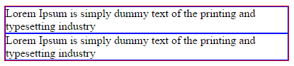
</div>在Chrome中,文本按预期自动换行:
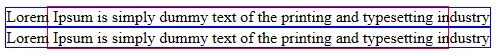
但是,在IE11中,文本未包装:
这是IE中的已知错误吗?(如果是,将不胜感激指针)
有已知的解决方法吗?
这个类似的问题没有明确的答案和官方的指针。
1
可能是IE11 flexbox的
—
Simen S
当我
—
Nathan Perrier
align-items: center从父元素中删除时,问题消失了。这似乎是造成它的原因