如何创建带有圆角的EditText?
Answers:
比CommonsWare编写的方法更简单。只需创建一个可绘制资源来指定EditText绘制方式:
<?xml version="1.0" encoding="utf-8"?>
<!--  res/drawable/rounded_edittext.xml -->
<shape xmlns:android="http://schemas.android.com/apk/res/android"
android:shape="rectangle" android:padding="10dp">
 <solid android:color="#FFFFFF"/>
    <corners
     android:bottomRightRadius="15dp"
     android:bottomLeftRadius="15dp"
  android:topLeftRadius="15dp"
  android:topRightRadius="15dp"/>
</shape>
然后,只需在您的布局中引用此可绘制对象:
<?xml version="1.0" encoding="utf-8"?>
<LinearLayout xmlns:android="http://schemas.android.com/apk/res/android"
    android:orientation="vertical"
    android:layout_width="fill_parent"
    android:layout_height="fill_parent"
    >
<EditText
    android:layout_width="fill_parent"
    android:layout_height="wrap_content"
    android:padding="5dip"
    android:background="@drawable/rounded_edittext" />
</LinearLayout>
您将获得类似以下内容的信息:
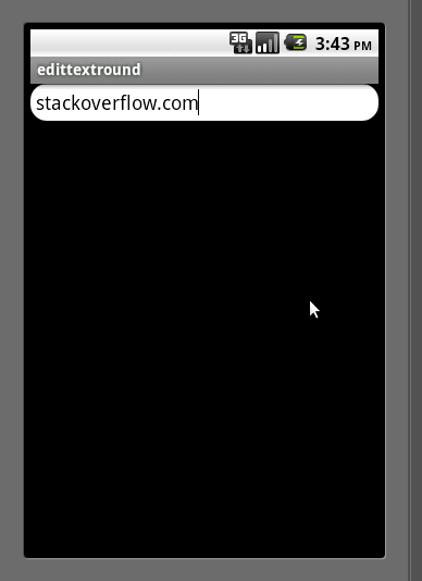
编辑
基于Mark的评论,我想添加为您创建不同状态的方式EditText:
<?xml version="1.0" encoding="utf-8"?>
<!-- res/drawable/rounded_edittext_states.xml -->
<selector xmlns:android="http://schemas.android.com/apk/res/android">
    <item
     android:state_pressed="true"
     android:state_enabled="true"
        android:drawable="@drawable/rounded_focused" />
    <item
     android:state_focused="true"
     android:state_enabled="true"
        android:drawable="@drawable/rounded_focused" />
    <item
     android:state_enabled="true"
        android:drawable="@drawable/rounded_edittext" />
</selector>
这些是状态:
<?xml version="1.0" encoding="utf-8"?>
<!-- res/drawable/rounded_edittext_focused.xml -->
<shape xmlns:android="http://schemas.android.com/apk/res/android"
android:shape="rectangle" android:padding="10dp">
 <solid android:color="#FFFFFF"/>
 <stroke android:width="2dp" android:color="#FF0000" />
    <corners
     android:bottomRightRadius="15dp"
     android:bottomLeftRadius="15dp"
  android:topLeftRadius="15dp"
  android:topRightRadius="15dp"/>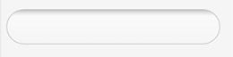
</shape>并且...现在,EditText应该看起来像:
<?xml version="1.0" encoding="utf-8"?>
<LinearLayout xmlns:android="http://schemas.android.com/apk/res/android"
    android:orientation="vertical"
    android:layout_width="fill_parent"
    android:layout_height="fill_parent">
<EditText
    android:layout_width="fill_parent"
    android:layout_height="wrap_content"
    android:text="@string/hello"
    android:background="@drawable/rounded_edittext_states"
    android:padding="5dip"/>
</LinearLayout>
这很棒!它在设备上运行良好,但是当我包括四舍五入的编辑框时,将阻止“图形布局”视图显示我的活动。错误日志给我一个'UnsupportedOperationException:null'。有任何想法吗?
—
本·克莱顿
很高兴知道...实际上我不知道如何解决它。我猜这是Eclipse的ADT错误。
—
Cristian
极好的答案。当我尝试使用最新的ADT进行操作时,什么也没发生,但是UI设计屏幕变得有点阴影。但是出色的答案。从老板那里救了我:)
—
杰伊·马尤
如果您对所有4个角使用相同的半径,
—
Viswanath Lekshmanan 2013年
android:radius而不是定义4条线
这只是一个XML文件中的相同解决方案(带有一些额外的奖励代码):
<?xml version="1.0" encoding="utf-8"?>
<!--  res/drawable/edittext_rounded_corners.xml -->
<selector xmlns:android="http://schemas.android.com/apk/res/android">

<item android:state_pressed="true" android:state_focused="true">
    <shape>
        <solid android:color="#FF8000"/>
        <stroke
            android:width="2.3dp"
            android:color="#FF8000" />
         <corners
            android:radius="15dp" />
    </shape>
</item>

<item android:state_pressed="true" android:state_focused="false">
    <shape>
        <solid android:color="#FF8000"/>
        <stroke
            android:width="2.3dp"
            android:color="#FF8000" />
        <corners
            android:radius="15dp" />
    </shape>
</item>

<item android:state_pressed="false" android:state_focused="true">
    <shape>
        <solid android:color="#FFFFFF"/>
        <stroke
            android:width="2.3dp"
            android:color="#FF8000" />
        <corners
            android:radius="15dp" />
    </shape>
</item>

<item android:state_pressed="false" android:state_focused="false">
    <shape>
        <gradient
            android:startColor="#F2F2F2"
            android:centerColor="#FFFFFF"
            android:endColor="#FFFFFF"
            android:angle="270"
        />
        <stroke
            android:width="0.7dp"
            android:color="#BDBDBD" />
        <corners
            android:radius="15dp" />
    </shape>
</item>

<item android:state_enabled="true">
    <shape>
        <padding
                android:left="4dp"
                android:top="4dp"
                android:right="4dp"
                android:bottom="4dp"
            />
    </shape>
</item>

</selector>
然后,您只需将background属性设置为edittext_rounded_corners.xml文件:
<EditText  android:id="@+id/editText_name"
      android:background="@drawable/edittext_rounded_corners"/>
在属性“宽度”中由于“ 0.5dp”而出现错误是无效的格式。
—
行家ツ
我尝试使用上述解决方案,但不幸的是,虽然我刚设置好
—
ikartik90 2014年
topRightRadius,topLeftRadius但四个角最终都变成了圆角。请帮忙。:(
试试这个
1.在Drawable中创建rounded_edittext.xml文件
    <?xml version="1.0" encoding="utf-8"?>
    <shape xmlns:android="http://schemas.android.com/apk/res/android"
        android:shape="rectangle" android:padding="15dp">
        <solid android:color="#FFFFFF"/>
        <corners
            android:bottomRightRadius="0dp"
            android:bottomLeftRadius="0dp"
            android:topLeftRadius="0dp"
            android:topRightRadius="0dp"/>
        <stroke android:width="1dip" android:color="#f06060" />
    </shape>
2.在xml文件中为EditText应用背景
                <EditText
                android:id="@+id/edit_expiry_date"
                android:layout_width="match_parent"
                android:layout_height="wrap_content"
                android:padding="10dip"
                android:background="@drawable/rounded_edittext"
                android:hint="@string/shop_name"
                android:inputType="text"/>
3,你会得到这样的输出
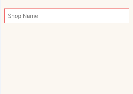
Sachin您的输出图像显示方形的角,而不是发问者所要求的圆角。这可能是使框具有轮廓的一种好方法。
—
JesseBoyd
@JesseBoyd,您的担心是对的,但是此xml文件中的rounded_edittext只是根据您的要求更改了所有Radius的值。
—
sachin pangare
感谢Norfeldt的回答。我对其渐变做了些微更改,以获得更好的内部阴影效果。
<item android:state_pressed="false" android:state_focused="false">
    <shape>
        <gradient
            android:centerY="0.2"
            android:startColor="#D3D3D3"
            android:centerColor="#65FFFFFF"
            android:endColor="#00FFFFFF"
            android:angle="270"
            />
        <stroke
            android:width="0.7dp"
            android:color="#BDBDBD" />
        <corners
            android:radius="15dp" />
    </shape>
</item>
在浅色背景布局中看起来很棒。
如果只想拐弯而不是弯曲整个末端,则使用下面的代码。
<?xml version="1.0" encoding="utf-8"?>
<shape xmlns:android="http://schemas.android.com/apk/res/android" >

    <corners android:radius="10dp" />

    <padding
        android:bottom="3dp"
        android:left="0dp"
        android:right="0dp"
        android:top="3dp" />

    <gradient
        android:angle="90"
        android:endColor="@color/White"
        android:startColor="@color/White" />

    <stroke
        android:width="1dp"
        android:color="@color/Gray" />

</shape>它只会弯曲的四个角度EditText。
随着材料零件库,你可以使用MaterialShapeDrawable来绘制自定义形状。
使用a,EditText您可以执行以下操作:
    <EditText
        android:id="@+id/edittext"
../>然后创建一个MaterialShapeDrawable:
float radius = getResources().getDimension(R.dimen.default_corner_radius);

EditText editText = findViewById(R.id.edittext);
//Apply the rounded corners
ShapeAppearanceModel shapeAppearanceModel = new ShapeAppearanceModel()
                .toBuilder()
                .setAllCorners(CornerFamily.ROUNDED,radius)
                .build();

MaterialShapeDrawable shapeDrawable =
            new MaterialShapeDrawable(shapeAppearanceModel);
//Apply a background color
shapeDrawable.setFillColor(ContextCompat.getColorStateList(this,R.color.white));
//Apply a stroke
shapeDrawable.setStroke(2.0f, ContextCompat.getColor(this,R.color.colorAccent));

ViewCompat.setBackground(editText,shapeDrawable);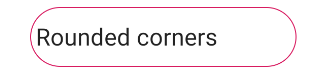
它需要该库的版本1.1.0。
EditText除了默认值以外,常规对象还具有不同的背景,可用于聚焦,禁用,按下和选择。如果我们得到一些缺少触摸屏的Android设备(例如Google TV),那么重点关注尤其重要。