我正在尝试使用Bootstrap 4将Container放在页面的中央。到目前为止,我一直没有成功。任何帮助,将不胜感激。
我已经在Codepen.io上构建了它,以便你们可以使用它,并让我知道什么出于我的想法而有效...
我正在尝试使用Bootstrap 4将Container放在页面的中央。到目前为止,我一直没有成功。任何帮助,将不胜感激。
我已经在Codepen.io上构建了它,以便你们可以使用它,并让我知道什么出于我的想法而有效...
Answers:
重要! 垂直中心相对于父级的高度
如果你想中心元素的父一直没有明确的 高度,没有垂直居中的解决方案将工作!
现在,进入Bootstrap 4的垂直居中...
您可以使用新的flexbox和size实用程序制作container全高和display: flex。这些选项不需要额外的CSS(除了容器的高度(即:html,body)必须为100%)。
align-self-centerflexbox子项的选项1
<div class="container d-flex h-100">
    <div class="row justify-content-center align-self-center">
     I'm vertically centered
    </div>
</div>
https://www.codeply.com/go/fFqaDe5Oey
align-items-centerflexbox父项上的选项2(.row是display:flex; flex-direction:row)
<div class="container h-100">
    <div class="row align-items-center h-100">
        <div class="col-6 mx-auto">
            <div class="jumbotron">
                I'm vertically centered
            </div>
        </div>
    </div>
</div>
https://www.codeply.com/go/BumdFnmLuk
justify-content-centerflexbox父项上的选项3(.card是display:flex;flex-direction:column)
<div class="container h-100">
    <div class="row align-items-center h-100">
        <div class="col-6 mx-auto">
            <div class="card h-100 border-primary justify-content-center">
                <div>
                    ...card content...
                </div>
            </div>
        </div>
    </div>
</div>
https://www.codeply.com/go/3gySSEe7nd
有关Bootstrap 4垂直居中的更多信息
现在,Bootstrap 4提供了flexbox和其他实用程序,有很多方法可以进行垂直对齐。http://www.codeply.com/go/WG15ZWC4lf
1-使用自动页边距的垂直中心:
垂直居中的另一种方法是使用my-auto。这将使元素在容器中居中。例如,h-100使行全高,并使列my-auto垂直居中col-sm-12。
<div class="row h-100">
    <div class="col-sm-12 my-auto">
        <div class="card card-block w-25">Card</div>
    </div>
</div>my-auto 表示垂直y轴上的边距,它等效于:
margin-top: auto;
margin-bottom: auto;
2-带Flexbox的垂直中心:

由于.row现在有了Bootstrap 4 ,display:flex您可以align-self-center在任何列上使用它来垂直居中...
       <div class="row">
           <div class="col-6 align-self-center">
                <div class="card card-block">
                 Center
                </div>
           </div>
           <div class="col-6">
                <div class="card card-inverse card-danger">
                    Taller
                </div>
          </div>
</div>或者,align-items-center整体.row上使所有col-*行垂直居中对齐...
       <div class="row align-items-center">
           <div class="col-6">
                <div class="card card-block">
                 Center
                </div>
           </div>
           <div class="col-6">
                <div class="card card-inverse card-danger">
                    Taller
                </div>
          </div>
</div>3-使用显示实用程序的垂直居中:
自举4具有显示utils的,可以被用于display:table,display:table-cell,display:inline等。这些可与所使用的垂直取向utils的要对齐的内联,内联块或表格单元格的元件。
<div class="row h-50">
    <div class="col-sm-12 h-100 d-table">
        <div class="card card-block d-table-cell align-middle">
            I am centered vertically
        </div>
    </div>
</div>更多示例
垂直中心图像<div>
垂直中心.row垂直.container
垂直中心和底部<div>
垂直父级内部子级
垂直中心全屏大屏幕
重要! 我有提到身高吗?
请记住,垂直居中是相对于父元素的高度的。如果您想在整个页面上居中,大多数情况下,这应该是您的CSS ...
body,html {
  height: 100%;
}或在父/容器上使用min-height: 100vh(min-vh-100在Bootstrap 4.1+中)。如果要将子元素居中放置在父元素内部。父级必须具有定义的身高。
另请参阅:
引导程序4中的垂直对齐引导程序
4中心垂直和水平对齐
html, body {height:100%}...添加,使其生效了!谢谢!
引导4课后,我帮助解决了这个问题
<div class="col text-center justify-content-center align-self-center">
    <img width=3rem src=".." alt="...">
</div>由于以上都不对我有用,因此我添加了另一个答案。
目标:使用bootstrap 4 flexbox类在页面上垂直和水平对齐div。
第1步:将最外面的div设置为100vh。这会将高度设置为Veiwport高度的100%。如果您不这样做,则别无选择。将其设置为的高度100%仅相对于父级,因此,如果父级不是视口的整个高度,则没有任何效果。在下面的示例中,我将“主体”设置为100vh。
步骤2:将容器div设置为带有d-flex类的flexbox容器。
步骤3:在justify-content-center课程中将div水平居中。
第4步:将div垂直居中 align-items-center
第5步:运行页面,查看垂直和水平居中的div。
请注意,不需要在居中的div本身(子div)上设置特殊的类
<body style="background-color:#f2f2f2; height:100vh;">

<div class="h-100 d-flex justify-content-center align-items-center">
    <div style="height:600px; background-color:white; width:600px;">
</div>

</div>

</body>100vh技巧对我很有帮助。Bootstrap还vh-100为此提供了类。
在Bootstrap 4(测试版)中,使用align-middle。请参阅有关垂直对齐的Bootstrap 4文档:
使用垂直对齐 工具更改元素的对齐方式。请注意,vertical-align仅影响inline, inline-block,inline-table和table单元元素。
选择
.align-baseline,.align-top,.align-middle,.align-bottom,.align-text-bottom,和.align-text-top需要。
<div class="col-lg-5 col-sm-5 offset-1 d-flex">
            <div class="offer-txt justify-content-center align-self-center">
                <span class="inner-title">Our Offer</span>
                <h2 class="section-title">Today’s Special </h2>
                <p>One morning, when Gregor Samsa woke from troubled dreams, he found himself transformed in his bed into vermin. He lay on his armour-like back, and if he lifted his head a little he could see his brown belly.</p>
            </div>
        </div>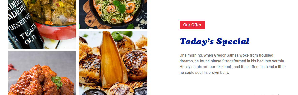
<div class="row">
  <div class="col-md-6">
     <img src="/assets/images/ebook2.png" alt="" class="img-fluid">
  </div>
  <div class="col-md-6 my-auto">
     <h3>Heading</h3>
     <p>Some text.</p>
   </div>
</div>这行是发生魔术的地方<div class="col-md-6 my-auto">,它my-auto将使列的内容居中。这适用于上面的代码示例之类的情况,在这种情况下,您可能具有可变大小的图像,并且需要使该列中的文本与它的右边对齐。
<!DOCTYPE html>
<html lang="en">
<head>
  <title>Bootstrap Example</title>
  <meta charset="utf-8">
  <meta name="viewport" content="width=device-width, initial-scale=1">
  <link rel="stylesheet" href="https://maxcdn.bootstrapcdn.com/bootstrap/4.2.1/css/bootstrap.min.css">
  <script src="https://ajax.googleapis.com/ajax/libs/jquery/3.3.1/jquery.min.js"></script>
  <script src="https://cdnjs.cloudflare.com/ajax/libs/popper.js/1.14.6/umd/popper.min.js"></script>
  <script src="https://maxcdn.bootstrapcdn.com/bootstrap/4.2.1/js/bootstrap.min.js"></script>
</head>
<body>
<div class="container">
    <div class="row align-items-center justify-content-center" style="height:100vh;">
         <div>Center Div Here</div>
    </div>
</div>
</body>
</html>flex-grow-1类添加到卡中可防止其缩小。
垂直对齐使用此引导程序4个类:
父级:d表
和
子级:d表单元格和中间居中文本中心
例如:
<div class="tab-icon-holder d-table bg-light">
   <div class="d-table-cell align-middle text-center">
     <img src="assets/images/devices/Xl.png" height="30rem">
   </div>
</div>
如果想让父母成为圈子:
<div class="tab-icon-holder d-table bg-light rounded-circle">
   <div class="d-table-cell align-middle text-center">
     <img src="assets/images/devices/Xl.png" height="30rem">
   </div>
</div>
这两个自定义css类如下:
.tab-icon-holder {
  width: 3.5rem;
  height: 3.5rem;
 }
.rounded-circle {
  border-radius: 50% !important
}
最终用法例如:
<div class="col-md-5 mx-auto text-center">
    <div class="d-flex justify-content-around">
     <div class="tab-icon-holder d-table bg-light rounded-circle">
       <div class="d-table-cell align-middle text-center">
         <img src="assets/images/devices/Xl.png" height="30rem">
       </div>
     </div>

     <div class="tab-icon-holder d-table bg-light rounded-circle">
       <div class="d-table-cell align-middle text-center">
         <img src="assets/images/devices/Lg.png" height="30rem">
       </div>
     </div>

     ...

    </div>
</div>.my-auto在div上使用(bootsrap4)CSS类