如何更改单选按钮的颜色?
Answers:
一个快速的解决方法是使用来覆盖单选按钮的输入样式:after,但是创建自己的自定义工具箱可能是更好的做法。
    input[type='radio']:after {
        width: 15px;
        height: 15px;
        border-radius: 15px;
        top: -2px;
        left: -1px;
        position: relative;
        background-color: #d1d3d1;
        content: '';
        display: inline-block;
        visibility: visible;
        border: 2px solid white;
    }

    input[type='radio']:checked:after {
        width: 15px;
        height: 15px;
        border-radius: 15px;
        top: -2px;
        left: -1px;
        position: relative;
        background-color: #ffa500;
        content: '';
        display: inline-block;
        visibility: visible;
        border: 2px solid white;
    }
<input type='radio' name="gender"/>
<input type='radio' name="gender"/>正如Fred所提到的,就颜色,大小等方面而言,无法自然地设置单选按钮的样式。但是您可以使用CSS Pseudo元素来设置任何给定单选按钮的冒名顶替者并设置其样式。谈到JamieD所说的,关于如何使用:after伪元素,可以同时使用:before和:after来获得理想的外观。
这种方法的好处:
- 设置您的单选按钮的样式,并添加内容标签。
- 将外缘颜色和/或选中的圆圈更改为您喜欢的任何颜色。
- 通过修改背景颜色属性和/或可选使用opacity属性,使其具有透明外观。
- 缩放单选按钮的大小。
- 在需要的地方添加各种阴影属性,例如CSS阴影插入。
- 将这个简单的CSS / HTML技巧融合到各种Grid系统中,例如Bootstrap 3.3.6,以便在视觉上与其余的Bootstrap组件匹配。
以下简短演示的说明:
- 为每个单选按钮设置相对的内联代码块
- 隐藏本机单选按钮的感觉,无法直接对其进行样式设置。
- 设置标签样式并对齐
- 在:before伪元素上重建CSS内容以做两件事-设置单选按钮的外边缘样式,并将元素设置为首先出现(标签内容的左侧)。您可以在此处了解有关伪元素的基本步骤-http: //www.w3schools.com/css/css_pseudo_elements.asp
- 如果选中了单选按钮,则要求标签随后显示CSS内容(单选按钮中带样式的点)。
HTML
<div class="radio-item">
    <input type="radio" id="ritema" name="ritem" value="ropt1">
    <label for="ritema">Option 1</label>
</div>

<div class="radio-item">
    <input type="radio" id="ritemb" name="ritem" value="ropt2">
    <label for="ritemb">Option 2</label>
</div>
CSS
.radio-item {
  display: inline-block;
  position: relative;
  padding: 0 6px;
  margin: 10px 0 0;
}

.radio-item input[type='radio'] {
  display: none;
}

.radio-item label {
  color: #666;
  font-weight: normal;
}

.radio-item label:before {
  content: " ";
  display: inline-block;
  position: relative;
  top: 5px;
  margin: 0 5px 0 0;
  width: 20px;
  height: 20px;
  border-radius: 11px;
  border: 2px solid #004c97;
  background-color: transparent;
}

.radio-item input[type=radio]:checked + label:after {
  border-radius: 11px;
  width: 12px;
  height: 12px;
  position: absolute;
  top: 9px;
  left: 10px;
  content: " ";
  display: block;
  background: #004c97;
}一个简短的演示,以了解其实际效果
总之,不需要JavaScript,图像或电池。纯CSS。
仅当您针对基于Webkit的浏览器(Chrome和Safari,也许您正在开发Chrome WebApp,知道...)时,才可以使用以下代码:
input[type='radio'] {
   -webkit-appearance: none;
}
然后对其进行样式设置,就好像它是一个简单的HTML元素一样,例如应用背景图像。
使用input[type='radio']:active当选择输入,以提供交替的图形
更新:从2018年开始,您可以添加以下内容以支持多个浏览器供应商:
input[type="radio"] {
  -webkit-appearance: none;
  -moz-appearance: none;
  appearance: none;
}:active,而应使用:checked来区分“选定”单选按钮之间的样式。
您可以通过两种纯CSS方法来实现自定义单选按钮
通过使用CSS删除标准外观
appearance并应用自定义外观。不幸的是,这不适用于桌面版IE(但适用于Windows Phone的IE)。演示:input[type="radio"] { /* remove standard background appearance */ -webkit-appearance: none; -moz-appearance: none; appearance: none; /* create custom radiobutton appearance */ display: inline-block; width: 25px; height: 25px; padding: 6px; /* background-color only for content */ background-clip: content-box; border: 2px solid #bbbbbb; background-color: #e7e6e7; border-radius: 50%; } /* appearance for checked radiobutton */ input[type="radio"]:checked { background-color: #93e026; } /* optional styles, I'm using this for centering radiobuttons */ .flex { display: flex; align-items: center; }<div class="flex"> <input type="radio" name="radio" id="radio1" /> <label for="radio1">RadioButton1</label> </div> <div class="flex"> <input type="radio" name="radio" id="radio2" /> <label for="radio2">RadioButton2</label> </div> <div class="flex"> <input type="radio" name="radio" id="radio3" /> <label for="radio3">RadioButton3</label> </div>通过隐藏单选按钮并将自定义单选按钮外观设置为
label的伪选择器。顺便说一下,这里不需要绝对定位(我在大多数演示中都看到了绝对定位)。演示:*, *:before, *:after { box-sizing: border-box; } input[type="radio"] { display: none; } input[type="radio"]+label:before { content: ""; /* create custom radiobutton appearance */ display: inline-block; width: 25px; height: 25px; padding: 6px; margin-right: 3px; /* background-color only for content */ background-clip: content-box; border: 2px solid #bbbbbb; background-color: #e7e6e7; border-radius: 50%; } /* appearance for checked radiobutton */ input[type="radio"]:checked + label:before { background-color: #93e026; } /* optional styles, I'm using this for centering radiobuttons */ label { display: flex; align-items: center; }<input type="radio" name="radio" id="radio1" /> <label for="radio1">RadioButton1</label> <input type="radio" name="radio" id="radio2" /> <label for="radio2">RadioButton2</label> <input type="radio" name="radio" id="radio3" /> <label for="radio3">RadioButton3</label>
您可以按照CSS技巧中的说明使用复选框hack
http://css-tricks.com/the-checkbox-hack/
单选按钮的工作示例:
http://codepen.io/Angelata/pen/Eypnq
input[type=radio]:checked ~ .check {}
input[type=radio]:checked ~ .check .inside{}
适用于IE9 +,Firefox 3.5 +,Safari 1.3 +,Opera 6 +,Chrome等。
简单的跨浏览器自定义单选按钮示例
.checkbox input{
    display: none;
}
.checkbox input:checked + label{
    color: #16B67F;
}
.checkbox input:checked + label i{
    background-image: url('http://kuzroman.com/images/jswiddler/radio-button.svg');
}
.checkbox label i{
    width: 15px;
    height: 15px;
    display: inline-block;
    background: #fff url('http://kuzroman.com/images/jswiddler/circle.svg') no-repeat 50%;
    background-size: 12px;
    position: relative;
    top: 1px;
    left: -2px;
}
<div class="checkbox">
<input type="radio" name="sort" value="popularity" id="sort1">
<label for="sort1">
<i></i>
<span>first</span>
</label>
<input type="radio" name="sort" value="price" id="sort2">
<label for="sort2">
<i></i>
<span>second</span>
</label>
</div>尝试使用以下CSS进行过渡:
$DarkBrown: #292321;
$Orange: #CC3300;
div {
margin:0 0 0.75em 0;
}
input[type="radio"] {
display:none;
}
input[type="radio"] + label {
color: $DarkBrown;
font-family:Arial, sans-serif;
font-size:14px;
}
input[type="radio"] + label span {
display:inline-block;
width:19px;
height:19px;
margin:-1px 4px 0 0;
vertical-align:middle;
cursor:pointer;
-moz-border-radius: 50%;
border-radius: 50%;
}
input[type="radio"] + label span {
background-color:$DarkBrown;
}
input[type="radio"]:checked + label span{
background-color:$Orange;
}
input[type="radio"] + label span,
input[type="radio"]:checked + label span {
-webkit-transition:background-color 0.4s linear;
-o-transition:background-color 0.4s linear;
-moz-transition:background-color 0.4s linear;
transition:background-color 0.4s linear;
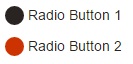
}HTML:
<div>
  <input type="radio" id="radio01" name="radio" />
  <label for="radio01"><span></span>Radio Button 1</label>
</div>

<div>
 <input type="radio" id="radio02" name="radio" />
 <label for="radio02"><span></span>Radio Button 2</label>
</div>我用@klewis的代码示例构建了另一个fork,以通过使用:before /:after伪元素和一个隐藏的单选按钮来演示一些使用纯CSS和渐变的游戏。

HTML:
sample radio buttons:
<div style="background:lightgrey;">
    <span class="radio-item">
        <input type="radio" id="ritema" name="ritem" class="true" value="ropt1" checked="checked">
        <label for="ritema">True</label>
    </span>

    <span class="radio-item">
        <input type="radio" id="ritemb" name="ritem" class="false" value="ropt2">
        <label for="ritemb">False</label>
    </span>
</div>
:
CSS:
.radio-item input[type='radio'] {
    visibility: hidden;
    width: 20px;
    height: 20px;
    margin: 0 5px 0 5px;
    padding: 0;
}
    .radio-item input[type=radio]:before {
        position: relative;
        margin: 4px -25px -4px 0;
        display: inline-block;
        visibility: visible;
        width: 20px;
        height: 20px;
        border-radius: 10px;
        border: 2px inset rgba(150,150,150,0.75);
        background: radial-gradient(ellipse at top left, rgb(255,255,255) 0%, rgb(250,250,250) 5%, rgb(230,230,230) 95%, rgb(225,225,225) 100%);
        content: "";
    }
        .radio-item input[type=radio]:checked:after {
            position: relative;
            top: 0;
            left: 9px;
            display: inline-block;
            visibility: visible;
            border-radius: 6px;
            width: 12px;
            height: 12px;
            background: radial-gradient(ellipse at top left, rgb(245,255,200) 0%, rgb(225,250,100) 5%, rgb(75,175,0) 95%, rgb(25,100,0) 100%);
            content: "";
        }
            .radio-item input[type=radio].true:checked:after {
                background: radial-gradient(ellipse at top left, rgb(245,255,200) 0%, rgb(225,250,100) 5%, rgb(75,175,0) 95%, rgb(25,100,0) 100%);
            }
            .radio-item input[type=radio].false:checked:after {
                background: radial-gradient(ellipse at top left, rgb(255,225,200) 0%, rgb(250,200,150) 5%, rgb(200,25,0) 95%, rgb(100,25,0) 100%);
            }
.radio-item label {
    display: inline-block;
    height: 25px;
    line-height: 25px;
    margin: 0;
    padding: 0;
}就像其他人说的那样,在所有浏览器中都无法实现这一目标,因此,跨浏览器的最佳方法就是毫不费力地使用javascript。基本上,您必须将单选按钮转换为链接(可通过CSS完全自定义)。每次点击链接都将绑定到相关的单选框,从而切换其状态和所有其他状态。
您可以将span元素嵌入到单选输入中,然后选择选中的颜色以在选中单选输入时呈现。请查看以下来自w3schools的示例。
<!DOCTYPE html>
<html>
<style>
/* The container */
.container {
  display: block;
  position: relative;
  padding-left: 35px;
  margin-bottom: 12px;
  cursor: pointer;
  font-size: 22px;
  -webkit-user-select: none;
  -moz-user-select: none;
  -ms-user-select: none;
  user-select: none;
}

/* Hide the browser's default radio button */
.container input {
  position: absolute;
  opacity: 0;
  cursor: pointer;
}

/* Create a custom radio button */
.checkmark {
  position: absolute;
  top: 0;
  left: 0;
  height: 25px;
  width: 25px;
  background-color: #eee;
  border-radius: 50%;
}

/* On mouse-over, add a grey background color */
.container:hover input ~ .checkmark {
  background-color: #ccc;
}

/* When the radio button is checked, add a blue background */
.container input:checked ~ .checkmark {
  background-color: #00a80e;
}

/* Create the indicator (the dot/circle - hidden when not checked) */
.checkmark:after {
  content: "";
  position: absolute;
  display: none;
}

/* Show the indicator (dot/circle) when checked */
.container input:checked ~ .checkmark:after {
  display: block;
}

/* Style the indicator (dot/circle) */
.container .checkmark:after {
    top: 9px;
    left: 9px;
    width: 8px;
    height: 8px;
    border-radius: 50%;
    background: white;
}
</style>
<body>

<h1>Custom Radio Buttons</h1>
<label class="container">One
  <input type="radio" checked="checked" name="radio">
  <span class="checkmark"></span>
</label>
<label class="container">Two
  <input type="radio" name="radio">
  <span class="checkmark"></span>
</label>
<label class="container">Three
  <input type="radio" name="radio">
  <span class="checkmark"></span>
</label>
<label class="container">Four
  <input type="radio" name="radio">
  <span class="checkmark"></span>
</label>

</body>
可以在下面的此代码段中更改背景颜色。
/* When the radio button is checked, add a blue background */
.container input:checked ~ .checkmark {
  background-color: #00a80e;
}