这个答案有两个主要部分:
- 了解对齐方式如何在CSS Grid中工作。
- 在CSS Grid中居中的六种方法。
如果您只对解决方案感兴趣,请跳过第一部分。
网格布局的结构和范围
要完全了解居中如何在网格容器中工作,首先了解网格布局的结构和范围很重要。
网格容器的HTML 结构具有三个级别:
就应用网格属性而言,每个级别都独立于其他级别。
网格容器的范围仅限于父子关系。
这意味着网格容器始终是父级,而网格项目始终是子级。网格属性仅在此关系内起作用。
子代以外的网格容器的后代不属于网格布局,并且不接受网格属性。(至少要等到该subgrid功能实现之后,网格元素的后代才能尊重主容器的行。)
这是上述结构和范围概念的示例。
想象一下像井字游戏一样的网格。
article {
  display: inline-grid;
  grid-template-rows: 100px 100px 100px;
  grid-template-columns: 100px 100px 100px;
  grid-gap: 3px;
}
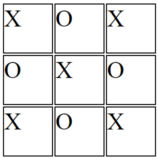
您希望X和O在每个单元格中居中。
因此,您可以在容器级别应用居中:
article {
  display: inline-grid;
  grid-template-rows: 100px 100px 100px;
  grid-template-columns: 100px 100px 100px;
  grid-gap: 3px;
  justify-items: center;
}
但是由于网格布局的结构和范围,justify-items容器在网格中心而不是内容(至少不是直接)位于网格项的中心。
article {
  display: inline-grid;
  grid-template-rows: 100px 100px 100px;
  grid-template-columns: 100px 100px 100px;
  grid-gap: 3px;
  justify-items: center;
}

section {
    border: 2px solid black;
    font-size: 3em;
}
<article>
    <section>X</section>
    <section>O</section>
    <section>X</section>
    <section>O</section>
    <section>X</section>
    <section>O</section>
    <section>X</section>
    <section>O</section>
    <section>X</section>
</article>
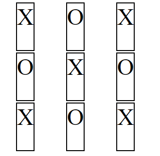
相同的问题align-items:内容可能以副产品为中心,但是您失去了版式设计。
article {
  display: inline-grid;
  grid-template-rows: 100px 100px 100px;
  grid-template-columns: 100px 100px 100px;
  grid-gap: 3px;
  justify-items: center;
  align-items: center;
}
article {
  display: inline-grid;
  grid-template-rows: 100px 100px 100px;
  grid-template-columns: 100px 100px 100px;
  grid-gap: 3px;
  justify-items: center;
  align-items: center;
}

section {
    border: 2px solid black;
    font-size: 3em;
}
<article>
    <section>X</section>
    <section>O</section>
    <section>X</section>
    <section>O</section>
    <section>X</section>
    <section>O</section>
    <section>X</section>
    <section>O</section>
    <section>X</section>
</article>
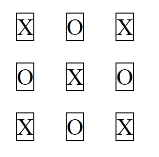
要使内容居中,您需要采用其他方法。再次参考网格布局的结构和范围,您需要将网格项视为父项,将内容项视为子项。
article {
  display: inline-grid;
  grid-template-rows: 100px 100px 100px;
  grid-template-columns: 100px 100px 100px;
  grid-gap: 3px;
}

section {
  display: flex;
  justify-content: center;
  align-items: center;
  border: 2px solid black;
  font-size: 3em;
}
article {
  display: inline-grid;
  grid-template-rows: 100px 100px 100px;
  grid-template-columns: 100px 100px 100px;
  grid-gap: 3px;
}

section {
  display: flex;
  justify-content: center;
  align-items: center;
  border: 2px solid black;
  font-size: 3em;
}
<article>
  <section>X</section>
  <section>O</section>
  <section>X</section>
  <section>O</section>
  <section>X</section>
  <section>O</section>
  <section>X</section>
  <section>O</section>
  <section>X</section>
</article>
jsFiddle演示
在CSS网格中居中的六种方法
有多种方法可以使网格项及其内容居中。
这是一个基本的2x2网格:
grid-container {
  display: grid;
  grid-template-columns: 1fr 1fr;
  grid-auto-rows: 75px;
  grid-gap: 10px;
}


/* can ignore styles below; decorative only */
grid-container {
  background-color: lightyellow;
  border: 1px solid #bbb;
  padding: 10px;
}
grid-item {
  background-color: lightgreen;
  border: 1px solid #ccc;
}
<grid-container>
  <grid-item>this text should be centered</grid-item>
  <grid-item>this text should be centered</grid-item>
  <grid-item><img src="http://i.imgur.com/60PVLis.png" width="50" height="50" alt=""></grid-item>
  <grid-item><img src="http://i.imgur.com/60PVLis.png" width="50" height="50" alt=""></grid-item>
</grid-container>
弹性盒
为了使网格项目的内容居中,一种简单方法是使用flexbox。
更具体地说,将网格项放入弹性容器中。
此方法没有冲突,违反规范或其他问题。这是干净有效的。
grid-item {
  display: flex;
  align-items: center;
  justify-content: center;
}
grid-container {
  display: grid;
  grid-template-columns: 1fr 1fr;
  grid-auto-rows: 75px;
  grid-gap: 10px;
}

grid-item {
  display: flex;            /* new */
  align-items: center;      /* new */
  justify-content: center;  /* new */
}

/* can ignore styles below; decorative only */
grid-container {
  background-color: lightyellow;
  border: 1px solid #bbb;
  padding: 10px;
}
grid-item {
  background-color: lightgreen;
  border: 1px solid #ccc;
}
<grid-container>
  <grid-item>this text should be centered</grid-item>
  <grid-item>this text should be centered</grid-item>
  <grid-item><img src="http://i.imgur.com/60PVLis.png" width="50" height="50" alt=""></grid-item>
  <grid-item><img src="http://i.imgur.com/60PVLis.png" width="50" height="50" alt=""></grid-item>
</grid-container>
请参阅此帖子以获取完整说明:
网格布局
与伸缩商品也可以是伸缩容器一样,网格商品也可以是栅格容器。该解决方案与上面的flexbox解决方案类似,不同的是,居中是通过grid属性(而不是flex属性)完成的。
grid-container {
  display: grid;
  grid-template-columns: 1fr 1fr;
  grid-auto-rows: 75px;
  grid-gap: 10px;
}

grid-item {
  display: grid;            /* new */
  align-items: center;      /* new */
  justify-items: center;    /* new */
}

/* can ignore styles below; decorative only */
grid-container {
  background-color: lightyellow;
  border: 1px solid #bbb;
  padding: 10px;
}
grid-item {
  background-color: lightgreen;
  border: 1px solid #ccc;
}
<grid-container>
  <grid-item>this text should be centered</grid-item>
  <grid-item>this text should be centered</grid-item>
  <grid-item><img src="http://i.imgur.com/60PVLis.png" width="50" height="50" alt=""></grid-item>
  <grid-item><img src="http://i.imgur.com/60PVLis.png" width="50" height="50" alt=""></grid-item>
</grid-container>
auto 边距
使用margin: auto垂直和水平中心网格项目。
grid-item {
  margin: auto;
}
grid-container {
  display: grid;
  grid-template-columns: 1fr 1fr;
  grid-auto-rows: 75px;
  grid-gap: 10px;
}

grid-item {
  margin: auto;
}

/* can ignore styles below; decorative only */
grid-container {
  background-color: lightyellow;
  border: 1px solid #bbb;
  padding: 10px;
}
grid-item {
  background-color: lightgreen;
  border: 1px solid #ccc;
}
<grid-container>
  <grid-item>this text should be centered</grid-item>
  <grid-item>this text should be centered</grid-item>
  <grid-item><img src="http://i.imgur.com/60PVLis.png" width="50" height="50" alt=""></grid-item>
  <grid-item><img src="http://i.imgur.com/60PVLis.png" width="50" height="50" alt=""></grid-item>
</grid-container>
要使网格项目的内容居中,您需要将其放入网格(或flex)容器中,将匿名项目包装在它们自己的元素中(因为CSS不能直接将它们定位),然后将边距应用于新元素。
grid-item {
  display: flex;
}

span, img {
  margin: auto;
}
grid-container {
  display: grid;
  grid-template-columns: 1fr 1fr;
  grid-auto-rows: 75px;
  grid-gap: 10px;
}

grid-item {
  display: flex;
}

span, img {
  margin: auto;
}

/* can ignore styles below; decorative only */
grid-container {
  background-color: lightyellow;
  border: 1px solid #bbb;
  padding: 10px;
}
grid-item {
  background-color: lightgreen;
  border: 1px solid #ccc;
}
<grid-container>
  <grid-item><span>this text should be centered</span></grid-item>
  <grid-item><span>this text should be centered</span></grid-item>
  <grid-item><img src="http://i.imgur.com/60PVLis.png" width="50" height="50" alt=""></grid-item>
  <grid-item><img src="http://i.imgur.com/60PVLis.png" width="50" height="50" alt=""></grid-item>
</grid-container>
框对齐属性
当考虑使用以下属性来对齐网格项目时,请阅读auto上面的边距部分。
align-itemsjustify-itemsalign-selfjustify-self
https://www.w3.org/TR/css-align-3/#property-index
text-align: center
要使内容在网格项目中水平居中,可以使用text-align属性。
grid-container {
  display: grid;
  grid-template-columns: 1fr 1fr;
  grid-auto-rows: 75px;
  grid-gap: 10px;
  text-align: center;  /* new */
}


/* can ignore styles below; decorative only */
grid-container {
  background-color: lightyellow;
  border: 1px solid #bbb;
  padding: 10px;
}
grid-item {
  background-color: lightgreen;
  border: 1px solid #ccc;
}
<grid-container>
  <grid-item>this text should be centered</grid-item>
  <grid-item>this text should be centered</grid-item>
  <grid-item><img src="http://i.imgur.com/60PVLis.png" width="50" height="50" alt=""></grid-item>
  <grid-item><img src="http://i.imgur.com/60PVLis.png" width="50" height="50" alt=""></grid-item>
</grid-container>
请注意,对于垂直居中,vertical-align: middle将不起作用。
这是因为该vertical-align属性仅适用于嵌入式和表格单元容器。
grid-container {
  display: grid;
  grid-template-columns: 1fr 1fr;
  grid-auto-rows: 75px;
  grid-gap: 10px;
  text-align: center;     /* <--- works */
  vertical-align: middle; /* <--- fails */
}


/* can ignore styles below; decorative only */
grid-container {
  background-color: lightyellow;
  border: 1px solid #bbb;
  padding: 10px;
}
grid-item {
  background-color: lightgreen;
  border: 1px solid #ccc;
}
<grid-container>
  <grid-item>this text should be centered</grid-item>
  <grid-item>this text should be centered</grid-item>
  <grid-item><img src="http://i.imgur.com/60PVLis.png" width="50" height="50" alt=""></grid-item>
  <grid-item><img src="http://i.imgur.com/60PVLis.png" width="50" height="50" alt=""></grid-item>
</grid-container>
可能有人说display: inline-grid建立了一个内联级别的容器,这是事实。那么,为什么vertical-align在网格项中不起作用?
原因是在网格格式化上下文中,项目被视为块级元素。
6.1。网格项目显示
display网格项的值被块化:如果display生成网格容器的元素的流入子代的指定是内联级别的值,它将计算为其等效的块级别。
在块格式化上下文中(该vertical-align属性最初是为该属性设计的),浏览器不希望在内联级容器中找到块级元素。那是无效的HTML。
CSS定位
最后,有一个通用的CSS居中解决方案也可以在Grid中使用:绝对定位
这是使需要从文档流中删除的对象居中的好方法。例如,如果您想:
只需position: absolute在要居中的元素上设置,然后position: relative在将用作包含块的祖先上设置(通常是父代)。像这样:
grid-item {
  position: relative;
  text-align: center;
}

span {
  position: absolute;
  left: 50%;
  top: 50%;
  transform: translate(-50%, -50%);
}
grid-container {
  display: grid;
  grid-template-columns: 1fr 1fr;
  grid-auto-rows: 75px;
  grid-gap: 10px;
}

grid-item {
  position: relative;
  text-align: center;
}

span, img {
  position: absolute;
  left: 50%;
  top: 50%;
  transform: translate(-50%, -50%);
}


/* can ignore styles below; decorative only */

grid-container {
  background-color: lightyellow;
  border: 1px solid #bbb;
  padding: 10px;
}

grid-item {
  background-color: lightgreen;
  border: 1px solid #ccc;
}
<grid-container>
  <grid-item><span>this text should be centered</span></grid-item>
  <grid-item><span>this text should be centered</span></grid-item>
  <grid-item><img src="http://i.imgur.com/60PVLis.png" width="50" height="50" alt=""></grid-item>
  <grid-item><img src="http://i.imgur.com/60PVLis.png" width="50" height="50" alt=""></grid-item>
</grid-container>
这是此方法如何工作的完整说明:
这是有关网格规范中绝对定位的部分: