如何在WPF选项卡控件中创建梯形选项卡?
我想创建看起来像Google Chrome中的标签或VS 2008代码编辑器中的标签的非矩形标签。
可以使用WPF样式完成它,还是必须用代码绘制?
互联网上是否有代码示例?
编辑:
有很多示例显示了如何圆角或更改选项卡的颜色,但像这两个示例一样,我找不到任何可以更改选项卡几何形状的示例:
VS 2008代码编辑器选项卡
Google Chrome浏览器标签
这两个示例中的选项卡不是矩形,而是梯形。
Answers:
我试图在Internet上找到一些解决此问题的控制模板或解决方案,但我没有找到任何“可接受的”解决方案。因此,我以自己的方式编写了此代码,这是我第一次(和last =))尝试执行的示例:
<Window x:Class="TabControlTemplate.Window1"
    xmlns="http://schemas.microsoft.com/winfx/2006/xaml/presentation"
    xmlns:x="http://schemas.microsoft.com/winfx/2006/xaml"
    xmlns:src="clr-namespace:TabControlTemplate"
    Title="Window1" Width="600" Height="400">
<Window.Background>
    <LinearGradientBrush StartPoint="0,0" EndPoint="1,1">
        <GradientStop Color="#FF3164a5" Offset="1"/>
        <GradientStop Color="#FF8AAED4" Offset="0"/>
    </LinearGradientBrush>
</Window.Background>
<Window.Resources>
    <src:ContentToPathConverter x:Key="content2PathConverter"/>
    <src:ContentToMarginConverter x:Key="content2MarginConverter"/>

    <SolidColorBrush x:Key="BorderBrush" Color="#FFFFFFFF"/>
    <SolidColorBrush x:Key="HoverBrush" Color="#FFFF4500"/>
    <LinearGradientBrush x:Key="TabControlBackgroundBrush" EndPoint="0.5,0" StartPoint="0.5,1">
        <GradientStop Color="#FFa9cde7" Offset="0"/>
        <GradientStop Color="#FFe7f4fc" Offset="0.3"/>
        <GradientStop Color="#FFf2fafd" Offset="0.85"/>
        <GradientStop Color="#FFe4f6fa" Offset="1"/>
    </LinearGradientBrush>
    <LinearGradientBrush x:Key="TabItemPathBrush" StartPoint="0,0" EndPoint="0,1">
        <GradientStop Color="#FF3164a5" Offset="0"/>
        <GradientStop Color="#FFe4f6fa" Offset="1"/>
    </LinearGradientBrush>

    <!-- TabControl style -->
    <Style x:Key="TabControlStyle" TargetType="{x:Type TabControl}">
        <Setter Property="BorderThickness" Value="1"/>
        <Setter Property="Template">
            <Setter.Value>
                <ControlTemplate TargetType="TabControl">
                    <Grid>
                        <Grid.RowDefinitions>
                            <RowDefinition Height="Auto"/>
                            <RowDefinition Height="*"/>
                        </Grid.RowDefinitions>
                        <Border Grid.Row="1" BorderThickness="2,0,2,2" Panel.ZIndex="2" CornerRadius="0,0,2,2"
                                BorderBrush="{StaticResource BorderBrush}"
                                Background="{StaticResource TabControlBackgroundBrush}">
                            <ContentPresenter ContentSource="SelectedContent"/>
                        </Border>
                        <StackPanel Orientation="Horizontal" Grid.Row="0" Panel.ZIndex="1" IsItemsHost="true"/>
                        <Rectangle Grid.Row="0" Height="2" VerticalAlignment="Bottom"
                                   Fill="{StaticResource BorderBrush}"/>
                    </Grid>
                </ControlTemplate>
            </Setter.Value>
        </Setter>
    </Style>
    <!-- TabItem style -->
    <Style x:Key="{x:Type TabItem}" TargetType="{x:Type TabItem}">
        <Setter Property="SnapsToDevicePixels" Value="True"/>
        <Setter Property="Template">
            <Setter.Value>
                <ControlTemplate TargetType="TabItem">
                    <Grid x:Name="grd">
                        <Path x:Name="TabPath" StrokeThickness="2"
                              Margin="{Binding ElementName=TabItemContent, Converter={StaticResource content2MarginConverter}}"
                              Stroke="{StaticResource BorderBrush}"
                              Fill="{StaticResource TabItemPathBrush}">
                            <Path.Data>
                                <PathGeometry>
                                    <PathFigure IsClosed="False" StartPoint="1,0"
                                                Segments="{Binding ElementName=TabItemContent, Converter={StaticResource content2PathConverter}}">
                                    </PathFigure>
                                </PathGeometry>
                            </Path.Data>
                            <Path.LayoutTransform>
                                <ScaleTransform ScaleY="-1"/>
                            </Path.LayoutTransform>
                        </Path>
                        <Rectangle x:Name="TabItemTopBorder" Height="2" Visibility="Visible"
                                   VerticalAlignment="Bottom" Fill="{StaticResource BorderBrush}"
                                   Margin="{Binding ElementName=TabItemContent, Converter={StaticResource content2MarginConverter}}" />
                        <ContentPresenter x:Name="TabItemContent" ContentSource="Header"
                                          Margin="10,2,10,2" VerticalAlignment="Center"
                                          TextElement.Foreground="#FF000000"/>
                    </Grid>
                    <ControlTemplate.Triggers>
                        <Trigger Property="IsMouseOver" Value="True" SourceName="grd">
                            <Setter Property="Stroke" Value="{StaticResource HoverBrush}" TargetName="TabPath"/>
                        </Trigger>
                        <Trigger Property="Selector.IsSelected" Value="True">
                            <Setter Property="Fill" TargetName="TabPath">
                                <Setter.Value>
                                    <SolidColorBrush Color="#FFe4f6fa"/>
                                </Setter.Value>
                            </Setter>
                            <Setter Property="BitmapEffect">
                                <Setter.Value>
                                    <DropShadowBitmapEffect Direction="302" Opacity="0.4"
                                                        ShadowDepth="2" Softness="0.5"/>
                                </Setter.Value>
                            </Setter>
                            <Setter Property="Panel.ZIndex" Value="2"/>
                            <Setter Property="Visibility" Value="Hidden" TargetName="TabItemTopBorder"/>
                        </Trigger>
                    </ControlTemplate.Triggers>
                </ControlTemplate>
            </Setter.Value>
        </Setter>
    </Style>
</Window.Resources>
<Grid Margin="20">
    <TabControl Grid.Row="0" Grid.Column="1" Margin="5" TabStripPlacement="Top"
                Style="{StaticResource TabControlStyle}" FontSize="16">
        <TabItem Header="MainTab">
            <Border Margin="10">
                <TextBlock Text="The quick brown fox jumps over the lazy dog."/>
            </Border>
        </TabItem>
        <TabItem Header="VeryVeryLongTab" />
        <TabItem Header="Tab" />
    </TabControl>
</Grid>
using System;
using System.Windows;
using System.Windows.Controls;
using System.Windows.Data;
using System.Windows.Media;

namespace TabControlTemplate
{
public partial class Window1
{
    public Window1()
    {
        InitializeComponent();
    }
}

public class ContentToMarginConverter: IValueConverter
{
    #region IValueConverter Members

    public object Convert(object value, Type targetType, object parameter, System.Globalization.CultureInfo culture)
    {
        return new Thickness(0, 0, -((ContentPresenter)value).ActualHeight, 0);
    }

    public object ConvertBack(object value, Type targetType, object parameter, System.Globalization.CultureInfo culture)
    {
        throw new NotImplementedException();
    }

    #endregion
}

public class ContentToPathConverter: IValueConverter
{
    #region IValueConverter Members

    public object Convert(object value, Type targetType, object parameter, System.Globalization.CultureInfo culture)
    {
        var ps = new PathSegmentCollection(4);
        ContentPresenter cp = (ContentPresenter)value;
        double h = cp.ActualHeight > 10 ? 1.4 * cp.ActualHeight : 10;
        double w = cp.ActualWidth > 10 ? 1.25 * cp.ActualWidth : 10;
        ps.Add(new LineSegment(new Point(1, 0.7 * h), true));
        ps.Add(new BezierSegment(new Point(1, 0.9 * h), new Point(0.1 * h, h), new Point(0.3 * h, h), true));
        ps.Add(new LineSegment(new Point(w, h), true));
        ps.Add(new BezierSegment(new Point(w + 0.6 * h, h), new Point(w + h, 0), new Point(w + h * 1.3, 0), true));
        return ps;
    }

    public object ConvertBack(object value, Type targetType, object parameter, System.Globalization.CultureInfo culture)
    {
        throw new NotImplementedException();
    }

    #endregion
}
}
我编写的这两个转换器是根据其内容调整选项卡大小的。实际上,我根据内容大小来制作Path对象。如果不需要具有各种宽度的标签,则可以使用此标签的一些修改后的副本:
<Style x:Key="tabPath" TargetType="{x:Type Path}">
      <Setter Property="Stroke" Value="Black"/>
      <Setter Property="Data">
          <Setter.Value>
              <PathGeometry Figures="M 0,0 L 0,14 C 0,18 2,20 6,20 L 60,20 C 70,20 80,0 84,0"/>
          </Setter.Value>
      </Setter>
  </Style>
屏幕:
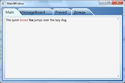
注意:这只是菜鸟的一个很好的答案的附录。
尽管rooks的解决方案对我来说在运行时运行良好,但在VS2010 WPF设计器界面中打开MainWindow时遇到了一些麻烦:设计器抛出异常,但未显示窗口。同样,TabControl.xaml中TabItem的整个ControlTemplate都有一条蓝色的花样线,并且工具提示告诉我发生了NullReferenceException。将相关代码移到我的应用程序中时,我有相同的行为。问题出在两台不同的机器上,所以我认为这与我的安装没有任何问题。
如果有人遇到相同的问题,我已经找到了解决方法,因此该示例现在可以在运行时以及在设计器中运行:
首先:替换TabControl-XAML代码...
<Path x:Name="TabPath" StrokeThickness="2"
      Margin="{Binding ElementName=TabItemContent,
               Converter={StaticResource content2MarginConverter}}"
      Stroke="{StaticResource BorderBrush}"
      Fill="{StaticResource TabItemPathBrush}">
    <Path.Data>
        <PathGeometry>
            <PathFigure IsClosed="False" StartPoint="1,0"
                 Segments="{Binding ElementName=TabItemContent,
                            Converter={StaticResource content2PathConverter}}">
            </PathFigure>
        </PathGeometry>
    </Path.Data>
    <Path.LayoutTransform>
        <ScaleTransform ScaleY="-1"/>
    </Path.LayoutTransform>
</Path>
...由...
<Path x:Name="TabPath" StrokeThickness="2"
      Margin="{Binding ElementName=TabItemContent,
               Converter={StaticResource content2MarginConverter}}"
      Stroke="{StaticResource BorderBrush}"
      Fill="{StaticResource TabItemPathBrush}"
      Data="{Binding ElementName=TabItemContent,
             Converter={StaticResource content2PathConverter}}">
    <Path.LayoutTransform>
        <ScaleTransform ScaleY="-1"/>
    </Path.LayoutTransform>
</Path>
第二:在ContentToPathConverter类的Convert方法的末尾替换...
return ps;
...由...
PathFigure figure = new PathFigure(new Point(1, 0), ps, false);
PathGeometry geometry = new PathGeometry();
geometry.Figures.Add(figure);

return geometry;
我没有任何解释为什么它在设计器中运行稳定,却没有鲁克斯的原始代码。
我刚刚完成了WPF的类似Google Chrome的Tab控件。您可以在https://github.com/realistschuckle/wpfchrometabs找到该项目,并在以下位置描述它的博客文章
希望能帮助您更好地理解从头开始构建自定义标签控件。
<Grid>
    <Grid.Resources>
        <Style TargetType="{x:Type TabControl}">
            <Setter Property="ItemContainerStyle">
                <Setter.Value>
                    <Style>
                        <Setter Property="Control.Height" Value="20"></Setter>
                        <Setter Property="Control.Template">
                            <Setter.Value>
                                <ControlTemplate TargetType="{x:Type TabItem}">
                                    <Grid Margin="0 0 -10 0">
                                        <Grid.ColumnDefinitions>
                                            <ColumnDefinition Width="10">
                                            </ColumnDefinition>
                                            <ColumnDefinition></ColumnDefinition>
                                            <ColumnDefinition Width="10"></ColumnDefinition>
                                        </Grid.ColumnDefinitions>
                                        <Path Data="M10 0 L 0 20 L 10 20 " Fill="{TemplateBinding Background}" Stroke="Black"></Path>
                                        <Rectangle Fill="{TemplateBinding Background}" Grid.Column="1"></Rectangle>
                                        <Rectangle VerticalAlignment="Top" Height="1" Fill="Black" Grid.Column="1"></Rectangle>
                                        <Rectangle VerticalAlignment="Bottom" Height="1" Fill="Black" Grid.Column="1"></Rectangle>
                                        <ContentPresenter Grid.Column="1" ContentSource="Header" />
                                       <Path Data="M0 20 L 10 20 L0 0" Fill="{TemplateBinding Background}" Grid.Column="2" Stroke="Black"></Path>
                                    </Grid>
                                    <ControlTemplate.Triggers>
                                        <Trigger Property="IsSelected" Value="True">
                                            <Trigger.Setters>
                                                <Setter Property="Background" Value="Beige"></Setter>
                                                <Setter Property="Panel.ZIndex" Value="1"></Setter>
                                            </Trigger.Setters>
                                        </Trigger>
                                        <Trigger Property="IsSelected" Value="False">
                                            <Trigger.Setters>
                                                <Setter Property="Background" Value="LightGray"></Setter>
                                            </Trigger.Setters>
                                        </Trigger>
                                    </ControlTemplate.Triggers>
                                </ControlTemplate>
                            </Setter.Value>
                        </Setter>
                    </Style>
                </Setter.Value>
            </Setter>
        </Style>
    </Grid.Resources>
    <TabControl>
        <TabItem Header="One" ></TabItem>
        <TabItem Header="Two" ></TabItem>
        <TabItem Header="Three" ></TabItem>
    </TabControl>
</Grid>
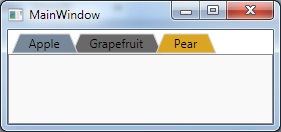
我知道这已经很老了,但我想提出:
XAML:
    <Window.Resources>

    <ControlTemplate x:Key="trapezoidTab" TargetType="TabItem">
        <Grid>
            <Polygon Name="Polygon_Part" Points="{Binding TabPolygonPoints}" />
            <ContentPresenter Name="TabContent_Part" Margin="{TemplateBinding Margin}" Panel.ZIndex="100" ContentSource="Header" HorizontalAlignment="Center" VerticalAlignment="Center"/>
        </Grid>

        <ControlTemplate.Triggers>

            <Trigger Property="IsMouseOver" Value="False">
                <Setter TargetName="Polygon_Part" Property="Stroke" Value="LightGray"/>
                <Setter TargetName="Polygon_Part" Property="Fill" Value="DimGray" />
            </Trigger>

            <Trigger Property="IsMouseOver" Value="True">
                <Setter TargetName="Polygon_Part" Property="Fill" Value="Goldenrod" />
                <Setter TargetName="Polygon_Part" Property="Stroke" Value="LightGray"/>
            </Trigger>

            <Trigger Property="IsSelected" Value="False">
                <Setter Property="Panel.ZIndex" Value="90"/>
            </Trigger>

            <Trigger Property="IsSelected" Value="True">
                <Setter Property="Panel.ZIndex" Value="100"/>
                <Setter TargetName="Polygon_Part" Property="Stroke" Value="LightGray"/>
                <Setter TargetName="Polygon_Part" Property="Fill" Value="LightSlateGray "/>
            </Trigger>


        </ControlTemplate.Triggers>

    </ControlTemplate>

</Window.Resources>

<!-- Test the tabs-->
<TabControl Name="FruitTab">
    <TabItem Header="Apple" Template="{StaticResource trapezoidTab}" />
    <TabItem Margin="-8,0,0,0" Header="Grapefruit" Template="{StaticResource trapezoidTab}" />
    <TabItem Margin="-16,0,0,0" Header="Pear" Template="{StaticResource trapezoidTab}"/>
</TabControl>
ViewModel:
    using System;
    using System.Collections.Generic;
    using System.Linq;
    using System.Text;
    using System.Threading.Tasks;
    using System.Windows;
    using System.Windows.Shapes;
    using System.ComponentModel;
    using System.Globalization;
    using System.Windows.Media;

    namespace TrapezoidTab
    {
        public class TabHeaderViewModel : INotifyPropertyChanged
        {
            public event PropertyChangedEventHandler PropertyChanged;
            private string _tabHeaderText;
            private List<Point> _polygonPoints;
            private PointCollection _pointCollection;

            public TabHeaderViewModel(string tabHeaderText)
            {
                _tabHeaderText = tabHeaderText;
                TabPolygonPoints = GenPolygon();
            }

            public PointCollection TabPolygonPoints
            {
                get { return _pointCollection; }
                set
                {
                    _pointCollection = value;
                    if (PropertyChanged != null)
                        PropertyChanged(this, new PropertyChangedEventArgs("TabPolygonPoints"));
                }
            }

            public string TabHeaderText
            {
                get { return _tabHeaderText; }
                set
                {
                    _tabHeaderText = value;
                    TabPolygonPoints = GenPolygon();
                    if (PropertyChanged != null)
                        PropertyChanged(this, new PropertyChangedEventArgs("TabHeaderText"));
                }
            }

            private PointCollection GenPolygon()
            {
                var w = new FormattedText(_tabHeaderText, CultureInfo.GetCultureInfo("en-us"), FlowDirection.LeftToRight, new Typeface("Tahoma"), 12, Brushes.Black);
                var width = w.Width + 30;

                _polygonPoints = new List<Point>(4);
                _pointCollection = new PointCollection(4);

                _polygonPoints.Add(new Point(2, 21));
                _polygonPoints.Add(new Point(10, 2));
                _polygonPoints.Add(new Point(width, 2));
                _polygonPoints.Add(new Point(width + 8, 21));

                foreach (var point in _polygonPoints)
                    _pointCollection.Add(point);

                return _pointCollection;
            }
        }
    }
主要:
namespace TrapezoidTab
{
    /// <summary>
    /// Interaction logic for MainWindow.xaml
    /// </summary>
    public partial class MainWindow : Window
    {
        public MainWindow()
        {
            InitializeComponent();

            foreach (var obj in FruitTab.Items)
            {
                var tab = obj as TabItem;
                if (tab == null) continue;
                tab.DataContext = new TabHeaderViewModel(tab.Header.ToString());
            }
        }
    }
}
是的,您可以做到这一点-基本上,您要做的就是制作一个自定义控件模板。请访问http://www.switchonthecode.com/tutorials/the-wpf-tab-control-inside-and-out以获取教程。只需搜索“ wpf”,“ tabcontrol”,“ shape”即可显示结果页面。
我自己还没有尝试过,但是您应该能够用标签替换模板中的标签以获得所需的形状。
为了使左右两个标签边都倾斜,这是对Slauma对rook可接受答案的增强的修改。这是ContentToPathConverter类的Convert方法的替代:
    public object Convert(object value, Type targetType, object parameter, System.Globalization.CultureInfo culture)
    {
        var ps = new PathSegmentCollection(4);
        ContentPresenter cp = (ContentPresenter)value;
        double h = cp.ActualHeight > 10 ? 1.4 * cp.ActualHeight : 10;
        double w = cp.ActualWidth > 10 ? 1.25 * cp.ActualWidth : 10;
        // Smaller unit, so don't need fractional multipliers.
        double u = 0.1 * h;
        // HACK: Start before "normal" start of tab.
        double x0 = -4 * u;
        // end of transition
        double x9 = w + 8 * u;
        // transition width
        double tw = 8 * u;
        // top "radius" (actually, gradualness of curve. Larger value is more rounded.)
        double rt = 5 * u;
        // bottom "radius" (actually, gradualness of curve. Larger value is more rounded.)
        double rb = 3 * u;
        // "(x0, 0)" is start point - defined in PathFigure.
        // Cubic: From previous endpoint, 2 control points + new endpoint.
        ps.Add(new BezierSegment(new Point(x0 + rb, 0), new Point(x0 + tw - rt, h), new Point(x0 + tw, h), true));
        ps.Add(new LineSegment(new Point(x9 - tw, h), true));
        ps.Add(new BezierSegment(new Point(x9 - tw + rt, h), new Point(x9 - rb, 0), new Point(x9, 0), true));

        // "(x0, 0)" is start point.
        PathFigure figure = new PathFigure(new Point(x0, 0), ps, false);
        PathGeometry geometry = new PathGeometry();
        geometry.Figures.Add(figure);

        return geometry;
    }
同样在TabControl的ControlTemplate中,在选项卡项目的容器中添加左(和可选的)右边距(唯一的变化是添加Margin="20,0,20,0"):
<Style x:Key="TabControlStyle" TargetType="{x:Type TabControl}">
    ...
    <Setter Property="Template">
        ...
        <StackPanel Grid.Row="0" Panel.ZIndex="1" Orientation="Horizontal" IsItemsHost="true" Margin="20,0,20,0"/>
问题:如果不是选定的选项卡,则选项卡左边缘的底部会有轻微的视觉“毛刺”。我认为这与在标签区域开始之前开始的“后退”有关。否则与在选项卡底部绘制线条有关(这不知道我们在选项卡“正常”矩形的左边缘之前开始)。
Path.DataXAML中的元素引起的。当我注释掉这个元素时,设计师是稳定的。您是否知道如何解决此问题?