尝试在SwiftUI中添加全屏活动指示器。
我可以.overlay(overlay: )在View协议中使用功能。
这样,我可以进行任何视图叠加,但是找不到的UIActivityIndicatorView等效于iOS默认样式SwiftUI。
如何使用默认样式微调器SwiftUI?
注意:这与在UIKit框架中添加活动指示器无关。
尝试在SwiftUI中添加全屏活动指示器。
我可以.overlay(overlay: )在View协议中使用功能。
这样,我可以进行任何视图叠加,但是找不到的UIActivityIndicatorView等效于iOS默认样式SwiftUI。
如何使用默认样式微调器SwiftUI?
注意:这与在UIKit框架中添加活动指示器无关。
Answers:
由于Xcode中12的β(iOS的14),一个称为新视图ProgressView是提供给开发者,并且可以同时显示确定的和不确定的进展。
它的样式默认为CircularProgressViewStyle,这正是我们想要的。
var body: some View {
    VStack {
        ProgressView()
           // and if you want to be explicit / future-proof...
           // .progressViewStyle(CircularProgressViewStyle())
    }
}
Xcode 11.x
尚未显示很多视图SwiftUI,但是很容易将它们移植到系统中。您需要包装UIActivityIndicator并使其包裹UIViewRepresentable。
(有关此内容的更多信息,请参见WWDC 2019精彩演讲-集成SwiftUI)
struct ActivityIndicator: UIViewRepresentable {

    @Binding var isAnimating: Bool
    let style: UIActivityIndicatorView.Style

    func makeUIView(context: UIViewRepresentableContext<ActivityIndicator>) -> UIActivityIndicatorView {
        return UIActivityIndicatorView(style: style)
    }

    func updateUIView(_ uiView: UIActivityIndicatorView, context: UIViewRepresentableContext<ActivityIndicator>) {
        isAnimating ? uiView.startAnimating() : uiView.stopAnimating()
    }
}
然后,您可以按以下方式使用它-这是加载叠加图的示例。
注意:我更喜欢使用ZStack,而不是overlay(:_),所以我确切地知道实现中发生了什么。
struct LoadingView<Content>: View where Content: View {

    @Binding var isShowing: Bool
    var content: () -> Content

    var body: some View {
        GeometryReader { geometry in
            ZStack(alignment: .center) {

                self.content()
                    .disabled(self.isShowing)
                    .blur(radius: self.isShowing ? 3 : 0)

                VStack {
                    Text("Loading...")
                    ActivityIndicator(isAnimating: .constant(true), style: .large)
                }
                .frame(width: geometry.size.width / 2,
                       height: geometry.size.height / 5)
                .background(Color.secondary.colorInvert())
                .foregroundColor(Color.primary)
                .cornerRadius(20)
                .opacity(self.isShowing ? 1 : 0)

            }
        }
    }

}
要对其进行测试,可以使用以下示例代码:
struct ContentView: View {

    var body: some View {
        LoadingView(isShowing: .constant(true)) {
            NavigationView {
                List(["1", "2", "3", "4", "5"], id: \.self) { row in
                    Text(row)
                }.navigationBarTitle(Text("A List"), displayMode: .large)
            }
        }
    }

}
结果:
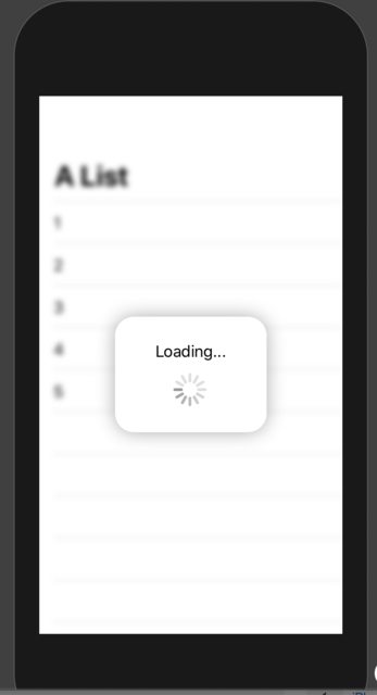
isShowing: .constant(true)。这意味着指示灯始终显示。您需要做的是有一个@State变量,当您要显示加载指示符时(数据正在加载),该变量为true;然后,当您希望加载指示符消失时(将数据完成加载时)将其更改为false。 。isDataLoading例如,如果调用了该变量,则可以isShowing: $isDataLoading代替Matteo放置的位置isShowing: .constant(true)。
tintColor只能在纯Swift UI视图上使用,而不能在桥接(UIViewRepresentable)视图上使用。
如果您想要一个快速的用户界面风格的解决方案,那么这就是魔术:
import SwiftUI

struct ActivityIndicator: View {

  @State private var isAnimating: Bool = false

  var body: some View {
    GeometryReader { (geometry: GeometryProxy) in
      ForEach(0..<5) { index in
        Group {
          Circle()
            .frame(width: geometry.size.width / 5, height: geometry.size.height / 5)
            .scaleEffect(!self.isAnimating ? 1 - CGFloat(index) / 5 : 0.2 + CGFloat(index) / 5)
            .offset(y: geometry.size.width / 10 - geometry.size.height / 2)
          }.frame(width: geometry.size.width, height: geometry.size.height)
            .rotationEffect(!self.isAnimating ? .degrees(0) : .degrees(360))
            .animation(Animation
              .timingCurve(0.5, 0.15 + Double(index) / 5, 0.25, 1, duration: 1.5)
              .repeatForever(autoreverses: false))
        }
      }
    .aspectRatio(1, contentMode: .fit)
    .onAppear {
        self.isAnimating = true
    }
  }
}
只需使用:
ActivityIndicator()
.frame(width: 50, height: 50)
希望能帮助到你!
用法示例:
ActivityIndicator()
.frame(size: CGSize(width: 200, height: 200))
    .foregroundColor(.orange)
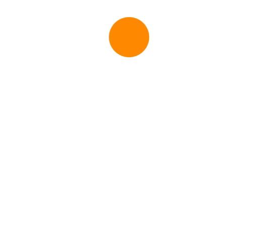
这只是一个简单的视图。
ProgressView()
当前,默认为,CircularProgressViewStyle但是您可以通过添加以下修饰符来手动设置其样式:
.progressViewStyle(CircularProgressViewStyle())
另外,样式可以是任何符合 ProgressViewStyle
UIActivityIndicatorSwiftUI中的完全可自定义标准:(完全作为本机View):您可以构建和配置它(与原始版本一样UIKit):
ActivityIndicator(isAnimating: loading)
    .configure { $0.color = .yellow } // Optional configurations (🎁 bones)
    .background(Color.blue)
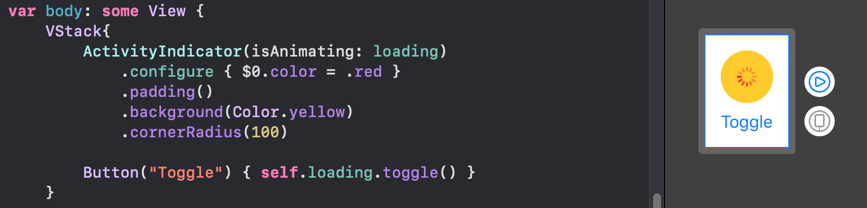
struct,您就会很高兴:struct ActivityIndicator: UIViewRepresentable {
typealias UIView = UIActivityIndicatorView
var isAnimating: Bool
fileprivate var configuration = { (indicator: UIView) in }
func makeUIView(context: UIViewRepresentableContext<Self>) -> UIView { UIView() }
func updateUIView(_ uiView: UIView, context: UIViewRepresentableContext<Self>) {
isAnimating ? uiView.startAnimating() : uiView.stopAnimating()
configuration(uiView)
}
}
通过这个有用的扩展,您可以通过modifier其他SwiftUI来访问配置view:
extension View where Self == ActivityIndicator {
    func configure(_ configuration: @escaping (Self.UIView)->Void) -> Self {
        Self.init(isAnimating: self.isAnimating, configuration: configuration)
    }
}
您也可以在经典的初始化程序中配置视图:
ActivityIndicator(isAnimating: loading) {
    $0.color = .red
    $0.hidesWhenStopped = false
    //Any other UIActivityIndicatorView property you like
}
这种方法是完全适应的。例如,您可以在此处查看如何使用相同的方法使TextField成为第一响应者
.progressViewStyle(CircularProgressViewStyle(tint: Color.red))会改变颜色
尽管Apple现在从SwiftUI 2.0支持本机活动指示器,但是您可以简单地实现自己的动画。SwiftUI 1.0均支持这些功能。此外,它是工作中的小部件。
struct Arcs: View {
    @Binding var isAnimating: Bool
    let count: UInt
    let width: CGFloat
    let spacing: CGFloat

    var body: some View {
        GeometryReader { geometry in
            ForEach(0..<Int(count)) { index in
                item(forIndex: index, in: geometry.size)
                    .rotationEffect(isAnimating ? .degrees(360) : .degrees(0))
                    .animation(
                        Animation.default
                            .speed(Double.random(in: 0.2...0.5))
                            .repeatCount(isAnimating ? .max : 1, autoreverses: false)
                    )
            }
        }
        .aspectRatio(contentMode: .fit)
    }

    private func item(forIndex index: Int, in geometrySize: CGSize) -> some View {
        Group { () -> Path in
            var p = Path()
            p.addArc(center: CGPoint(x: geometrySize.width/2, y: geometrySize.height/2),
                     radius: geometrySize.width/2 - width/2 - CGFloat(index) * (width + spacing),
                     startAngle: .degrees(0),
                     endAngle: .degrees(Double(Int.random(in: 120...300))),
                     clockwise: true)
            return p.strokedPath(.init(lineWidth: width))
        }
        .frame(width: geometrySize.width, height: geometrySize.height)
    }
}
演示不同的变化

struct Bars: View {
    @Binding var isAnimating: Bool
    let count: UInt
    let spacing: CGFloat
    let cornerRadius: CGFloat
    let scaleRange: ClosedRange<Double>
    let opacityRange: ClosedRange<Double>

    var body: some View {
        GeometryReader { geometry in
            ForEach(0..<Int(count)) { index in
                item(forIndex: index, in: geometry.size)
            }
        }
        .aspectRatio(contentMode: .fit)
    }

    private var scale: CGFloat { CGFloat(isAnimating ? scaleRange.lowerBound : scaleRange.upperBound) }
    private var opacity: Double { isAnimating ? opacityRange.lowerBound : opacityRange.upperBound }

    private func size(count: UInt, geometry: CGSize) -> CGFloat {
        (geometry.width/CGFloat(count)) - (spacing-2)
    }

    private func item(forIndex index: Int, in geometrySize: CGSize) -> some View {
        RoundedRectangle(cornerRadius: cornerRadius,  style: .continuous)
            .frame(width: size(count: count, geometry: geometrySize), height: geometrySize.height)
            .scaleEffect(x: 1, y: scale, anchor: .center)
            .opacity(opacity)
            .animation(
                Animation
                    .default
                    .repeatCount(isAnimating ? .max : 1, autoreverses: true)
                    .delay(Double(index) / Double(count) / 2)
            )
            .offset(x: CGFloat(index) * (size(count: count, geometry: geometrySize) + spacing))
    }
}
演示不同的变化
struct Blinking: View {
    @Binding var isAnimating: Bool
    let count: UInt
    let size: CGFloat

    var body: some View {
        GeometryReader { geometry in
            ForEach(0..<Int(count)) { index in
                item(forIndex: index, in: geometry.size)
                    .frame(width: geometry.size.width, height: geometry.size.height)

            }
        }
        .aspectRatio(contentMode: .fit)
    }

    private func item(forIndex index: Int, in geometrySize: CGSize) -> some View {
        let angle = 2 * CGFloat.pi / CGFloat(count) * CGFloat(index)
        let x = (geometrySize.width/2 - size/2) * cos(angle)
        let y = (geometrySize.height/2 - size/2) * sin(angle)
        return Circle()
            .frame(width: size, height: size)
            .scaleEffect(isAnimating ? 0.5 : 1)
            .opacity(isAnimating ? 0.25 : 1)
            .animation(
                Animation
                    .default
                    .repeatCount(isAnimating ? .max : 1, autoreverses: true)
                    .delay(Double(index) / Double(count) / 2)
            )
            .offset(x: x, y: y)
    }
}
演示不同的变化

为了避免代码壁垒,您可以在git上的这个回购中找到更优雅的指示符。
注意,所有这些动画有一个Binding是MUST切换到运行。
iActivityIndicator(style: .rotatingShapes(count: 10, size: 15))
iActivityIndicator().style(.rotatingShapes(count: 10, size: 15))?@ pawello2222吗?
count为5或更少,则动画看起来很好(看起来类似于此答案)。但是,如果将设置count为15,则前导点不会停在圆的顶部。它开始执行另一个循环,然后返回顶部,然后再次开始循环。我不确定这是否有意。仅在模拟器Xcode 12.0.1上进行了测试。
我使用SwiftUI实现了经典的UIKit指标。 此处查看活动指标
struct ActivityIndicator: View {
  @State private var currentIndex: Int = 0

  func incrementIndex() {
    currentIndex += 1
    DispatchQueue.main.asyncAfter(deadline: .now() + .milliseconds(50), execute: {
      self.incrementIndex()
    })
  }

  var body: some View {
    GeometryReader { (geometry: GeometryProxy) in
      ForEach(0..<12) { index in
        Group {
          Rectangle()
            .cornerRadius(geometry.size.width / 5)
            .frame(width: geometry.size.width / 8, height: geometry.size.height / 3)
            .offset(y: geometry.size.width / 2.25)
            .rotationEffect(.degrees(Double(-360 * index / 12)))
            .opacity(self.setOpacity(for: index))
        }.frame(width: geometry.size.width, height: geometry.size.height)
      }
    }
    .aspectRatio(1, contentMode: .fit)
    .onAppear {
      self.incrementIndex()
    }
  }

  func setOpacity(for index: Int) -> Double {
    let opacityOffset = Double((index + currentIndex - 1) % 11 ) / 12 * 0.9
    return 0.1 + opacityOffset
  }
}

struct ActivityIndicator_Previews: PreviewProvider {
  static var previews: some View {
    ActivityIndicator()
      .frame(width: 50, height: 50)
      .foregroundColor(.blue)
  }
}
我进行了一些更新,以便可以将其放入快速包装中:
活动指标:
import Foundation
import SwiftUI
import UIKit

public struct ActivityIndicator: UIViewRepresentable {

  public typealias UIView = UIActivityIndicatorView
  public var isAnimating: Bool = true
  public var configuration = { (indicator: UIView) in }

 public init(isAnimating: Bool, configuration: ((UIView) -> Void)? = nil) {
    self.isAnimating = isAnimating
    if let configuration = configuration {
        self.configuration = configuration
    }
 }

 public func makeUIView(context: UIViewRepresentableContext<Self>) -> UIView {
    UIView()
 }

 public func updateUIView(_ uiView: UIView, context:
    UIViewRepresentableContext<Self>) {
     isAnimating ? uiView.startAnimating() : uiView.stopAnimating()
     configuration(uiView)
}}
延期:
public extension View where Self == ActivityIndicator {
func configure(_ configuration: @escaping (Self.UIView) -> Void) -> Self {
    Self.init(isAnimating: self.isAnimating, configuration: configuration)
 }
}
SwiftUI中的活动指示器
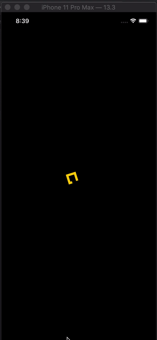
import SwiftUI

struct Indicator: View {

    @State var animateTrimPath = false
    @State var rotaeInfinity = false

    var body: some View {

        ZStack {
            Color.black
                .edgesIgnoringSafeArea(.all)
            ZStack {
                Path { path in
                    path.addLines([
                        .init(x: 2, y: 1),
                        .init(x: 1, y: 0),
                        .init(x: 0, y: 1),
                        .init(x: 1, y: 2),
                        .init(x: 3, y: 0),
                        .init(x: 4, y: 1),
                        .init(x: 3, y: 2),
                        .init(x: 2, y: 1)
                    ])
                }
                .trim(from: animateTrimPath ? 1/0.99 : 0, to: animateTrimPath ? 1/0.99 : 1)
                .scale(50, anchor: .topLeading)
                .stroke(Color.yellow, lineWidth: 20)
                .offset(x: 110, y: 350)
                .animation(Animation.easeInOut(duration: 1.5).repeatForever(autoreverses: true))
                .onAppear() {
                    self.animateTrimPath.toggle()
                }
            }
            .rotationEffect(.degrees(rotaeInfinity ? 0 : -360))
            .scaleEffect(0.3, anchor: .center)
            .animation(Animation.easeInOut(duration: 1.5)
            .repeatForever(autoreverses: false))
            .onAppear(){
                self.rotaeInfinity.toggle()
            }
        }
    }
}

struct Indicator_Previews: PreviewProvider {
    static var previews: some View {
        Indicator()
    }
}
import SwiftUI

struct LoadingPlaceholder: View {
    var text = "Loading..."
    init(text:String ) {
        self.text = text
    }
    var body: some View {
        VStack(content: {
            ProgressView(self.text)
        })
    }
}
有关SwiftUI ProgressView的更多信息
// Activity View

struct ActivityIndicator: UIViewRepresentable {

    let style: UIActivityIndicatorView.Style
    @Binding var animate: Bool

    private let spinner: UIActivityIndicatorView = {
        $0.hidesWhenStopped = true
        return $0
    }(UIActivityIndicatorView(style: .medium))

    func makeUIView(context: UIViewRepresentableContext<ActivityIndicator>) -> UIActivityIndicatorView {
        spinner.style = style
        return spinner
    }

    func updateUIView(_ uiView: UIActivityIndicatorView, context: UIViewRepresentableContext<ActivityIndicator>) {
        animate ? uiView.startAnimating() : uiView.stopAnimating()
    }

    func configure(_ indicator: (UIActivityIndicatorView) -> Void) -> some View {
        indicator(spinner)
        return self
    }
}

// Usage
struct ContentView: View {

    @State var animate = false

    var body: some View {
            ActivityIndicator(style: .large, animate: $animate)
                .configure {
                    $0.color = .red
            }
            .background(Color.blue)
    }
}