我正在对具有圆形边框(边界半径)的输入字段进行样式设置,并尝试向该边框添加渐变。我可以成功制作渐变色和圆角边框,但是不能同时使用。它可以是不带渐变的圆角,也可以是带渐变但不带圆角的边界。
-webkit-border-radius: 5px;
-webkit-border-image: -webkit-gradient(linear, 0 0, 0 100%, from(#b0bbc4), to(#ced9de)) 1 100%;
无论如何,两个CSS属性可以一起工作,还是不可能?
Answers:
根据W3C规范,可能不可能:
盒子的背景而不是边框图像被裁剪为适当的曲线(由“ background-clip”确定)。剪切到边框或填充边缘的其他效果(例如“可见”以外的“溢出”)也必须剪切到曲线。替换元素的内容始终会修剪到内容边缘曲线。同样,边界边缘曲线之外的区域也不代表该元素接受鼠标事件。
这很可能是因为border-image可能采取一些潜在的复杂模式。如果您想要一个圆形的图像边框,则需要自己创建一个。
这是可能的,并且不需要额外的标记,但是使用了::after伪元素。
它涉及在下面放置一个带有渐变背景的伪元素并将其剪切。这适用于所有当前没有供应商前缀或黑客(甚至是IE)的浏览器,但是如果您想支持IE的老式版本,则应考虑纯色后备,JavaScript和/或自定义MSIE CSS扩展(即filterCSSPie-例如向量欺骗等)。
这是一个实时示例(jsfiddle版本):
@import url('//raw.githubusercontent.com/necolas/normalize.css/master/normalize.css');

html {
    /* just for showing that background doesn't need to be solid */
    background: linear-gradient(to right, #DDD 0%, #FFF 50%, #DDD 100%);
    padding: 10px;
}

.grounded-radiants {
    position: relative;
    border: 4px solid transparent;
    border-radius: 16px;
    background: linear-gradient(orange, violet);
    background-clip: padding-box;
    padding: 10px;
    /* just to show box-shadow still works fine */
    box-shadow: 0 3px 9px black, inset 0 0 9px white;
}

.grounded-radiants::after {
    position: absolute;
    top: -4px; bottom: -4px;
    left: -4px; right: -4px;
    background: linear-gradient(red, blue);
    content: '';
    z-index: -1;
    border-radius: 16px;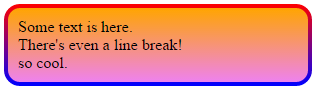
}<p class="grounded-radiants">
Some text is here.<br/>
There's even a line break!<br/>
so cool.
</p>上面的额外样式是为了显示:
box-shadow,inset或不再次,这适用于IE,Firefox和Webkit / Blink浏览器。
position:relative;z-index:-1到后台并保存:jsfiddle.net/osw11t96/346
解决这个问题。遇到了一个非SVG解决方案,该解决方案比其他解决方案更简洁:
div{
  width: 300px;
  height: 80px;
  border: double 1em transparent;
  border-radius: 30px;
  background-image: linear-gradient(white, white),
                    linear-gradient(to right, green, gold);
  background-origin: border-box;
  background-clip: content-box, border-box;
}<div></div>这不是我自己的解决方案,而是从这里获取的:https : //gist.github.com/stereokai/36dc0095b9d24ce93b045e2ddc60d7a0
padding元素,请将background-clip属性更改为padding-box, border-box。
我将为此使用SVG:
<svg xmlns="http://www.w3.org/2000/svg" viewBox="0 0 220 220" width="100%" height="100%" preserveAspectRatio="none">
  <defs>
    <linearGradient id="gradient">
      <stop offset="0" style="stop-color:#0070d8" />
      <stop offset="0.5" style="stop-color:#2cdbf1" />
      <stop offset="1" style="stop-color:#83eb8a" />
    </linearGradient>
  </defs>
  <ellipse ry="100" rx="100" cy="110" cx="110" style="fill:none;stroke:url(#gradient);stroke-width:6;" />
</svg>SVG可以用作单独的文件(首选方式)或类似value的一部分background(以下代码仅在webkit-browsers中有效):
div {
  width: 250px;
  height: 250px;
  background: url('data:image/svg+xml;utf8,<svg xmlns="http://www.w3.org/2000/svg" viewBox="0 0 220 220" width="100%" height="100%" preserveAspectRatio="none"><defs><linearGradient id="gradient"><stop offset="0" style="stop-color:#0070d8" /><stop offset="0.5" style="stop-color:#2cdbf1" /><stop offset="1" style="stop-color:#83eb8a" /></linearGradient></defs><ellipse ry="100" rx="100" cy="110" cx="110" style="fill:none;stroke:url(#gradient);stroke-width:6;" /></svg>');
}<div></div>对于这个在MS Edge和Firefox的工作中,我们要越狱后我们的标记utf8,因此,我们将取代双引号"与单引号',#用%23和%用%25:
div {
  width: 250px;
  height: 250px;
  background: url("data:image/svg+xml;utf8,<svg xmlns='http://www.w3.org/2000/svg' viewBox='0 0 220 220' width='100%25' height='100%25' preserveAspectRatio='none'><defs><linearGradient id='gradient'><stop offset='0' style='stop-color:%230070d8' /><stop offset='0.5' style='stop-color:%232cdbf1' /><stop offset='1' style='stop-color:%2383eb8a' /></linearGradient></defs><ellipse ry='100' rx='100' cy='110' cx='110' style='fill:none;stroke:url(%23gradient);stroke-width:6;' /></svg>");
  background-size: 100% 100%; /* Fix for Fifefox image scaling */
}<div></div>透明元素的解决方案:至少在Firefox中有效。
实际上,我发现没有伪类的一种方法-但它仅适用于径向渐变:
body {
  background: linear-gradient(white, black), -moz-linear-gradient(white, black), -webkit-linear-gradient(white, black);
  height: 300px;

  }

div{
text-align: center;
  width: 100px;
  height: 100px;
  font-size:30px;
  color: lightgrey;
  border-radius: 80px;
  color: transparent;
  background-clip: border-box, text;
  -moz-background-clip: border-box, text;
  -webkit-background-clip: border-box, text;
  background-image: radial-gradient(circle,
      transparent, transparent 57%, yellow 58%, red 100%), repeating-linear-gradient(-40deg, yellow,
  yellow 10%, orange 21%, orange 30%, yellow 41%);
  line-height: 100px;
}<body>
<div class="radial-gradient"> OK </div>
</body>使用伪类来获得透明元素,我才是这样发现的-好的,它不是渐变,但至少是彩色条纹边框(看起来像救生圈):
body {
  background: linear-gradient(white, black, white);
  height: 600px;
  }

div{
  position: absolute;
  width: 100px;
  height: 100px;
  font-size:30px;
  background-color:transparent;
  border-radius:80px;
  border: 10px dashed orange;
  color: transparent;
  background-clip: text;
  -moz-background-clip: text;
  -webkit-background-clip: text;
  background-image: repeating-linear-gradient(-40deg, yellow,
  yellow 10%, orange 11%, orange 20%, yellow 21%);
  text-align:center;
  line-height:100px;
}


div::after {
    position: absolute;
    top: -10px; bottom: -10px;
    left: -10px; right: -10px;
    border: 10px solid yellow;
    content: '';
    z-index: -1;
    border-radius: 80px;
}<body>
<div class="gradient"> OK </div>
</body>带有svg(在可变性方面最令人满意,但也需要大多数代码行):
body{
  margin: 0;
  padding: 0;
}

div {
  position: absolute;
  display: flex;
  align-items: center;
  left: 50%;
  transform: translateX(-50%);
  text-align: center;
}

span {
  position: absolute;
  left: 50%;
  transform: translateX(-50%);
  width: 100px;
  height: 100px;
  line-height: 105px;
  font-size:40px;
  background-clip: text;
  -moz-background-clip: text;
  -webkit-background-clip: text;
  background-image: repeating-linear-gradient(-40deg, yellow,
  yellow 10%, orange 11%, orange 20%, yellow 21%);
  color: transparent;
}

svg {
  fill: transparent;
  stroke-width: 10px;
  stroke:url(#gradient);

}<head>
</head>
<body>
<div>
<span>OK</span>
<svg>
<circle class="stroke-1" cx="50%" cy="50%" r="50"/>
<defs>
<linearGradient id="gradient" x1="0%" y1="0%" x2="0%" y2="15%" gradientTransform="rotate(-40)" spreadMethod="reflect">
<stop offset="0%" stop-color="orange" />
<stop offset="49%" stop-color="orange" />
<stop offset="50%" stop-color="yellow" />
<stop offset="99%" stop-color="yellow" />
</linearGradient>
</defs>
</svg>
</div>
</body>如果将渐变应用于背景怎么办。并在其中添加一个额外的div,边距设置为旧的border-width,背景为白色,当然还有borderradius。这样,您具有边框的效果,但是实际上使用的是背景,背景被正确裁剪。
在WebKit中,这总是对我有用,尽管有点棘手!
基本上,您只是使边框变大,然后使用越来越大的伪元素的边框将其屏蔽掉:)。
.thing {
  display: block;
  position: absolute;
  left: 50px;
  top: 50px;
  margin-top: 18pt;
  padding-left: 50pt;
  padding-right: 50pt;
  padding-top: 25pt;
  padding-bottom: 25pt;
  border-radius: 6px;
  font-size: 18pt;
  background-color: transparent;
  border-width: 3pt;
  border-image: linear-gradient(#D9421C, #E8A22F) 14% stretch;
}
.thing::after {
  content: '';
  border-radius: 8px;
  border: 3pt solid #fff;
  width: calc(100% + 6pt);
  height: calc(100% + 6pt);
  position: absolute;
  top: -6pt;
  left: -6pt;
  z-index: 900;
}
.thing::before {
  content: '';
  border-radius: 2px;
  border: 1.5pt solid #fff;
  width: calc(100%);
  height: calc(100% + 0.25pt);
  position: absolute;
  top: -1.5pt;
  left: -1.5pt;
  z-index: 900;
}
答案很简单:要具有彩色的弯曲边框,我们首先需要具有弯曲的背景。然后您的问题将得到解决(没有梯度的情况):
.buttonBorder {
    -fx-border-color: red;
    -fx-background-color: white;
    -fx-background-radius: 30;
    -fx-border-radius: 30;
}