如何将整个html主体对齐到中心?
如何将整个HTML正文与中心对齐?
Answers:
我只是偶然发现了这篇旧文章,虽然我确定user01很早就找到了他的答案,但我发现当前的答案不太有效。在使用其他人提供的信息玩了一会儿之后,我找到了一个适用于IE,Firefox和Chrome的解决方案。在CSS中:
html, body {
    height: 100%;
}

html {
    display: table;
    margin: auto;
}

body {
    display: table-cell;
    vertical-align: middle;
}
这几乎与abernier的答案相同,但是我发现包含宽度会破坏居中,并且会忽略自动边距。我希望任何偶然发现此线程的人都能对我的回答有所帮助。
注意:忽略html, body { height: 100%; }仅水平居中。
好答案。只是想知道(因为我没有使用HTML的丰富经验),将高度设置为100%是否必要?
—
日落。
@JackHumphries仅在要在垂直轴和水平轴上对齐页面中心时才需要高度。如果只需要水平,则可以省略高度。
—
MildWolfie 2013年
你可以试试:
body{ margin:0 auto; }
这是一个简单的答案,但却是将body标签居中在页面中间的最干净,最有效的方法。
—
justinhartman '18 -10-30
虽然很短,但在IE,Edge Legacy,Edge,Chrome和Firefox中也无法使用。问题在于,仅当元素宽度小于父元素宽度时,margin自动工作。由于“ body”默认为100%,因此边缘没有空间自动插入边距。您可以使用
—
user3347790
body { margin:0 auto; max-width: 700px; },然后您的身体将达到700像素,并允许在较小的设备上包装。
编辑
从今天起,使用flexbox,您可以
body {
  display:flex; flex-direction:column; justify-content:center;
  min-height:100vh;
}
上一个答案
html, body {height:100%;}
html {display:table; width:100%;}
body {display:table-cell; text-align:center; vertical-align:middle;}
哪个DOCTYPE允许实体的
—
2014年
style属性html?
@ceving:不确定要了解...是不是CSS有效的?
—
阿伯尼耶(Abernier)
如果我想分享一件事关于CSS的东西,那是我在两根轴上都放置东西的最喜欢的方式!
这种方法的优点:
- 与人们实际使用的浏览器完全兼容
- 不需要桌子
- 高度可重用,可将其他任何元素置于其父元素内部居中
- 为父母和孩子提供动态(变化的)尺寸!
我总是通过使用2个类来做到这一点:一种指定父元素,其内容将居中(.centered-wrapper),第二种指定父元素的哪个子项居中(.centered-content)。如果父级有多个子级,但只需要居中1个,则第二类很有用。在这种情况下,body将是.centered-wrapper,内部div将是.centered-content。
<html>
    <head>...</head>
    <body class="centered-wrapper">
        <div class="centered-content">...</div>
    </body>
</html>居中的想法现在是做.centered-content一个inline-block。可以轻松地通过进行水平居中,text-align: center;也可以实现垂直居中,如您所见。
.centered-wrapper {
    position: relative;
    text-align: center;
}
.centered-wrapper:before {
    content: "";
    position: relative;
    display: inline-block;
    width: 0; height: 100%;
    vertical-align: middle;
}
.centered-content {
    display: inline-block;
    vertical-align: middle;
}这为您提供了2个真正可重用的类,用于将任何孩子居于任何父母中间!只需添加.centered-wrapper和.centered-content类。
那么,那个:before元素是怎么回事?vertical-align: middle;因为垂直对齐方式与父级的高度无关- 垂直对齐方式与最高的同级兄弟的高度有关,所以它很方便而且是必需的!。因此,通过确保有一个兄弟姐妹的高度是父母的高度(100%的高度,0宽度使其不可见),我们知道垂直对齐将相对于父母的高度。
最后一件事:您需要确保html和body标签的大小与窗口的大小相同,以使其居中与以浏览器居中相同!
html, body {
    width: 100%;
    height: 100%;
    padding: 0;
    margin: 0;
}http://bluerobot.com/web/css/center1.html
body {
    margin:50px 0;
    padding:0;
    text-align:center;
}

#Content {
    width:500px;
    margin:0 auto;
    text-align:left;
    padding:15px;
    border:1px dashed #333;
    background-color:#eee;
}
最后的目的是什么
—
Don Cheadle
0px,而不是auto?
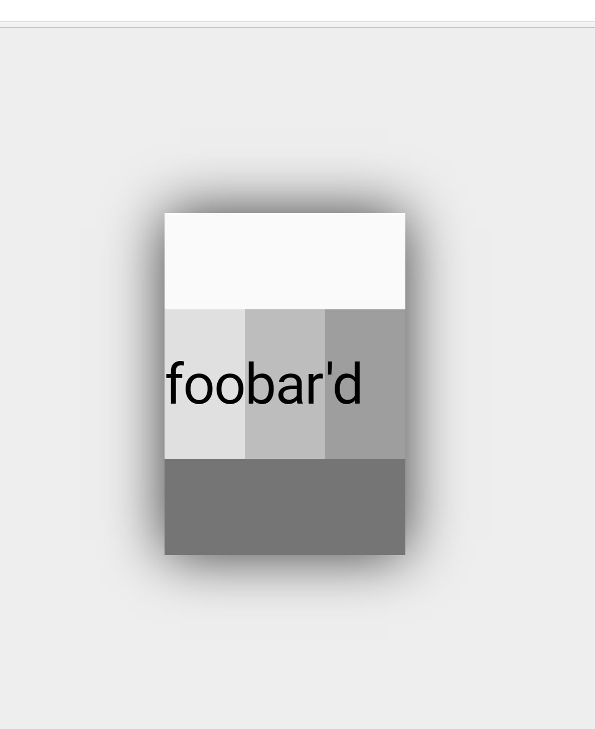
我在上使用flexbox html。为了获得良好的效果,您可以匹配浏览器的chrome浏览器,以便在大于页面最大值的屏幕尺寸上显示内容。我发现#eeeeee匹配很好。您可以添加框阴影以获得不错的浮动效果。
    html{
        display: flex;
        flex-flow: row nowrap;
        justify-content: center;
        align-content: center;
        align-items: center;
        height:100%;
        margin: 0;
        padding: 0;
        background:#eeeeee;
    }
    body {
        margin: 0;
        flex: 0 1 auto;
        align-self: auto;
        /*recommend 1920 / 1080 max based on usage stats, use 100% to that point*/
        width: 100%
        max-width: 900px;
        height: 100%;
        max-height: 600px;
        background:#fafafa;
        -webkit-box-shadow: 0px 0px 96px 0px rgba(0,0,0,0.75);
        -moz-box-shadow: 0px 0px 96px 0px rgba(0,0,0,0.75);
        box-shadow: 0px 0px 96px 0px rgba(0,0,0,0.75);
    }
 图片/数据由StatCounter提供
好,现代的答案。只是一些评论。(a)的厂商前缀
—
Manngo '18
box-shadow可能是多余的,因为支持的浏览器flex也支持box-shadow。(b)有很多CSS可以修饰您的答案,但会使重要的部分难以区分。感谢
在上面@Manngo的评论中,非常(b)。
—
cjauvin
好答案。现代。但这可能是具有相同内容的一种更简单的方法。
—
carloswm85
<style>
        body{
            max-width: 1180px;
            width: 98%;
            margin: 0px auto;
            text-align: left;
        }
</style>
在应用任何CSS之前,只需应用此样式即可。您可以根据需要更改宽度。
试试这个
body {
max-width: max-content;
margin: auto;
}