我想创建一个进度条,如下图所示:

我不知道要创建这个。我应该使用HTML5技术吗?
您能否给我一些有关创建此进度条的帮助?
Answers:
#progressbar {
  background-color: black;
  border-radius: 13px;
  /* (height of inner div) / 2 + padding */
  padding: 3px;
}

#progressbar>div {
  background-color: orange;
  width: 40%;
  /* Adjust with JavaScript */
  height: 20px;
  border-radius: 10px;
}<div id="progressbar">
<div></div>
</div>(编辑:更改了语法高亮;将后代更改为子选择器)
http://jsfiddle.net/cwZSW/1406/
#progress {
    background: #333;
    border-radius: 13px;
    height: 20px;
    width: 300px;
    padding: 3px;
}

#progress:after {
    content: '';
    display: block;
    background: orange;
    width: 50%;
    height: 100%;
    border-radius: 9px;
}<div id="progress"></div>border-radius,-webkit-border-radius或-moz-border-radius
2014年的答案:自2014年以来,HTML 5现在包含<progress> element不需要JavaScript的。百分比值使用内联内容随进度移动。仅在webkit中测试。希望能帮助到你:
CSS:
progress {
	display:inline-block;
	width:190px;
	height:20px;
	padding:15px 0 0 0;
	margin:0;
	background:none;
	border: 0;
	border-radius: 15px;
	text-align: left;
	position:relative;
	font-family: Arial, Helvetica, sans-serif;
	font-size: 0.8em;
}
progress::-webkit-progress-bar {
	height:11px;
	width:150px;
	margin:0 auto;
	background-color: #CCC;
	border-radius: 15px;
	box-shadow:0px 0px 6px #777 inset;
}
progress::-webkit-progress-value {
	display:inline-block;
	float:left;
	height:11px;
	margin:0px -10px 0 0;
	background: #F70;
	border-radius: 15px;
	box-shadow:0px 0px 6px #777 inset;
}
progress:after {
	margin:-26px 0 0 -7px;
	padding:0;
	display:inline-block;
	float:left;
	content: attr(value) '%';
}<progress id="progressBar" max="100" value="77"></progress>我喜欢这一个:
HTML和其余的向后兼容的CSS3都非常流畅(尽管它的眼花less乱)
编辑 下面的已添加代码,但直接取自上面的页面,所有功劳归该作者
.meter {
  height: 20px;
  /* Can be anything */
  position: relative;
  background: #555;
  -moz-border-radius: 25px;
  -webkit-border-radius: 25px;
  border-radius: 25px;
  padding: 10px;
  -webkit-box-shadow: inset 0 -1px 1px rgba(255, 255, 255, 0.3);
  -moz-box-shadow: inset 0 -1px 1px rgba(255, 255, 255, 0.3);
  box-shadow: inset 0 -1px 1px rgba(255, 255, 255, 0.3);
}

.meter>span {
  display: block;
  height: 100%;
  -webkit-border-top-right-radius: 8px;
  -webkit-border-bottom-right-radius: 8px;
  -moz-border-radius-topright: 8px;
  -moz-border-radius-bottomright: 8px;
  border-top-right-radius: 8px;
  border-bottom-right-radius: 8px;
  -webkit-border-top-left-radius: 20px;
  -webkit-border-bottom-left-radius: 20px;
  -moz-border-radius-topleft: 20px;
  -moz-border-radius-bottomleft: 20px;
  border-top-left-radius: 20px;
  border-bottom-left-radius: 20px;
  background-color: #f1a165;
  background-image: -webkit-gradient(linear, left top, left bottom, color-stop(0, #f1a165), color-stop(1, #f36d0a));
  background-image: -webkit-linear-gradient(top, #f1a165, #f36d0a);
  background-image: -moz-linear-gradient(top, #f1a165, #f36d0a);
  background-image: -ms-linear-gradient(top, #f1a165, #f36d0a);
  background-image: -o-linear-gradient(top, #f1a165, #f36d0a);
  -webkit-box-shadow: inset 0 2px 9px rgba(255, 255, 255, 0.3), inset 0 -2px 6px rgba(0, 0, 0, 0.4);
  -moz-box-shadow: inset 0 2px 9px rgba(255, 255, 255, 0.3), inset 0 -2px 6px rgba(0, 0, 0, 0.4);
  position: relative;
  overflow: hidden;
}<div class="meter">
<span style="width: 33%"></span>
<!-- I use my viewmodel in MVC to calculate the progress and then use @Model.progress to place it in my HTML with Razor -->
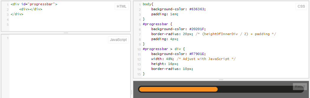
</div>与@RoToRa的答案相同,但进行了一些细微调整(正确的颜色和尺寸):
body {
  background-color: #636363;
  padding: 1em;
}

#progressbar {
  background-color: #20201F;
  border-radius: 20px; /* (heightOfInnerDiv / 2) + padding */
  padding: 4px;
}

#progressbar>div {
  background-color: #F7901E;
  width: 48%;
  /* Adjust with JavaScript */
  height: 16px;
  border-radius: 10px;
}<div id="progressbar">
<div></div>
</div>这是小提琴:jsFiddle
这是它的样子:
在现代浏览器中,您可以使用CSS3和HTML5进度元素!
progress {
  width: 40%;
  display: block; /* default: inline-block */
  margin: 2em auto;
  padding: 3px;
  border: 0 none;
  background: #444;
  border-radius: 14px;
}
progress::-moz-progress-bar {
  border-radius: 12px;
  background: orange;

}
/* webkit */
@media screen and (-webkit-min-device-pixel-ratio:0) {
  progress {
    height: 25px;
  }
}
progress::-webkit-progress-bar {
    background: transparent;
}
progress::-webkit-progress-value {
  border-radius: 12px;
  background: orange;
} <progress max="100" value="40"></progress>没有嵌套div的进度栏...对于css线性渐变起作用的每个元素。
这里是JSFiddle http://jsfiddle.net/oj1L3y6t/2/
function show_progress(i) {
  var progress1 = i;
  var progress2 = progress1 + 1;
  var progress3 = progress1 + 2;

  var magic = "linear-gradient(to right, #FFC2CE " + progress1 + "% ,red " + progress2 + "% , #FFFFFF " + progress3 + "%)";
  document.getElementById("progress-0").style.background = magic;

  var magic = "linear-gradient(to right, lightblue " + progress1 + "% , lightgreen " + progress2 + "%)";
  document.getElementById("progress-1").style.background = magic;

  var magic = "linear-gradient(to right, lightblue " + progress1 + "% , #FFFFFF 100%)";
  document.getElementById("progress-2").style.background = magic;

  var magic = "linear-gradient(#FFC2CE " + progress1 + "% ,red " + progress2 + "% , #FFFFFF " + progress3 + "%)";
  document.getElementById("progress-3").style.background = magic;
}

function timeout() {
  t = setTimeout(function() {
    show_progress(t)
    timeout();
  }, 50);
  if (t == 78) {
    clearTimeout(t);
  }
  console.log(t);
}

timeout();
#progress-0 {
border: 1px solid black;
width: 500px;
background: #999;
text-align: center;
}
#progress-1 {
border: 1px solid black;
width: 500px;
background: #999;
text-align: center;
margin-top: 10px;
border-radius: 10px;
}
#progress-2 {
border: 1px solid black;
width: 500px;
background: #999;
text-align: center;
margin-top: 10px;
}
#progress-3 {
border: 1px solid black;
width: 100px;
height: 100px;
background: #999;
line-height: 100px;
text-align: center;
margin-top: 10px;
border-radius: 200px;
}<div id="progress-0">Loading</div>
<input id="progress-1" value="Loading"></input>
<button id="progress-2">Loading</button>
<p id="progress-3">Loading</p>创建一个显示条形图的左侧部分(圆形部分)的元素,并为右侧部分创建一个元素。对于实际进度条,请创建第三个元素,该元素的重复背景和宽度取决于实际进度。将其全部放在背景图像的顶部(包含空白进度栏)。
但是我想你已经知道了...
编辑:创建不使用文本背景的进度条时。您可以使用border-radius获得圆形效果,如Rikudo Sennin和RoToRa所示!
.loading {
  position: relative;
  width: 50%;
  height: 200px;
  border: 1px solid rgba(160, 160, 164, 0.2);
  background-color: rgba(160, 160, 164, 0.2);
  border-radius: 3px;
}

span.loader {
  position: absolute;
  top: 40%;
  left: 10%;
  width: 250px;
  height: 20px;
  border-radius: 8px;
  border: 2px solid rgba(160, 160, 164, 0.8);
  padding: 0;
}

span.loader span.innerLoad {
  text-align: center;
  width: 140px;
  font-size: 15px;
  font-stretch: extra-expanded;
  color: #2A00FF;
  padding: 1px 18px 3px 80px;
  border-radius: 8px;
  background: rgb(250, 198, 149);
  background: -moz-linear-gradient(left, rgba(250, 198, 149, 1) 0%, rgba(245, 171, 102, 1) 47%, rgba(239, 141, 49, 1) 100%);
  background: -webkit-gradient(linear, left top, right top, color-stop(0%, rgba(250, 198, 149, 1)), color-stop(47%, rgba(245, 171, 102, 1)), color-stop(100%, rgba(239, 141, 49, 1)));
  background: -webkit-linear-gradient(left, rgba(250, 198, 149, 1) 0%, rgba(245, 171, 102, 1) 47%, rgba(239, 141, 49, 1) 100%);
  background: -o-linear-gradient(left, rgba(250, 198, 149, 1) 0%, rgba(245, 171, 102, 1) 47%, rgba(239, 141, 49, 1) 100%);
  background: -ms-linear-gradient(left, rgba(250, 198, 149, 1) 0%, rgba(245, 171, 102, 1) 47%, rgba(239, 141, 49, 1) 100%);
  background: linear-gradient(to right, rgba(250, 198, 149, 1) 0%, rgba(245, 171, 102, 1) 47%, rgba(239, 141, 49, 1) 100%);
  filter: progid:DXImageTransform.Microsoft.gradient( startColorstr='#fac695', endColorstr='#ef8d31', GradientType=1);
}<div class="loading">
<span class="loader">
<span class="innerLoad">Loading...</span>
</span>
</div> .black-strip
{ width:100%;
height: 30px;
background-color:black;
}
.green-strip
{ width:0%;
height: 30px;
background-color:lime;
animation-name: progress-bar;
animation-duration: 4s;
animation-iteration-count: infinite;
}
@keyframes progress-bar {
from{width:0%}
to{width:100%}
}
<div class="black-strip">
<div class="green-strip">
</div>
</div>
如果您希望在不添加任何代码的情况下拥有进度条,那么PACE可能是您的绝佳工具。
只需包括一下speed.js和您选择的CSS主题,您就会获得页面加载和AJAX导航的漂亮进度指示器。使用PACE最好的是自动检测进度。
它还包含各种主题和配色方案。
值得一试。
.bar {
background - color: blue;
height: 40 px;
width: 40 px;
border - style: solid;
border - right - width: 1300 px;
border - radius: 40 px;
animation - name: Load;
animation - duration: 11 s;
position: relative;
animation - iteration - count: 1;
animation - fill - mode: forwards;
}

@keyframes Load {
100 % {
    width: 1300 px;border - right - width: 5;
}
background - color: blue;必须是background-color: blue;
使用setInterval。
var totalelem = document.getElementById("total");
var progresselem = document.getElementById("progress");
var interval = setInterval(function(){
    if(progresselem.clientWidth>=totalelem.clientWidth)
    {
        clearInterval(interval);
        return;
    }
    progresselem.style.width = progresselem.offsetWidth+1+"px";
},10)
.outer
{
width: 200px;
height: 15px;
background: red;
}
.inner
{
width: 0px;
height: 15px;
background: green;
}<div id="total" class="outer">
<div id="progress" class="inner"></div>
</div>使用CSS Transtitions。
function loading()
{
    document.getElementById("progress").style.width="200px";
}
.outer
{
width: 200px;
height: 15px;
background: red;
}
.inner
{
width: 0px;
height: 15px;
background: green;
-webkit-transition:width 3s linear;
transition: width 3s linear;
}<div id="total" class="outer">
<div id="progress" class="inner"></div>
</div>
<button id="load" onclick="loading()">Load</button>为什么不能只为状态栏的每个部分创建多张图片?如果是三分之一,那么只需显示状态栏的三分之一即可。这非常简单。您可能会想出如何根据带有form标签的输入将其更改为下一幅图片。这是我的代码部分,您稍后必须弄清楚表单中的内容
<form> <!--(extra code)-->
<!--first progress bar:-->
<img src="directory"></img>
<!--second progress bar:-->
<img src="directory"></img>
<!--et caetera...-->
</form>
现在看来很简单,不是吗?