Android-按钮边框
Answers:
步骤1:创建名为:my_button_bg.xml的文件
步骤2:将此文件放置在res / drawables.xml中
步骤3:插入以下代码
<?xml version="1.0" encoding="utf-8"?>
<shape xmlns:android="http://schemas.android.com/apk/res/android"
  android:shape="rectangle">
  <gradient android:startColor="#FFFFFF"
    android:endColor="#00FF00"
    android:angle="270" />
  <corners android:radius="3dp" />
  <stroke android:width="5px" android:color="#000000" />
</shape>
步骤4:在需要的地方使用代码“ android:background =“ @ drawable / my_button_bg”,例如:
<Button
    android:layout_width="wrap_content"
    android:layout_height="wrap_content"
    android:text="Your Text"
    android:background="@drawable/my_button_bg"
    />
• Android Official Solution
自从引入Android Design支持v28以来,使用即可轻松创建带边框的按钮MaterialButton。此类为构造函数中的按钮提供更新的Material样式。使用app:strokeColor和app:strokeWidth您可以创建自定义边框,如下所示:
1.使用时androidx:
build.gradle
dependencies {
    implementation 'androidx.appcompat:appcompat:1.1.0'
    implementation 'com.google.android.material:material:1.0.0'
}
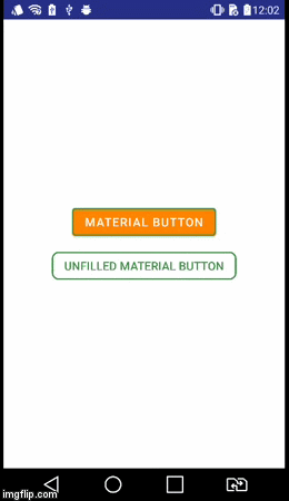
•带边框的按钮:
<com.google.android.material.button.MaterialButton
    style="@style/Widget.AppCompat.Button.Colored"
    android:layout_width="wrap_content"
    android:layout_height="wrap_content"
    android:text="MATERIAL BUTTON"
    android:textSize="15sp"
    app:strokeColor="@color/green"
    app:strokeWidth="2dp" />
•未填充边框按钮:
<com.google.android.material.button.MaterialButton
    style="@style/Widget.AppCompat.Button.Borderless"
    android:layout_width="wrap_content"
    android:layout_height="wrap_content"
    android:text="UNFILLED MATERIAL BUTTON"
    android:textColor="@color/green"
    android:textSize="15sp"
    app:backgroundTint="@android:color/transparent"
    app:cornerRadius="8dp"
    app:rippleColor="#33AAAAAA"
    app:strokeColor="@color/green"
    app:strokeWidth="2dp" />
2.使用时appcompat:
build.gradle
dependencies {
    implementation 'com.android.support:design:28.0.0'
}
style.xml
确保您的应用程序主题继承自Theme.MaterialComponents而不是Theme.AppCompat。
<style name="AppTheme" parent="Theme.MaterialComponents.Light.DarkActionBar">
    <!-- Customize your theme here. -->
</style>
•带边框的按钮:
<android.support.design.button.MaterialButton
    android:layout_width="wrap_content"
    android:layout_height="wrap_content"
    android:text="MATERIAL BUTTON"
    android:textSize="15sp"
    app:strokeColor="@color/green"
    app:strokeWidth="2dp" />
•未填充边框按钮:
<android.support.design.button.MaterialButton
    style="@style/Widget.AppCompat.Button.Borderless"
    android:layout_width="wrap_content"
    android:layout_height="wrap_content"
    android:text="UNFILLED MATERIAL BUTTON"
    android:textColor="@color/green"
    android:textSize="15sp"
    app:backgroundTint="@android:color/transparent"
    app:cornerRadius="8dp"
    app:rippleColor="#33AAAAAA"
    app:strokeColor="@color/green"
    app:strokeWidth="2dp" />
视觉结果
style="@style/Widget.AppCompat.Button.Borderless"怎么办?
button_border.xml在您的可绘制文件夹中创建文件。
res / drawable / button_border.xml
<?xml version="1.0" encoding="utf-8"?>
<shape xmlns:android="http://schemas.android.com/apk/res/android"
    android:shape="rectangle" >

    <solid android:color="#FFDA8200" />

    <stroke
        android:width="3dp"
        android:color="#FFFF4917" />

</shape>
并将按钮添加到XML活动布局并设置background android:background="@drawable/button_border"。
        <Button
                android:layout_width="wrap_content"
                android:layout_height="wrap_content"
                android:background="@drawable/button_border"
                android:text="Button Border" />
创建drawable / button_green.xml:
<?xml version="1.0" encoding="utf-8"?>
<shape xmlns:android="http://schemas.android.com/apk/res/android"
  android:shape="rectangle">
  <gradient
    android:startColor="#003000"
    android:centerColor="#006000"
    android:endColor="#003000"
    android:angle="270" />
  <corners android:radius="5dp" />
  <stroke android:width="2px" android:color="#007000" />
</shape>
并指出为@drawable/button_green:
<Button
        android:id="@+id/button1"
        android:layout_width="wrap_content"
        android:layout_height="wrap_content"
        android:layout_margin="10dp"
        android:background="@drawable/button_green"
        android:text="Button" />
请在此处查看有关创建形状可绘制对象的信息 http://developer.android.com/guide/topics/resources/drawable-resource.html#Shape
完成此操作后,在XML中为您的按钮设置 android:background="@drawable/your_button_border"
如果按钮不需要透明的背景,则可以使用“框架布局”创建边框的错觉。只需调整FrameLayout的“ padding”属性即可更改边框的粗细。
<FrameLayout
        android:layout_width="wrap_content"
        android:layout_height="wrap_content"
        android:padding="1sp"
        android:background="#000000">
        <Button
            android:layout_width="wrap_content"
            android:layout_height="wrap_content"
            android:text="Your text goes here"
            android:background="@color/white"
            android:textColor="@color/black"
            android:padding="10sp"
            />
</FrameLayout>
我不确定shape xml文件是否具有可动态编辑的边框颜色。但是我确实知道,使用此解决方案,您可以通过设置FrameLayout背景来动态更改边框的颜色。
在您的XML布局中:
<Button
    android:id="@+id/cancelskill"
    android:layout_width="0dp"
    android:layout_height="wrap_content"
    android:layout_marginLeft="25dp"
    android:layout_weight="1"
    android:background="@drawable/button_border"
    android:padding="10dp"
    android:text="Cancel"
    android:textAllCaps="false"
    android:textColor="#ffffff"
    android:textSize="20dp" />
在drawable文件夹中,为按钮的边框样式创建一个文件:
<shape xmlns:android="http://schemas.android.com/apk/res/android"
    android:shape="rectangle" >
    <stroke
        android:width="1dp"
        android:color="#f43f10" />
</shape>
在您的活动中:
    GradientDrawable gd1 = new GradientDrawable();
    gd1.setColor(0xFFF43F10); // Changes this drawbale to use a single color instead of a gradient
    gd1.setCornerRadius(5);
    gd1.setStroke(1, 0xFFF43F10);

    cancelskill.setBackgroundDrawable(gd1);

    cancelskill.setOnClickListener(new View.OnClickListener() {

        @Override
        public void onClick(View v) {
            cancelskill.setBackgroundColor(Color.parseColor("#ffffff"));
            cancelskill.setTextColor(Color.parseColor("#f43f10"));

            GradientDrawable gd = new GradientDrawable();

            gd.setColor(0xFFFFFFFF); // Changes this drawbale to use a single color instead of a gradient
            gd.setCornerRadius(5);
            gd.setStroke(1, 0xFFF43F10);
            cancelskill.setBackgroundDrawable(gd);

            finish();
        }
    });
我知道它大概晚了一年,但你也可以创建一个9路图像有自带的Android SDK,这有助于创造这样的图片查看这个链接的工具:http://developer.android.com/tools/help/draw9patch .html
PS:图像也可以无限缩放