表格单元格中的CSS文本溢出?
Answers:
要在表格单元溢出时用省略号剪切文本,您需要max-width在每个td类上设置CSS属性,以使溢出起作用。不需要额外的布局div
td {
    max-width: 100px;
    overflow: hidden;
    text-overflow: ellipsis;
    white-space: nowrap;
}对于响应式布局;使用max-widthCSS属性指定列的有效最小宽度,或仅max-width: 0;用于无限的灵活性。此外,包含表将需要特定的宽度,通常为width: 100%;,列的宽度通常设置为总宽度的百分比
table {
    width: 100%;
}
td {
    max-width: 0;
    overflow: hidden;
    text-overflow: ellipsis;
    white-space: nowrap;
}
td.columnA {
    width: 30%;
}
td.columnB {
    width: 70%;
}
历史记录:对于IE 9(或更低版本),您需要在HTML中包含它,以解决特定于IE的呈现问题
<!--[if IE]>
<style>
    table {
        table-layout: fixed;
        width: 100px;
    }
</style>
<![endif]-->width: 100%;,min-width: 1px;则单元格将始终尽可能宽,并且仅在需要时才使用省略号截断文本(而不是在元素宽度达到特定大小时截断)-这对于响应式布局非常有用。
display: table-cell确实可以使用,但是当max-width以百分比(%)定义时则无效。测试于FF 32
table-layout: fixed在with元素上使用display: table将达到目的
指定max-width宽度或固定宽度并非在所有情况下都适用,并且表格应该是流畅的并自动间隔其单元格。那就是表的用途。
使用此:http : //jsfiddle.net/maruxa1j/
HTML:
<td class="ellipsis">
    <span>This Text Overflows and is too large for its cell.</span>
</td>
CSS:
.ellipsis {
    position: relative;
}
.ellipsis:before {
    content: ' ';
    visibility: hidden;
}
.ellipsis span {
    position: absolute;
    left: 0;
    right: 0;
    white-space: nowrap;
    overflow: hidden;
    text-overflow: ellipsis;
}
可在IE9和其他浏览器上使用。
<span>元素中。
display: block没有这样做时,这将保持垂直对齐
为什么会这样?
w3.org上的这一部分似乎建议文本溢出仅适用于块元素:
11.1.  Overflow Ellipsis: the ‘text-overflow’ property

text-overflow      clip | ellipsis | <string>
Initial:           clip
APPLIES TO:        BLOCK CONTAINERS               <<<<
Inherited:         no
Percentages:       N/A
Media:             visual
Computed value: as specified 该MDN说了同样的。
这个jsfiddle具有您的代码(进行了一些调试修改),如果将其应用于a div而不是,则可以正常工作td。通过将的内容包装td在一个包含div块中,它也是我能很快想到的唯一解决方法。但是,对我来说这看起来像“丑陋”的标记,因此我希望其他人有更好的解决方案。测试它的代码如下所示:
td, div {
  overflow: hidden;
  text-overflow: ellipsis;
  white-space: nowrap;
  border: 1px solid red;
  width: 80px;
}
Works, but no tables anymore:
<div>Lorem ipsum and dim sum yeah yeah yeah. Lorem ipsum and dim sum yeah yeah yeah. Lorem ipsum and dim sum yeah yeah yeah. Lorem ipsum and dim sum yeah yeah yeah. Lorem ipsum and dim sum yeah yeah yeah.</div>
Works, but non-semantic markup required:
<table><tr><td><div>Lorem ipsum and dim sum yeah yeah yeah. Lorem ipsum and dim sum yeah yeah yeah. Lorem ipsum and dim sum yeah yeah yeah. Lorem ipsum and dim sum yeah yeah yeah. Lorem ipsum and dim sum yeah yeah yeah.</div></td></tr></table>如果您不想将固定宽度设置为任何值
下面的解决方案使您可以拥有较长的表格单元格内容,但不得影响父表的宽度或父行的高度。例如,您想拥有一个表格,width:100%并且该表格仍将自动调整大小功能应用于所有其他单元格。在带有“注释”或“注释”列或其他内容的数据网格中很有用。
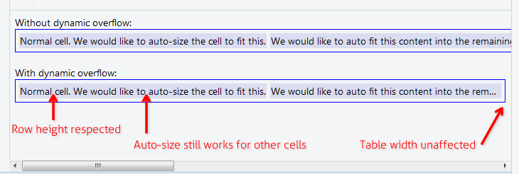
将以下3条规则添加到CSS:
.text-overflow-dynamic-container {
    position: relative;
    max-width: 100%;
    padding: 0 !important;
    display: -webkit-flex;
    display: -moz-flex;
    display: flex;
    vertical-align: text-bottom !important;
}
.text-overflow-dynamic-ellipsis {
    position: absolute;
    white-space: nowrap;
    overflow-y: visible;
    overflow-x: hidden;
    text-overflow: ellipsis;
    -ms-text-overflow: ellipsis;
    -o-text-overflow: ellipsis;
    max-width: 100%;
    min-width: 0;
    width:100%;
    top: 0;
    left: 0;
}
.text-overflow-dynamic-container:after,
.text-overflow-dynamic-ellipsis:after {
    content: '-';
    display: inline;
    visibility: hidden;
    width: 0;
}
在任何要使动态文本溢出的表单元格中,将HTML格式设置为:
<td>
  <span class="text-overflow-dynamic-container">
    <span class="text-overflow-dynamic-ellipsis" title="...your text again for usability...">
      //...your long text here...
    </span>
  </span>
</td>另外,将所需的min-width(或根本不使用)应用于表格单元。
当然是小提琴:https : //jsfiddle.net/9wycg99v/23/
max-width: X现在它们可以更宽-我认为这是因为display: flex使用了列,但我删除了它,没有区别...
似乎,如果您table-layout: fixed;在table元素上指定,则您的样式td应会生效。但是,这也会影响单元的大小。
Sitepoint在这里讨论了表布局方法:http : //reference.sitepoint.com/css/tableformatting
如果您只是想要表格自动布局
不使用max-width,或列宽百分比table-layout: fixed等。
https://jsfiddle.net/tturadqq/
怎么运行的:
步骤1:只需让表格自动布局即可。
当一个或多个列中包含大量文本时,它将尽可能缩小其他列,然后包装长列中的文本:

第2步:将单元格内容包装在div中,然后将该div设置为 max-height: 1.1em
(额外的0.1em用于在文本底部下方呈现一些字符的字符,例如'g'和'y'的尾部)

第3步:title在div上设置
这对可访问性有好处,对于我们稍后将使用的小技巧也是必需的。

步骤4:::after在div上添加CSS
这有点棘手。我们用设置CSS ::after,content: attr(title)然后将其放置在div顶部并进行设置text-overflow: ellipsis。为了清楚起见,我在这里将其涂成红色。
(请注意,长列现在具有尾部省略号)

步骤5:将div文本的颜色设置为 transparent
我们完成了!

如果是百分比表格宽度,或者无法在表格单元格上设置固定宽度。您可以申请table-layout: fixed;使其生效。
table {
  table-layout: fixed;
  width: 100%;
}
td {
  text-overflow: ellipsis;
  white-space: nowrap;
  overflow: hidden;
  border: 1px solid red;
}
<table>
<tr>
<td>Lorem ipsum and dim sum yeah yeah yeah. Lorem ipsum and dim sum yeah yeah yeah. Lorem ipsum and dim sum yeah yeah yeah. Lorem ipsum and dim sum yeah yeah yeah. Lorem ipsum and dim sum yeah yeah yeah.</td>
<td>Lorem ipsum and dim sum yeah yeah yeah. Lorem ipsum and dim sum yeah yeah yeah. Lorem ipsum and dim sum yeah yeah yeah. Lorem ipsum and dim sum yeah yeah yeah. Lorem ipsum and dim sum yeah yeah yeah.</td>
</tr>
</table>将单元格内容包装在flex块中。另外,单元格自动适合可见宽度。
table {
  width: 100%;
}

div.parent {
  display: flex;
}

div.child {
  flex: 1;
  width: 1px;
  overflow-x: hidden;
  text-overflow: ellipsis;
}
<table>
<tr>
<td>
<div class="parent">
<div class="child">
xxxxxxxxxxxxxxxxxxxxxxxxxxxxxxxxxxxxxxxxxxxxxxxxxxxxxxxxxxxxxxxxxxxxxxxxxxxxxxxxxxxxxxxxxxxxxxxxxxxxxxxxxxxxxxxxxxxxxxxxxxxxxxxxxxxxxxxxxxxxxxxxxxxxxxxxxxxxxxxxxxxxxxxxxxxxxxxxxxxxxxxxxxxxxxxxxxxxxxxxxxxxxxxxxxxxxxxxxxxxxxxxxxxxxxxxxxxxxxxxxxxxxxxxxxxxxxxxxxxxxxxxxxxxxxxxxxxxxxxxxxxxxxxxxxxxxxxxxxxxxxxxxxxxxxxxxxxxxxxxxxxxxxxxxxxxxxxxxxxxxxxxxxxxxxxxxxxxxxxxxxxxxxxxxxxxxxxxxxxxxxxxxxxxxxxxxxxxxxxxxxxxxxxxxxxxxxxxxxxxxxxxxxxxxxxxxxxxxxxxxxxxxxxxxxxxxxxxxxxxxxxxxxxxxxxxxxxxxxxxxxxxxxxxxxxxxxxxxxxxxxxxxxxxxxxxxxxxxxxxxxxxxxxxxxxxxxxxxxxxxxxxxxxxxxxxxxxxxxxxxxxxxxxxxxxxxxxxxxxxxxxxxxxxxxxxxxxx
</div>
<div>
</td>
</tr>
</table>white-space: nowrap;到child课堂上。
我使用绝对定位的div(相对)来解决此问题。
td {
    position: relative;
}
td > div {
    position: absolute;
    white-space: nowrap;
    overflow: hidden;
    text-overflow: ellipsis;
    max-width: 100%;
}
而已。然后,您可以在div中添加top:值或将其垂直居中:
td > div {
    top: 0;
    bottom: 0;
    margin: auto 0;
    height: 1.5em; // = line height
}
要在右侧留出一些空间,可以稍微减小最大宽度。
这是IE 9中可用的版本。
<div style="display:table; table-layout: fixed; width:100%; " >
        <div style="display:table-row;">
            <div style="display:table-cell;">
                <table style="width: 100%; table-layout: fixed;">
                    <div style="text-overflow:ellipsis;overflow:hidden;white-space:nowrap;">First row. Lorem Ipsum is simply dummy text of the printing and typesetting industry. Lorem Ipsum has been the industry's standard dummy text ever since the 1500s, when an unknown printer took a galley of type and scrambled it to make a type specimen book. It has survived not only five centuries, but also the leap into electronic typesetting, remaining essentially unchanged. It was popularised in the 1960s with the release of Letraset sheets containing Lorem Ipsum passages, and more recently with desktop publishing software like Aldus PageMaker including versions of Lorem Ipsum.</div>
                </table>
            </div>
            <div style="display:table-cell;">
                Top right Cell.
            </div>
        </div>
        <div style="display:table-row;">
            <div style="display:table-cell;">
                <table style="width: 100%; table-layout: fixed;">
                    <div style="text-overflow:ellipsis;overflow:hidden;white-space:nowrap;">Second row - Lorem Ipsum is simply dummy text of the printing and typesetting industry. Lorem Ipsum has been the industry's standard dummy text ever since the 1500s, when an unknown printer took a galley of type and scrambled it to make a type specimen book. It has survived not only five centuries, but also the leap into electronic typesetting, remaining essentially unchanged. It was popularised in the 1960s with the release of Letraset sheets containing Lorem Ipsum passages, and more recently with desktop publishing software like Aldus PageMaker including versions of Lorem Ipsum.</div>
                </table>
            </div>
            <div style="display:table-cell;">
                Bottom right cell.
            </div>
        </div>
    </div>
overflow很好地处理。尝试在单元格中放置一个div并设置该div的样式。